

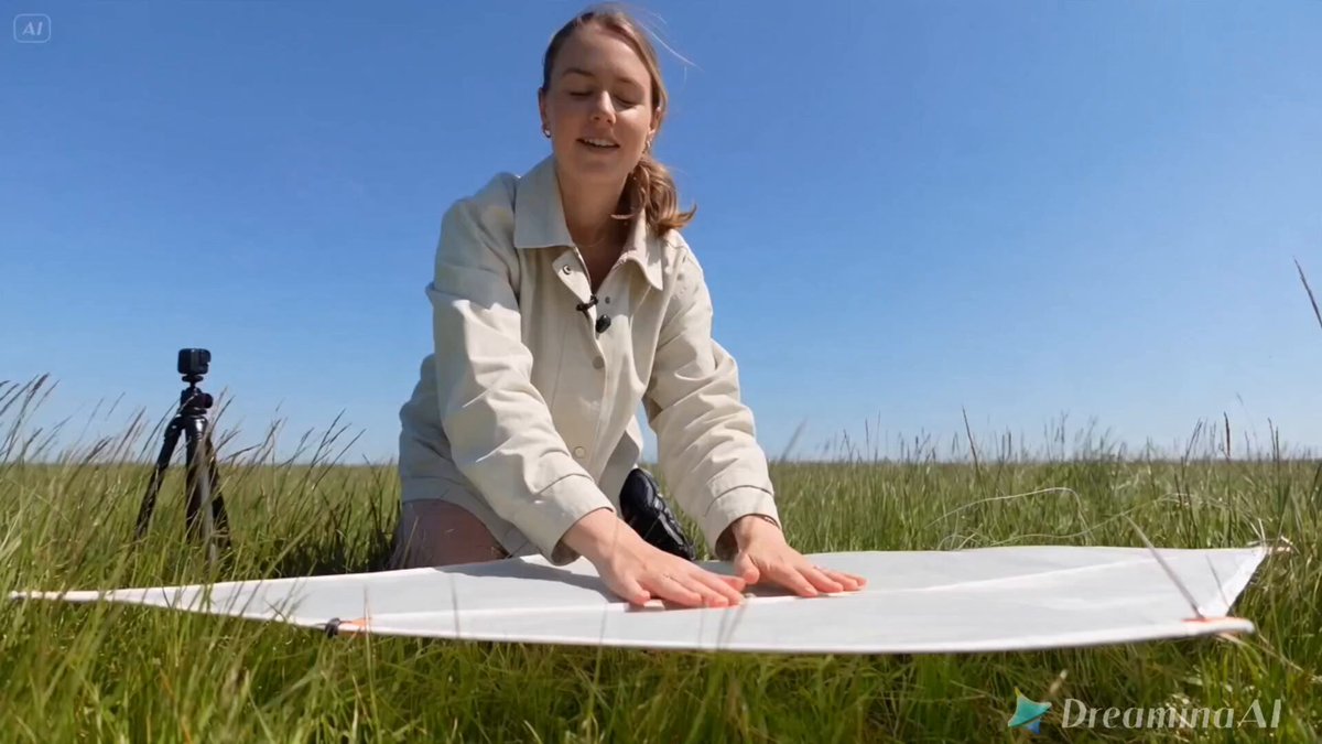


Photorealistic rendering used to be a hardware race. Today the constraint has moved. Generators can already produce skin, glass, and fabric that hold up at a glance; the failures that get a frame rejected in a client review are almost always structural — light arriving from nowhere, materials that behave like plastic, a camera that could not physically exist, or a finish so clean it looks manufactured.
This guide lays out a repeatable method for designers and motion artists who need photorealism on demand rather than by luck. It covers the rendering stack, lighting logic, material cues, prompt construction, camera behavior, post-processing, and a complete workflow you can adapt to commercial work.
Why Photorealistic Rendering Became a Workflow Discipline
Realism is a set of agreements between an image and the viewer's experience of the physical world. Depth of field behaves a certain way. Shadow edges soften as distance grows. Skin scatters light. Metal reflects its surroundings. When one agreement breaks, the eye flags the image as synthetic even if the viewer cannot say why.
The practical consequence is that consistency beats detail. A frame with four coherent light cues and moderate texture resolution reads as more real than a frame with enormous detail and contradictory shadows.
Three habits follow from this:
- Define the physical setup before writing a prompt — where the light sits, what the surface is, what the camera is doing.
- Lock that setup across a series so every asset shares one visual logic.
- Push every output through the same finishing chain so grain, contrast, and color stay consistent.
Designers who treat generation as the entire job iterate forever. Designers who treat generation as one stage in a pipeline ship faster and survive fewer revision rounds.
Building the Right Rendering Stack
No single tool covers a full production. A four-layer stack handles almost all commercial work, and each layer can be replaced independently as models improve.
Base generation
Text-to-image models create hero frames, backgrounds, product beauty shots, and texture libraries. Judge candidates on three things: how they handle light falloff in shadows, how they render repeated patterns and fine type, and how stable they are across seeds. Fix a seed range and generate eight to twelve variations instead of rewriting the prompt endlessly.
Reference-driven generation
Image-to-image, inpainting, and structural guidance tools keep poses, compositions, and brand assets on model. Depth maps and edge maps are especially useful for product photography, where a slight change in silhouette means a reshoot. Style references built from your own archive converge faster than long adjective lists.
Video generation
Video models turn stills into motion or generate motion directly. Prefer image-to-video when composition matters, since the first frame anchors everything after it. Keep clips short at first — three to five seconds — and extend only once motion looks natural. Long clips generated in one pass tend to drift in geometry and lighting.
Finishing layers
Upscalers, detail enhancement, relighting, and denoising tools handle the last ten percent of quality. Relighting is the fastest way to rescue a strong composition with flat or unmotivated light, and it is usually cheaper than regenerating from scratch.
Lighting: The First Language of Realism
If you can control only one variable, control light. Nearly every realism problem a viewer notices traces back to lighting before it traces back to texture.
Hard versus soft light
Hard light produces crisp, defined shadows and tight specular highlights. Soft light produces gradual falloff and gentle transitions. Most synthetic-looking images come from mixing the two within one frame — a hard shadow on the floor beneath a softly lit face. Decide which source dominates and let it govern the whole scene.
Motivated sources
Real photographs usually imply a source: a window, a practical lamp, an overcast sky, a bounce card. Naming that source in your setup keeps every shadow pointing in a believable direction. If two highlights meet on one surface, the viewer assumes two lights, so either commit to two or remove one.
Falloff and contrast ratio
Falloff describes how quickly light dims with distance. Contrast ratio describes the gap between the brightest highlight and the deepest shadow. Photographic work rarely pushes either extreme to the limit. Keeping a little detail in both ends — barely visible shadow texture, slightly held highlights — is what makes an image feel captured rather than computed.
Materials and Texture: Where Realism Is Won or Lost
Material response is the second layer of believability. A technically perfect render with waxy skin or rubbery metal will still fail.
Skin and organic surfaces
Skin is translucent. Light enters, scatters beneath the surface, and exits with a reddish tint. Add subtle unevenness in tone, visible pores in high-detail areas, faint shine on the T-zone, and fine stray hairs at the silhouette. Uniform smoothness is the single most common marker of an AI-generated face.
Metal, glass, and water
Reflective materials need content to reflect. A chrome surface in an empty void reads as grey plastic. Give reflections an environment: a studio backdrop, a window, foliage, or a gradient wall. Glass should bend and slightly tint what sits behind it. Water needs surface disturbance — ripples, droplets, or a broken reflection — because perfectly still water looks like a mirror.
Fabric
Weave scale must match the garment. Denim shows a visible twill, silk shows a directional sheen, wool shows fiber fuzz at the edges. Wrinkles follow gravity and tension: fabric pulls from seams, bunches at joints, and pools where it meets a surface. Random wrinkle patterns are as misleading as random shadows.
Prompt Engineering for Realism Without Gimmicks
Realism comes from specificity about physics, not from stacking quality keywords.
Use camera language precisely
"85mm portrait lens, f/2.0, natural window light from camera left, eye level" outperforms "hyperrealistic 8K ultra detailed masterpiece." Specify focal length, aperture, light direction, and angle. Those four parameters describe how the image is made, and generators respond to them more reliably than to adjectives about quality.
Treat negative prompts as cleanup
Negative prompts work best as a list of recurring flaws rather than a statement of taste. Useful entries include plastic skin, waxy texture, extra fingers, duplicated limbs, blurry text, HDR halo, over-sharpened edges, watermark, and floating objects. Build the list from your own failed renders — that is where the useful patterns live.
Prefer references over adjectives
One strong reference image usually beats a paragraph of description. A typical high-control setup combines a depth or pose reference for structure, a style reference for color and finish, and a short text prompt for subject and lighting. Keep the text prompt under roughly sixty words so the references are not overridden.
Iterate one variable at a time
When a render misses, change either the lighting description, the material description, or the reference set — not all three at once. Otherwise you never learn which change produced the improvement, and the workflow never stabilizes into something a team can repeat.
Camera Behavior and Motion in AI Video
Video adds a second realism problem: time. Still frames can be perfect and the clip still feels wrong because motion follows the rules of animation rather than photography.
Shutter and motion blur
Real footage has motion blur that scales with subject speed. Fast pans smear, slow movements stay sharp. If a generated clip shows crisp edges during a fast move, it reads as digital. Mention shutter behavior and natural motion blur in your prompt, and prefer slightly slower camera moves so blur appears organically.
Handheld versus stabilized
Locked-off shots are the safest starting point: a tripod frame with natural subject movement looks photographic. Handheld adds life but amplifies small geometry errors. If you need handheld energy, keep it subtle and check for warping at the frame edges, where distortion is most visible.
Temporal consistency
Watch for flickering highlights, shifting facial features, and fabric that changes weave between frames. Reducing clip length, lowering motion intensity, and anchoring the first frame with a strong still are the three most effective fixes. Extending a clip in short increments also keeps drift under control.
Post-Processing: Color, Grain, and Cleanup
A raw generation is rarely finished. The final pass is what makes a frame sit comfortably next to real photography in the same layout.
Tone mapping and color
Apply one consistent grade across a project. Start by setting black and white points so neither end clips, then shape midtone contrast. Slight desaturation in the highlights and a warm shift in the highlights with a cool shift in the shadows is a common photographic look. Avoid heavy saturation boosts; they amplify artifacts.
Grain and noise
Adding fine grain is one of the fastest ways to unify synthetic and photographic assets. Match grain size to the surrounding imagery — heavy grain over a clean render looks added on. Keep grain monochrome and subtle, and apply it after sharpening so it does not get crushed.
Artifact repair
Work at high magnification through the frame in quadrants. Inpainting handles bad hands, warped text, and broken edges; cloning tools handle small seams. Finish by checking the four most common problem zones: hands, teeth, ears, and any area where two surfaces meet.
A Practical End-to-End Workflow
Here is a sequence that keeps quality consistent across a project rather than per image.
Step 1 — Write the physical brief. One paragraph covering light source, surface materials, camera, and mood. This replaces scattered prompt fragments.
Step 2 — Build a small reference board. Three to six images: one for light, one for color, one for material, one for camera angle. Keep it small enough to stay coherent.
Step 3 — Generate wide, then narrow. Produce eight to twelve low-cost variations with fixed seeds. Select two candidates. Do not polish anything that has not survived selection.
Step 4 — Refine structurally. Use inpainting and structural references to fix composition, then refine texture. Structure first prevents wasted detail work.
Step 5 — Move to video if needed. Animate only selected stills. Keep the first clip short and extend after motion looks right.
Step 6 — Unify the finish. Apply the same grade, grain, and sharpening chain to every asset in the set.
Step 7 — Validate in context. View the asset at final size, in the final layout, next to real photography. Most realism issues surface here rather than at full zoom.
Step 8 — Archive the working setup. Save the prompt, seed, references, and grade as a reusable preset. Reuse is where the real time savings accumulate.
Common Mistakes and How to Fix Them
| Mistake | Why it breaks realism | Fix |
|---|---|---|
| Contradictory shadows | Implies impossible light sources | Commit to one dominant source and check shadow direction |
| Uniform skin | Removes subsurface scattering cues | Add tone variation, pores, and highlight breakup |
| Empty reflections | Metal reads as plastic | Give reflective surfaces an environment to reflect |
| Over-sharpening | Creates halos and crunchy edges | Sharpen lightly before grain, not after |
| Keyword stacking | Dilutes the parameters that matter | Replace quality adjectives with camera and light specifics |
| Per-image grading | Assets look unrelated in a layout | Apply one shared grade across the set |
| Long single-pass clips | Geometry and light drift mid-shot | Extend in short increments from a strong first frame |
Choosing the Right Approach for Each Project
Not every brief needs maximum realism, and chasing it everywhere wastes time. Use these criteria to decide how far to push.
Use full photorealistic treatment when the asset must sit beside real photography in a catalog, packaging mockup, or editorial layout, or when a client's approval depends on the image being indistinguishable from a photograph.
Use controlled semi-realism when the project needs a consistent look across many assets — a campaign with twenty product variations benefits more from a locked style than from maximum fidelity on each frame.
Use stylized generation when the message depends on mood rather than physical accuracy. Stylized work is also easier to keep consistent, because small errors are absorbed by the aesthetic.
The deciding question is usually not "how real can this look" but "what will this asset sit next to." Match the target, not the maximum.
FAQ
How many variations should I generate before choosing?
Eight to twelve per concept with fixed seed ranges is usually enough to see which direction works. More variations rarely fix a concept problem — if none of the twelve work, the physical brief is wrong, not the model.
Why does skin always look slightly plastic?
Because generic prompts describe skin as a smooth surface. Real skin is translucent, uneven, and textured. Describe scattering, tone variation, pores in sharp areas, and small highlight breakup, and the plastic look usually disappears within a few iterations.
Do negative prompts actually improve realism?
Yes, when they target specific recurring flaws rather than broad aesthetic dislikes. Keep a running list built from your own rejected renders, and update it whenever you see a repeated defect like warped text or duplicated fingers.
How do I keep a series visually consistent?
Lock four things: lighting direction, color grade, grain treatment, and camera focal length. Save those as a preset and apply them to every asset in the series. Consistency across a set matters more than the quality of any single frame.
Why do AI video clips drift after a few seconds?
Error compounds frame by frame. Short clips have less time to drift, so generating three to five seconds and extending in increments keeps geometry and lighting stable. A strong first frame also anchors everything that follows.
Do I still need post-processing if the render looks good?
Almost always, yes. Grading and grain are what let a synthetic asset sit naturally beside real photography. Even a small amount of unified contrast, color, and grain removes the last visual tell in most finished work.
How do I judge whether a render is finished?
View it at final size in its real context rather than zoomed in. If it holds up beside the surrounding photography without drawing attention to itself, it is finished. Detail that only exists at 200 percent zoom does not help the viewer.
