
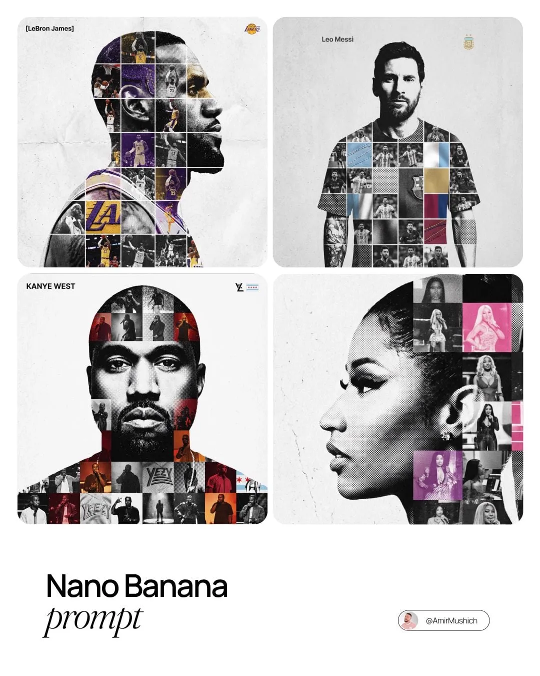


Style transfer used to be a single blurry filter: feed an image into a network, pick a painting, hope the output looks deliberate. That still works for moodboards, but it falls apart the moment you need a sequence of shots, a recurring character, or art direction that survives a change of scene. Pixel-block style transfer — decomposing a frame into typed primitives and rebuilding it from a controlled visual grammar — takes the opposite route. Instead of stylizing everything at once, it stylizes in layers you can inspect, reorder, and reuse.
Why Block-Based Style Transfer Solves a Real Problem
Classic neural style transfer optimizes a loss between content features and style features. It is brilliant at texture and terrible at structure: faces melt, text turns to soup, and thin objects disappear. Diffusion-based pipelines flipped the difficulty. They produce gorgeous surface detail, but they drift. Run the same prompt on forty frames and you get forty slightly different worlds, with lighting that shifts and costumes that reinvent themselves between cuts.
The block approach treats style as a series of explicit decisions instead of a statistical coincidence. Which region is this? What palette does it belong to? What primitive shape represents it? How are edges handled? Because those decisions are discrete, they can be written down, copied, and reapplied. A style bible created once can drive shot 1 and shot 40. When a director asks for "more contrast in the sky," you adjust one layer rather than rerendering the entire sequence and praying.
This matters most for serialized work: pixel-art game intros, explainer series, children's content, stylized music videos, and branded shorts that need to feel like they came from the same studio every week. It also matters for revision-heavy production, where the cost of a change should be proportional to the size of the change.
Block grammar has limits. It is not photorealistic, and at very low resolution it can erase the identity markers that make a character recognizable. The practical answer is to use it as a stylistic layer applied over a well-lit, well-composed base rather than as a rescue attempt for weak source material.
How the Pipeline Works
A block-based pipeline has four stages: decomposition, typing, grammar, and overlay. Decomposition splits the frame into regions. Typing assigns each region a semantic label and a visual role. Grammar defines how each role is drawn. Overlay composites the result in a fixed order so the image stays readable.
Segmenting the Frame Into Meaningful Regions
Start by producing masks: sky, ground, architecture, foreground props, subject, hair, skin, clothing, and any effect layers like smoke or glow. Modern segmentation models give you a strong first pass, but plan to clean up edges manually on hero shots. Export each layer as a transparent PNG with a consistent naming convention such as shot03_subject_hair.png. Naming discipline is not bureaucracy; it is what lets you re-run a single layer six weeks later without rebuilding the whole scene.
Building a Palette and Primitive Grammar
A workable grammar usually specifies four things. First, a palette cap — commonly 12 to 24 colors, with a dedicated ramp for skin, foliage, metal, and sky. Second, a block grid, often 4 to 8 pixels depending on final resolution. Third, a small set of edge treatments: hard edge, dithered edge, and outline. Fourth, lighting rules that state which direction light comes from and how shadows are quantized.
Write these rules down in a document. A short grammar file is the difference between a repeatable style and a happy accident you cannot reproduce.
Modular Overlay Instead of Global Stylization
Apply the grammar layer by layer, from background to foreground, so occlusion stays logical. Keep effect layers separate: glow, rain, dust, and lens artifacts should never be baked into the subject layer, because you will want to reduce them later. Blend modes and opacity are your friends here. A subtle overlay at 40 percent opacity often reads better than a full-strength stylization that destroys form.
Where Consistency Gets Decided
Consistency is decided before animation, not during it. Build a character sheet with front, three-quarter, and profile views in the target style. Lock the palette and block size for the whole project. Reuse masks across shots whenever the camera allows it, and anchor keyframes — first, middle, and last frame of each shot — before generating anything between them. If your tool supports structure conditioning, feed it the previous frame to keep silhouettes stable.
Choosing the Right Tool for Each Stage
No single application does the whole job well. The strongest results come from assembling a small stack, where each tool does one thing predictably.
Segmentation and Masking
Options range from promptable segmentation models to classic rotoscoping inside a compositor. Promptable models are fast for clear subjects and weak on transparency, hair, and motion-blurred edges. Depth estimators help separate foreground from background in flat lighting. For hero shots, nothing beats a manual pass. Decision criteria: how many shots share the subject, how clean the edges must be, and whether you can amortize a character sheet across a whole project.
Stylization and Rendering
Three families are worth knowing. Indexed-color conversion in a pixel editor gives you total control and no AI artifacts. Structure-conditioned diffusion gives you texture variety and speed. Dedicated pixelization filters sit in between and are useful for quick look development. Most teams settle on a hybrid: index the color manually, then use diffusion only for texture variation inside already-masked regions.
Motion, Upscaling, and Cleanup
For movement, image-to-video models handle subtle camera drift well but tend to warble on busy textures. Frame interpolation smooths playback but can smear dithered edges. Upscalers are essential if you rendered at a small grid, and temporal denoising removes the shimmer that appears when each frame is stylized independently. Budget time for cleanup — it is routinely 30 to 40 percent of the schedule.
A Practical Workflow: Reference Frame to Finished Shot
Step 1 — Prep and Normalize
Work at a resolution your grid divides cleanly. Fix exposure and white balance before stylization, because a block palette cannot rescue an underexposed frame. Crop to the final aspect ratio early so you never restyle a region that will be cut.
Step 2 — Decompose and Tag
Run segmentation, then manually correct subject edges. Tag every layer with a role: background, midground, subject, hair, skin, clothing, effect. Apply the target palette as a preview so you can spot conflicts — for example, a character whose jacket and the wall behind them share the same value and therefore mush together.
Step 3 — Apply the Block Grammar
Quantize each layer to the grid, then apply the edge treatment appropriate to its role. Keep hard edges on architecture, dithered edges on skies and gradients, and outlines only on subjects. Check the frame at 25 percent zoom; if the silhouette still reads, the composition survives the style.
Step 4 — Lock the Character Sheet
Before generating a single in-between frame, export the locked character sheet and a reference palette swatch image. Every subsequent shot references them. This is the single most effective anti-drift measure in the entire pipeline.
Step 5 — Animate and Review in Loops
Animate in short segments of two to four seconds. Review them as loops rather than as straight playback, because flicker and edge crawl are far easier to spot when a clip repeats. Fix the worst frame first and regenerate outward from it.
Comparing Approaches
| Approach | Structural control | Temporal stability | Revision cost | Best use |
|---|---|---|---|---|
| Classic neural style transfer | Low | Low | High | Single images, moodboards |
| Diffusion img2img | Medium | Low to medium | Medium | Texture passes inside masks |
| Block grammar pipeline | High | High | Low | Series, characters, brand work |
| Hybrid block plus diffusion | High | Medium to high | Medium | Stylized shorts with rich texture |
The pattern is consistent: control comes from how much of the frame you decide in advance. Diffusion gives you surprise; block grammar gives you repeatability. Most commercial work needs repeatability with a controlled amount of surprise.
Common Mistakes and How to Avoid Them
Too many colors. A palette that keeps growing produces muddy, indistinct frames. Cap it and force yourself to solve contrast with value, not with new hues.
One block size everywhere. A uniform grid flattens detail and makes skin look like sandpaper. Use a finer grid for faces and hands, and a coarser grid for backgrounds.
Restyling each frame independently. This guarantees flicker. Either propagate masks and structure from a keyframe, or stylize at a lower frame rate and interpolate carefully.
Ignoring grid alignment. If your grid does not divide the resolution cleanly, you get uneven blocks and a drifting edge that looks like a rendering bug.
Over-relying on prompts. Prompts describe mood; they do not define structure. Write the grammar down and treat the prompt as a secondary nudge.
Skipping the silhouette test. Squint at the frame or convert it to pure black and white. If the subject disappears, the value design failed, and no amount of dithering will fix it.
Quality Control: Metrics and Review Habits
Build a short checklist and use it on every shot. Palette audit: are you still within the declared color set? Flicker test: play a three-frame loop at full speed and watch the edges. Mask integrity: does the subject mask hold through fast motion? Edge crawl: do outlines jitter between adjacent frames? Value separation: does each layer read against its neighbors?
Quantitative checks help too. Track mask overlap between consecutive frames to catch segmentation slip, and measure average color drift across a shot to catch palette creep. Neither metric replaces human review, but both catch problems early, when regeneration is cheap. Establish a review rhythm: contact sheet for composition, loop test for motion, full playback for pacing. Different problems show up at different speeds.
Prompting and Art Direction Notes
When you do use text prompts, describe material and light instead of naming a style genre. "Weathered brass with a warm rim light from the upper left" gives a model more usable information than "cyberpunk pixel art." Keep the prompt constant across a shot so variation comes from the animation, not the language.
Negative guidance is equally practical: avoid soft gradients, avoid photographic depth of field, avoid anti-aliased edges. If your tool supports reference images, supply both a palette swatch and a previously approved frame — the swatch controls color, the frame controls rendering character.
Finally, separate authoring from finishing. Let the block pass establish structure, then add lighting and atmosphere as distinct layers. That split keeps revisions cheap and makes it obvious which stage introduced a defect.
FAQ
Does block-based stylization work for live-action footage? Yes, with well-lit source material and clean masks. Flat lighting and heavy motion blur are the two biggest obstacles.
How many colors should a palette have? Twelve to twenty-four for most projects. Series work benefits from a smaller, stricter set because it makes cross-shot matching easier.
What block size should I pick? Choose based on final delivery resolution, not on the working resolution. Smaller blocks preserve facial identity; larger blocks read as more abstract art.
Can I mix block style with diffusion rendering? Yes. Mask first, then apply diffusion only inside masks at low strength. Keep structure conditioning enabled so silhouettes stay put.
Why does my sequence flicker? Usually because each frame was stylized independently. Anchor keyframes, reuse masks, and add temporal smoothing before blaming the model.
Do I need a character sheet? For anything with a returning character, yes. It is the cheapest consistency insurance available.
How long should a stylized shot be? Two to four seconds per segment while iterating. Longer cuts hide problems and make review harder.
A Starter Checklist
Before you render anything: normalize exposure, lock the aspect ratio, define the palette, set the grid, and write the grammar down. During production: segment first, tag every layer, anchor keyframes, and review in loops. Before delivery: run the palette audit, the flicker test, and the silhouette test, then confirm that every asset still matches the character sheet.
Pixel-block style transfer is less a single tool than a discipline. It asks you to decide in advance what the frame is made of, and it rewards that decision with work you can revise, reuse, and ship as a coherent whole. Teams that adopt it usually find the biggest gain is not visual at all — it is that a change to the art direction no longer means starting over.
