

Why Pixel-Level Style Control Changes AI Video
Most people start with a prompt and hope. They type something like "cinematic retro-futuristic city, neon, moody" into a text-to-video model and get a result that is impressive for about four seconds and unusable for a twelve-shot sequence. The problem is not the model. The problem is that a vibe is not a specification.
Pixel-level style control flips that relationship. Instead of describing an overall feeling and accepting whatever the generator decides that means, you define the visual system itself: the palette, the edge treatment, the shading model, the texture density, the amount of grain, the way light wraps around a surface. Then you hold that system constant while everything else in the shot changes.
This matters more than ever now that video generators have become genuinely good. Tools like Sora, Runway Gen-4, Kling, Luma Dream Machine, Veo, and Pika can produce photoreal detail that would have seemed impossible a few years ago. When realism is cheap, consistency becomes the scarce resource. A viewer will forgive a slightly soft frame. They will not forgive a character whose jacket changes colour between cuts, or a stylised world that looks like a different artist drew every third shot.
So the practical skill in modern AI video work is not prompting harder. It is engineering a style that survives generation, re-generation, resolution changes, and model switches. This guide lays out a complete workflow for doing exactly that, from decomposing a look into reusable parts to running quality control on the final render.
Treat Every Look as a Set of Reusable Parts
The most useful mental model is modular. Think of a visual style the way you would think of a construction set: a defined inventory of small pieces that can be combined in predictable ways. A style is not one monolithic thing you either capture or miss. It is a stack of independent decisions, and each decision can be specified, tested, and reused.
Breaking a style into building blocks
Before you write a single prompt, sit down and decompose the look you want into at least eight layers:
- Palette. Six to ten named colours with approximate values, plus a rule for how saturated highlights are allowed to get.
- Line and edge treatment. Hard outlines, soft edges, no outlines at all, or edge darkening that mimics painted cel work.
- Shading model. Flat fills, two-tone cel shading, gradient ramps, or physically based lighting.
- Texture density. How much surface noise, grain, halftone, or dithering appears at a given scale.
- Material vocabulary. The specific set of surfaces allowed in the world: brushed metal, matte clay, glazed ceramic, knit fabric, wet asphalt.
- Lighting grammar. Key direction, contrast ratio, whether shadows are coloured, whether practical lights bloom.
- Camera grammar. Lens length, height, movement vocabulary, and how much depth of field is permitted.
- Motion signature. Frame rate feel, motion blur behaviour, and whether stop-motion-style judder is part of the look.
Once those eight layers exist as written decisions rather than instincts, you can debug a bad render. If a shot feels wrong, you can ask which layer drifted, and you will usually know the answer within seconds.
Turning a mood board into a style sheet
A mood board communicates taste. A style sheet communicates instructions. You need both, but only one of them can be pasted into a tool.
Build a one-page style sheet with three columns: the layer name, the decision, and the reference image that proves it. Keep the language concrete. "Warm palette" is useless. "Palette anchored on burnt orange, dusty teal, and bone white, with highlights capped at 85 percent luminance" is something a model can actually approximate and a reviewer can actually check.
This sheet becomes your reusable asset. Every project you build with that style starts from the same document, and every improvement you make to the sheet improves every future project.
Assembling Reference Images That Survive Generation
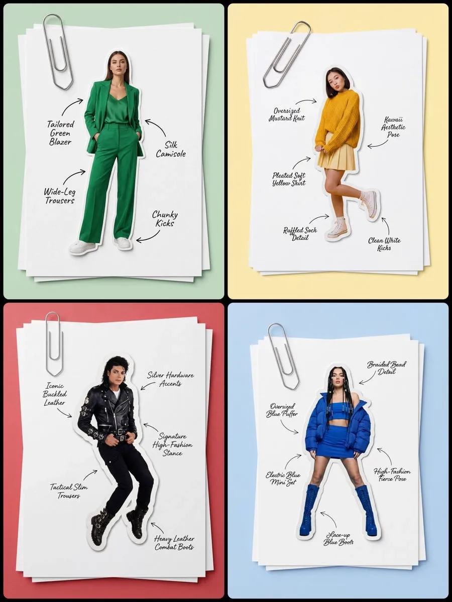
Text describes style poorly. Images describe it well. The core technique of modern style transfer is to stop relying on adjectives and start relying on a curated reference set.
Choosing and pruning references
Pull ten to twenty candidates, then cut ruthlessly down to three to six. A good reference set has three qualities:
- Internal consistency. If two references disagree about the palette, the model will average them and produce mud.
- Coverage of distinct surfaces. One reference for skin and fabric, one for hard surfaces, one for the environment, and optionally one for a signature detail.
- Clean, well-exposed source images. References with heavy compression artifacts or blown highlights teach the model the wrong lesson.
Resist the urge to include a reference just because it looks cool. A reference that introduces a colour the style sheet does not mention will fight everything else you do.
Multi-image fusion in practice
Fusion means combining several references into a single coherent target. There are four practical approaches, and most strong pipelines use two or three of them together:
- Composite sheets. Arrange your references into one image with clear separation, then condition on the whole sheet. This reduces the chance that one reference dominates by accident.
- Weighted conditioning. Where the interface allows it, weight the primary style reference higher than secondary ones. Start at roughly 70/30 and adjust.
- Region-based guidance. Use masks or depth passes to tell the model which reference applies to which part of the frame.
- Fine-tuned style adapters. If you have enough consistent training material, a small style adapter can lock a look far more reliably than prompt text ever will.
The order matters. Lock the palette and shading model first, because those are the hardest to change later. Texture and grain come last, since they are easiest to add in post.
Texture, Material, and Surface Fidelity
Once the broad look is locked, the battle moves to materials. This is where most stylised AI video either becomes convincing or falls apart.
Build a material library, not a material prompt
Collect reference crops of each material at the scale it will appear on screen. A metal plate seen from three metres away and the same plate seen in close-up need different references. Store them as a library with short names so you can reference them quickly and reuse them across shots.
Watch for tiling and repetition artifacts
Synthetic surfaces love to repeat. Check every large flat plane — walls, floors, skies, water — at full resolution for obvious pattern repetition. The fix is usually to break the surface with geometry, add a subtle lighting gradient, or composite a second low-opacity texture layer on top.
Respect the pixel grid if you are working in a pixel look
If your target style is deliberately low-resolution, whether retro game art, mosaic, or any blocky aesthetic, then alignment matters. Keep edges snapped to a consistent grid, avoid anti-aliased edges that contradict the style, and be deliberate about dithering. A pixel look is destroyed by a single smooth gradient, a hair-thin line, or a rotated element that introduces sub-pixel edges. Test your pipeline on a rotation-heavy shot early, because that is where grid discipline breaks first.
Keeping Motion Coherent Across Frames
A still frame with perfect style is only half the job. The moment things move, new failure modes appear: flicker, crawling texture, warping edges, shifting palette, and characters whose proportions breathe in and out.
Anchor keyframes, then interpolate
Generate or paint a small number of anchor frames where the composition is exactly right. Then generate the in-between motion with a model or a traditional interpolation pass, always comparing each result against the nearest anchor. If the palette drifts two percent between anchors, viewers will not consciously notice, but they will feel a subtle instability.
Use optical flow as a diagnostic, not just a tool
Optical flow computation between frames is one of the cheapest ways to find problems. Large unexpected flow vectors in areas that should be static usually mean texture crawling. Inconsistent flow around edges means the model is redrawing the outline every frame instead of holding it.
Tame camera motion
Slow, deliberate camera moves hide temporal artifacts far better than fast ones. If you need energy, get it from cuts, subject motion, and sound design rather than from a wildly swinging virtual camera. When you do want a fast move, add motion blur intentionally and consistently, because uneven blur draws attention to the seams.
A Repeatable Workflow for a Stylized Short
Here is the full pipeline in the order that produces the fewest wasted renders.
- Write the style sheet. Eight layers, concrete values, three to six references.
- Lock a single hero frame. Do not move on until one still image is exactly the look you want at final resolution.
- Generate a 40-frame test. Use the simplest possible motion: a slow push-in with no subject movement. This isolates style stability from motion problems.
- Add subject motion. Same style, now with a character or object moving. Compare against the hero frame.
- Add camera motion. Introduce the most aggressive move the final piece will contain. Fix problems here, not in the final render.
- Generate the full sequence in short segments. Keep segments between three and eight seconds. Longer segments give the model more opportunities to drift.
- Assemble and grade. Apply one consistent colour pass across the whole timeline so any residual per-segment differences flatten out.
- Run quality control. Score every shot against the same checklist, then fix only the shots that fail.
Steps three through five are the ones people skip, and they are why so many projects collapse at the end. A five-minute test at each stage saves hours of re-rendering.
Using Several Models Without Losing the Look
Almost no serious project uses one model for everything. You might use one tool for the establishing shot, another for character close-ups, and a third for effects. The risk is obvious: three models, three interpretations of your style.
There are three techniques that keep a multi-model pipeline coherent.
Style-locked conditioning. Always pass the same reference set and the same style sheet text to every model. Never paraphrase for one tool and not another. Differences in prompt interpretation compound.
Cross-model translation passes. Generate your hero frame once, then use image-to-image or video-to-video translation to move the established look onto new footage rather than generating from text again. This is far more reliable than trying to re-describe the style.
Per-model compensation. Each model has biases. One might oversaturate, another might soften edges. Note these biases in your style sheet as model-specific adjustments so you do not rediscover them every project.
A useful rule: any element that appears in more than one shot should be generated once and reused, not regenerated. Characters, props, and environments should exist as assets, not as prompts.
Mistakes That Break Pixel Accuracy
The same handful of errors show up in almost every failed stylised project.
- Overloading a single prompt. Trying to specify palette, material, camera, and motion in one sentence guarantees that something gets dropped.
- Using references that contradict each other. The model will average them into something bland and inconsistent.
- Skipping the hero frame. Building motion on an unapproved still amplifies every flaw.
- Mixing resolutions mid-pipeline. Upscaling and downscaling can introduce softness that contradicts a hard-edged style. Pick a working resolution and stay there.
- Ignoring the background. Backgrounds drift first, and viewers notice because they are large and static.
- Grading per shot. Apply grades across the sequence. Per-shot grading reintroduces exactly the inconsistency you worked to remove.
- Chasing perfection in the first pass. Style transfer is iterative. Build a loop that makes iteration cheap rather than expecting one perfect generation.
Quality Control: How to Review a Stylized Render
Reviewing needs to be systematic. Vague dissatisfaction cannot be fixed. Score each shot on a five-point scale across five dimensions:
- Palette match. Does the frame hit the specified colours, including shadows and highlights?
- Edge and shading fidelity. Are outlines and shading ramps consistent with the style sheet?
- Material accuracy. Do surfaces read as the intended material at the intended scale?
- Temporal stability. Does anything flicker, crawl, or shift when played at speed?
- Motion signature. Does the movement feel like the style, or like a generic render wearing a costume?
Anything scoring three or below gets fixed. Anything scoring four or five gets left alone, even if you personally dislike a small detail. Perfectionism at this stage usually makes the work worse, because fixing one shot in isolation breaks it against its neighbours.
FAQ
Do I need a fine-tuned model to get consistent style?
No, but it helps a lot at scale. A well-built reference set and style sheet will get you most of the way. Fine-tuning becomes worth the effort once you are producing many sequences from the same look.
How many reference images is too many?
More than six usually hurts. Beyond that, conflicting signals start cancelling each other out and the output becomes average rather than specific.
What is the hardest part of a pixel-art video pipeline?
Rotation and camera movement. Perspective changes force sub-pixel edges, which break grid discipline. Test those shots first.
Can I fix an inconsistent shot in post instead of regenerating it?
Sometimes. Colour, contrast, grain, and sharpness are all fixable. Structural problems — wrong shading model, wrong edge treatment — are not. Regenerate those.
How long should a generated segment be?
Three to eight seconds for stylised work. Longer segments accumulate drift, and the cost of a failed long segment is much higher than the cost of a failed short one.
What is the single biggest upgrade to a stylised AI video?
Consistent colour grading across the whole timeline. It is cheap, it hides small per-shot differences, and it makes a sequence of separately generated shots feel like one film.
