
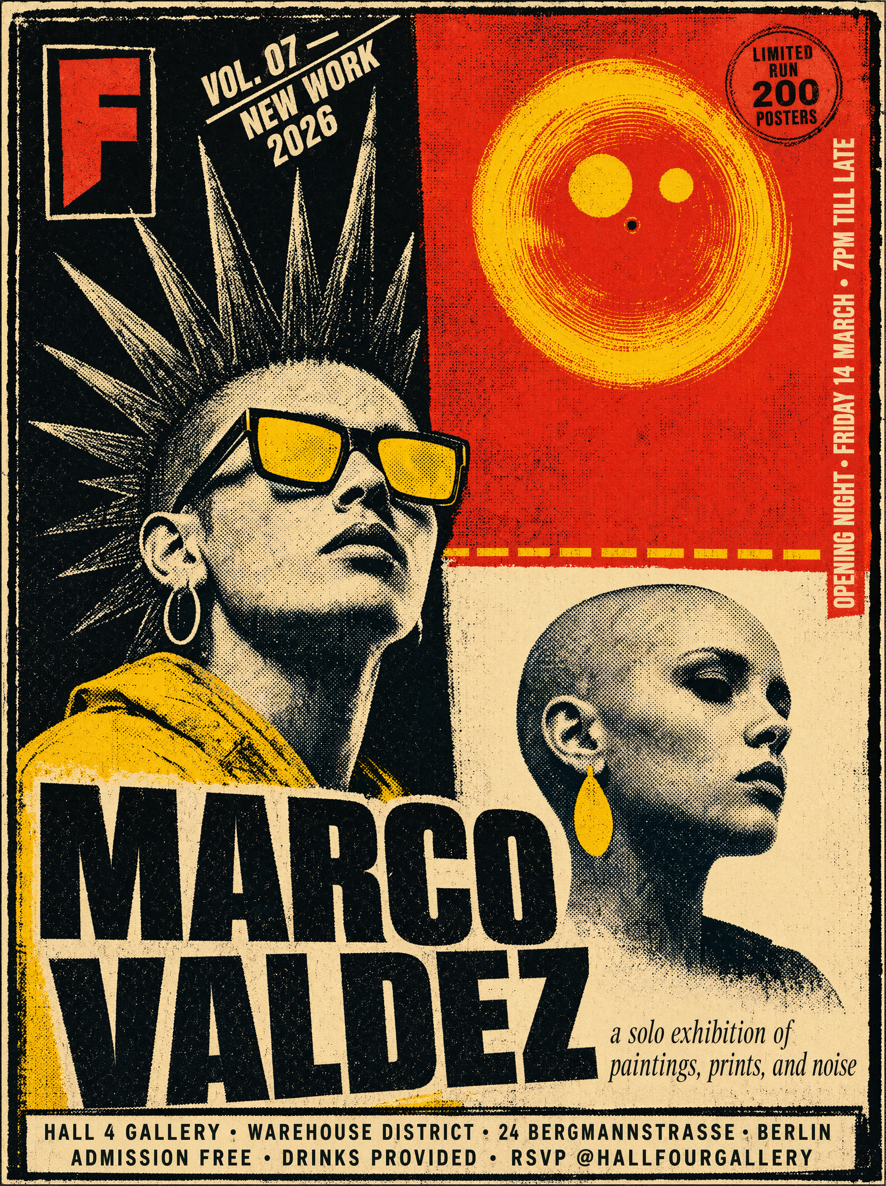
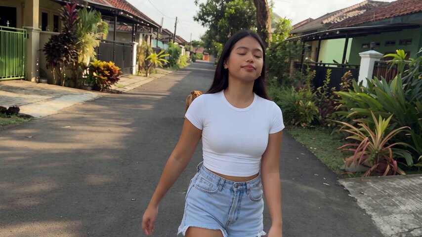
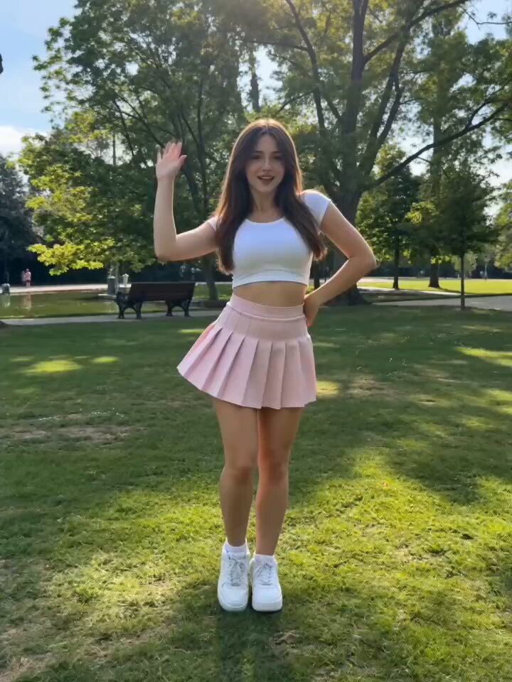
Why Photorealism Became a Prompting Discipline
A few years ago, "AI image" meant something visibly synthetic: melted hands, plastic skin, lighting that seemed to come from nowhere. Today the gap between a generated frame and a studio photograph is often a matter of a handful of deliberate decisions, and nearly all of those decisions live inside the prompt. The tools improved, but so did the way experienced creators talk to them. They stopped describing pictures and started directing them.
That shift matters because photorealism is not a single quality. It is a stack of smaller signals the human eye reads in under a second: skin that scatters light, fabric that folds with weight, shadows that agree on one light source, grain that behaves like a sensor rather than a filter. Miss one signal and the whole image reads as fake, even when everything else is technically excellent.
The practical consequence is that you cannot fix realism with one magic word like "hyperrealistic." You have to build the shot from parts: the model, the subject, the environment, the camera, the light, the texture, and the exclusions. This guide walks through those parts in the order a working creator actually uses them, with adaptable example prompts, decision criteria, and a troubleshooting checklist you can return to when a render looks almost right but not quite believable.
Start With the Model, Not the Words
Most weak AI images are not weak prompts. They are the right prompt sent to the wrong model. Different image models are trained on different data distributions, and each one has a personality: some are tuned for illustration, some for product photography, some for cinematic film stills, and some for natural-light portraiture.
Matching the model to the shot type
Before writing a single word, ask what kind of image you are making:
- Editorial portrait or headshot: choose a model known for skin rendering, shallow depth of field, and soft light falloff. These models usually handle eyes and hair strands better than general-purpose ones.
- Product and packshot: look for a model that respects geometry, straight edges, reflective surfaces, and label text. Product realism fails on logos and glass, not on faces.
- Cinematic film still: use a model with strong cinematic training, then reinforce it with film stock, aspect ratio, and lighting language.
- Documentary or street scene: prioritize models that produce believable crowds, mid-ground clutter, and imperfect framing. Too much polish kills credibility here.
- Architectural and interior: choose models with accurate perspective and physically plausible bounce light, or you will spend your time fixing warped windows.
A fast way to evaluate a new model is the twenty-minute test: run the same three prompts through it — one portrait, one product, one wide scene — and judge texture, geometry, and light consistency. Keep a small notes file with your findings. Over a few months this becomes more valuable than any prompt library, because it tells you which tool to reach for instead of forcing one model to do everything.
What to check before you write a single prompt
- Resolution and aspect ratio controls and whether they can be set independently of the prompt.
- Whether the tool separates positive and negative prompt fields.
- Whether it supports reference images, style references, or subject references.
- How it handles text inside the image, and whether you should add text in post instead.
- Whether seeds are reproducible, which is essential for consistency work.
If a tool hides the seed or ignores negative prompts, you can still get good realism, but your workflow has to shift toward generating many variations and selecting the best rather than refining one image.
The Anatomy of a Photorealistic Prompt
A reliable photorealistic prompt has six layers. Not every image needs all six in full detail, but knowing the layers keeps you from writing vague, adjective-heavy prompts that sound impressive and produce mush.
1. Subject and action
Name the subject precisely and give it something to do. "A woman" is weak. "A woman in her late thirties leaning against a workshop bench, wiping her hands on a rag" is a shot. Action creates body tension, and body tension creates believable anatomy.
2. Environment and context
Where is this happening, and what is the time of day? Context determines light and clutter. A kitchen at dawn and a kitchen at midnight are completely different renders. Add two or three environmental anchors — a chipped enamel sink, steam on the window, a cat on the counter — rather than a long list of props.
3. Camera and lens language
This is the highest-leverage layer for realism. Terms like 85mm lens, f/1.8, shallow depth of field, eye-level angle, and medium close-up tell the model how a photographer would have framed the shot. Without camera language, models default to a flat, wide, slightly-too-perfect composition.
4. Lighting
Lighting does more for believability than any other single element. Specify direction, quality, and color: soft window light from camera left, warm tungsten practical behind subject, overcast daylight, no hard shadows. Vague words like beautiful lighting do nothing.
5. Texture and imperfection
Real photographs contain noise, dust, small asymmetries, and imperfect focus. Adding subtle sensor grain, slight motion blur in the background, realistic skin texture with visible pores, and minor lens vignetting pushes an image out of the uncanny valley.
6. Output and technical constraints
State the aspect ratio, the intended use, and any stylistic anchor: 35mm film scan aesthetic, professional editorial photograph, no text, no watermark. These constraints prevent the model from adding captions, mock logos, or unintended framing devices.
A complete example that combines all six layers:
Editorial photograph of a baker in her forties lifting a tray of bread from a
stone oven, three-quarter view, medium shot. Rustic bakery interior at dawn,
flour dust in the air, steel prep table in the mid-ground.
Shot on 50mm lens at f/2.0, eye-level, shallow depth of field.
Warm light from the oven mouth as the key light, cool blue window light as
fill. Visible skin texture, fine film grain, slight lens vignette.
3:2 aspect ratio, no text, no watermark, no extra limbs.
That prompt is long, but every clause is doing work. Compare it with beautiful realistic photo of a baker, 8k, masterpiece and the difference in output quality is immediate and repeatable.
Camera and Lens Language That Sells the Shot
Camera vocabulary works because image models were trained on metadata-rich photographs. When you say 85mm, you are not just naming a lens; you are invoking a whole visual signature — compressed perspective, creamy background separation, flattering facial geometry.
Focal length shorthand
- 24mm to 28mm: environmental, wide, slight distortion at the edges. Great for interiors, crowds, and documentary scenes.
- 35mm: the classic reportage lens. Natural perspective with context still visible.
- 50mm: closest to human vision. Safe, neutral, works for almost anything.
- 85mm to 135mm: portraits and product close-ups. Flattering compression, strong subject isolation.
- 200mm and beyond: compressed backgrounds, sports and wildlife feel, flattened layers.
Aperture and depth of field
f/1.4 and f/1.8 create a blurred background and a narrow plane of focus. f/8 and f/11 keep everything sharp, which is what you want for architecture, landscapes, and group scenes. A common mistake is requesting maximum blur on a wide scene where a real photographer would have stopped down. The result looks like a miniature model, not a photograph.
Composition and angle
Use established terms so the model does not guess: eye-level, low angle, over-the-shoulder, dutch angle, rule of thirds, centered symmetrical composition, negative space on the left. Angles also change emotional tone. A slight low angle makes a subject dominant; a high angle makes them vulnerable.
Film versus digital
Adding shot on Kodak Portra 400, Cinestill 800T tungsten film, or digital photo, clean high-ISO rendering changes color science, contrast, and grain structure at once. This is one of the fastest ways to make a render look intentional rather than generated.
Lighting Vocabulary for Believable Depth
Light is where realism is won or lost. Three properties matter: direction, quality, and color temperature.
Direction and quality
- Key light: the main source. Say where it comes from —
camera left,45 degrees above and behind subject,directly overhead. - Fill light: softens shadows.
Bounced fill from a white wall,soft fill at half strength. - Rim or hair light: separates subject from background.
Cool rim light along the shoulder. - Hard vs. soft:
hard midday sun with crisp shadow edgesversusdiffused overcast light with gradual shadow transitions. Both are realistic; mixing them carelessly is not.
Color temperature and practicals
Real locations almost always mix color temperatures, and that mix is a strong realism cue. Warm 2700K table lamp in frame, cool 5600K daylight through the window instantly reads as a real room. Practicals — lamps, screens, neon signs, exit signs — give a scene plausible reasons for its light.
Cinematic patterns worth learning
- Three-point lighting: key, fill, rim. Reliable for portraits and interviews.
- Rembrandt lighting: key at 45 degrees, small triangle of light on the shadow-side cheek. Dramatic and instantly readable.
- Golden hour: low, warm, directional sun with long shadows and atmospheric haze.
- Blue hour: ambient dusk light with warm practicals, low contrast, cool shadows.
- Hard flash on camera: direct, flat frontal light with a sharp falloff. Very fashionable in editorial and street work.
Negative Prompts: Removing the Uncanny
Negative prompts are your quality control layer. They tell the model what a real photograph would never contain.
A dependable starting list for photorealism:
cartoon, illustration, painting, 3d render, cgi, plastic skin, waxy texture,
over-smoothed, airbrushed, extra fingers, extra limbs, deformed hands,
duplicated faces, fused bodies, floating objects, inconsistent shadows,
multiple light sources, blurry, low resolution, jpeg artifacts,
watermark, signature, text, logo, frame, border
Do not paste this blindly into every prompt. Long negative lists can flatten creativity and sometimes introduce artifacts of their own. Build it in tiers:
- Base tier (always): style exclusions, watermark and text, anatomy errors.
- Scene tier (as needed):
no modern cars,no power lines,no plastic chairsfor period or rural scenes. - Fix tier (on demand): after a render, add only the corrections you actually need, such as
no glossy skinorno symmetrical background.
The fix tier is the important habit. Look at your output, name the specific problem, and add one or two targeted exclusions. Iterating this way teaches you which words your model responds to, which is more useful than any universal list.
Keeping Characters and Scenes Consistent
Single beautiful frames are easy. A set of frames that look like they came from the same shoot is the actual professional requirement — for storyboards, product sequences, character sheets, and campaign imagery.
Character consistency
- Lock a seed and reuse it as your starting point.
- Keep the identity block of the prompt identical word for word across every shot: age, build, hair, distinguishing features, wardrobe. Change only framing, action, and light.
- Use reference-image or subject-reference features when the tool provides them, and feed the same reference every time.
- Avoid re-describing clothing in new words. If the prompt said
olive canvas jacket, do not switch togreen work coatin shot two.
Scene and palette consistency
Decide on a palette before you generate: two dominant colors, one accent. Include it in every prompt as a fixed phrase — muted teal and warm amber palette. The same applies to time of day, weather, and lens choice. A sequence shot on 35mm, f/4, overcast across ten frames will feel like a photo essay; the same subject rendered at drifting focal lengths and apertures will feel like unrelated stock images.
Multi-image blending and reference workflows
Many modern tools let you blend several references to lock identity or style. The practical approach is to combine one identity reference with one style reference, then describe the new scene in text. Keep the reference count low — two or three strong references usually beat five conflicting ones — and keep the written prompt explicit about what changes between frames.
A Repeatable End-to-End Workflow
Here is a workflow that holds up whether you are making one image or a twenty-frame series.
Step 1 — Brief in one sentence. Write the shot's purpose: "hero image for a coffee brand's packaging page, warm and tactile." Purpose decides everything downstream.
Step 2 — Choose the model. Match it to the shot type from your notes file. Do not default to your favorite model out of habit.
Step 3 — Write the six-layer prompt. Subject, environment, camera, light, texture, constraints. Keep it under roughly 120 words; beyond that, models start dropping clauses.
Step 4 — Generate a small batch. Four to eight variations at a moderate resolution. Fast, cheap exploration beats one slow, precious render.
Step 5 — Diagnose, do not re-roll. When an image is close but wrong, name the fault: bad shadow direction, rubbery hands, blown highlights, flat background. Fix that fault in the prompt instead of generating blindly.
Step 6 — Refine at higher resolution. Change one variable at a time and keep notes. When something works, save the exact prompt with its seed.
Step 7 — Post-process. Subtle grade, slight grain, tiny crop. A two-minute edit in an image editor often does more for believability than ten more generations. Clean up hands and text manually if needed.
Step 8 — Archive the recipe. Store the final prompt, negative list, seed, model, and settings together. Your best asset is not the image; it is the reproducible recipe.
Common Mistakes and Their Fixes
Adjective stacking. "Stunning, gorgeous, ultra-detailed, 8k, masterpiece" adds noise, not information. Replace adjectives with concrete nouns and technical specifics.
No single light source. Shadows pointing in three directions destroy credibility. State one key light and one fill, then let the rest be dark.
Plastic skin. Ask for visible pores, fine skin texture, natural color variation, no retouching. Skin that is too smooth is the fastest path to the uncanny valley.
Perfect symmetry. Real photos are slightly off. Add slightly off-center framing, asymmetric composition, or handheld feel.
Wrong depth of field. Wide shots with f/1.2 blur look like tabletop miniatures. Stop down for wide scenes.
Ignoring the background. Backgrounds with melted signage, impossible architecture, or cloned faces ruin otherwise strong images. Describe the mid-ground explicitly.
Over-processing later. Heavy sharpening and saturation crushing make images look synthetic. Keep the grade conservative.
Rendering text instead of adding it. Unless the tool is unusually good at typography, generate clean surfaces and place text in a design app.
FAQ
How long should a photorealistic prompt be?
Long enough to cover subject, environment, camera, and light, and short enough that every clause is doing something. Most strong prompts land between 50 and 120 words. If you cannot explain why a phrase is there, cut it.
Do I need camera settings to get realism?
No, but they help significantly. A well-lit scene described in plain language can be photorealistic, but camera terms give you predictable control over perspective, depth of field, and subject isolation.
Why do my images look like 3D renders?
Usually because the prompt lacks grain, texture, and imperfection, or because you asked for cinematic lighting without a plausible light source. Add sensor noise, uneven skin, minor vignetting, and a defined key light.
How many negative prompts should I use?
Start with eight to twelve core exclusions, then add targeted corrections only when you see a specific fault. Very long lists can suppress detail along with the artifacts you wanted removed.
Can I get consistent characters across many images?
Yes, with discipline: keep a fixed identity block, lock the seed, use the same reference images, and vary only framing and action. Expect some cleanup between frames, especially in close-ups of hands.
Is it better to generate one image at high quality or many at low quality?
Many at moderate quality, then refine the winner. Exploration is cheaper than perfectionism, and the best composition is rarely in the first batch.
What is the single biggest realism upgrade?
Defined, motivated lighting. When light comes from an identifiable source with a believable direction and color, everything else in the frame becomes easier to accept.
Final Notes on Building a Personal Prompt System
Photorealism in AI still images is not a secret list of words. It is a repeatable system: choose the model for the job, describe the shot in six layers, use camera and lighting vocabulary precisely, exclude the artifacts you actually see, and keep identity and palette locked across a series. The creators who consistently produce believable images are not writing more poetic prompts — they are writing more specific ones and iterating with a clear diagnosis in mind.
Build your own reference over time. Keep a notes file with prompts that worked, the seeds behind them, the models that responded best, and the negative terms that fixed recurring faults. Within a few weeks, that file becomes a workflow you can apply to any new project without starting from a blank page. That, more than any single trick, is what separates images that look generated from images that look photographed.
