

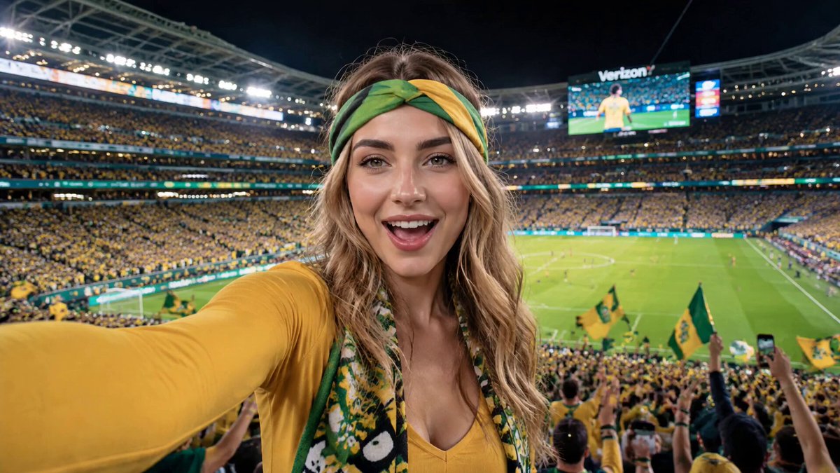
Why the Preview Frame Still Decides Who Watches Your Short
Vertical video autoplays in most feeds, so a lot of creators have quietly concluded that cover images no longer matter. That conclusion is only half true. Inside the swipe feed, the first frame does the job a thumbnail used to do. Outside it — search results, channel grids, suggested rails, notification panels, embedded players, watch-later lists, and connected-TV interfaces — a static image is the first and often the only chance to earn a tap.
That gap is where strategy lives. A Short that performs well in the feed but has a weak cover will underperform every time it gets surfaced somewhere else. Because a growing share of views for evergreen vertical video arrives months after publishing, from search and suggested placement, the cover is not a one-time decision. It is a durable asset that keeps working long after the upload-day spike fades.
There is also a compounding effect that is easy to miss. Covers are the only visual element that appears across your entire catalog at once. When someone lands on your channel page or a playlist, they are effectively browsing a grid of covers. Consistent color, typography, and subject framing turn that grid into a recognizable shelf, and recognition is what converts a casual viewer into a returning one.
This guide covers an end-to-end workflow: planning a cover before you render, composing for multiple crops, generating art with AI video and image tools, writing metadata that supports the image, uploading without quality loss, testing variants, and avoiding the mistakes that quietly suppress click-through.
How Shorts Covers Differ From Long-Form Thumbnails
Long-form thumbnails were designed for a single 16:9 slot. Shorts covers live in at least four different shapes and sizes depending on where they appear, so the design constraints are stricter, not looser.
Aspect ratio reality
A cover that looks perfect on a mobile search result may be cropped into a square on a playlist rail or squeezed into a wide banner on a TV interface. The safest approach is to build a 9:16 master canvas with the core content inside a centered square, so any crop still contains the subject and the hook. Design the center, treat the edges as disposable.
Interface safe zones
Vertical players overlay interface elements on top of the video: action buttons on the right edge, captions and progress bars along the bottom. Roughly the bottom 18 percent and the right 12 percent of the frame get covered. Text or faces placed there will be hidden exactly when the cover is doing its job in the feed. Keep everything that matters inside the central band.
Legibility at absurdly small sizes
On a phone, a cover often renders between 90 and 140 pixels wide. At that scale, a five-word headline is already pushing it, thin fonts vanish into grey mush, and low-contrast color pairs read as a single blurry smear. This is why the most reliable covers use one strong subject, one high-contrast accent color, and at most three to five words.
No baiting allowed
The cover must match what happens in the first two seconds. If the image promises a reveal, a reaction, or a result that the opening does not deliver, viewers swipe away immediately, and the retention penalty outweighs any click gain. A cover is a promise, not a trailer for a different video.
Planning a Cover Before You Render the Video
The most expensive mistake in this workflow is treating the cover as an afterthought. If you finish editing first and then hunt for a usable frame, you are stuck with whatever exists. Plan the cover while you plan the shoot or the generation prompt.
Choose a cover mode
Four modes cover most Shorts, and each has clear decision criteria:
- Face-forward: best for commentary, storytelling, and personality-driven channels. Eyes to camera, clear expression, subject slightly off-center so text can sit beside the face.
- Object in hand: best for product, food, tool, and how-to content. Close enough that the object is unmistakable at small sizes.
- Action still: best for sports, dance, travel, and entertainment. Pick a frame with implied motion — mid-air, blurred background, dynamic diagonal.
- Typographic card: best for data, lists, and hot takes where the words themselves are the hook. Works only when contrast is extreme and the type is huge.
Write the hook before you write the script
Draft the three-to-five-word cover hook at the same time as the title. If you cannot compress the idea into a few words, the concept is probably too diffuse for a Short. A useful test: read the hook out loud and ask whether a stranger would understand it without the video.
Brief the generation prompt with the crop in mind
When you generate footage with an AI video model, include the framing instructions in the prompt. Terms like centered subject, clean negative space on the left, minimal background clutter, consistent lighting, and vertical composition all steer the output toward something you can actually use as a cover. Without those constraints, you get beautiful footage with the subject jammed against the edge of the frame.
A Repeatable Production Workflow
Once you have a cover concept, the production path should be boring and repeatable. Here is a sequence that works for single creators and small teams alike.
Step 1: Extract candidate frames
If the footage already exists, scrub through the first three seconds and export candidates every half second. Save them into a dated folder. Ten candidates is normal; three is optimistic. You are looking for the frame where the subject reads instantly, the expression is clean, and no interface element would be covered by text.
Step 2: Generate a clean plate if needed
When no frame works, generate a dedicated still. Image models with strong typography handling are useful for cards that mix art and text; video models with image-to-video capability are useful when you want the cover to look like a real frame from the clip. Keep the visual style identical to the video by reusing the same prompt scaffold, color palette, and reference images.
Step 3: Composite for the center
Build the cover on a 1080 by 1920 canvas, then place a square guide in the middle and check that the subject and hook survive inside it. Keep the outer zone visually calm so crops never cut something important in half.
Step 4: Add the hook text
Three to five words, heavy sans-serif type, high contrast, with a subtle outline or drop shadow for separation. Place text in negative space, never over a busy area. If the subject fills the frame, shrink the subject instead of shrinking the text.
Step 5: Export variants and log them
Export two or three variants — for example one face-forward and one typographic — and record which one goes live and when. A simple spreadsheet with columns for date, video ID, cover variant, title, and impressions is enough to make future decisions evidence-based rather than vibes-based.
Working as a team
Split the roles: concept, generation, design, upload, review. Adopt a naming convention like channel-topic-cover-v2.png and keep a shared folder per month. Batch ten covers in one session so the shelf stays visually consistent, and schedule a short weekly review to swap covers on underperforming evergreen Shorts.
Composition, Safe Zones, and Typography That Survives Shrinking
Composition rules for tiny images are stricter than for posters. The eye has a fraction of a second, so the visual hierarchy has to be almost brutally simple.
Hierarchy in three layers
Layer one is the subject: a face, an object, or a bold shape. Layer two is the hook text. Layer three is atmosphere — background, gradient, texture. If layer three competes with layer one, delete it.
Contrast over color
High saturation is not the same as high contrast. A bright subject on a bright background flattens when the image compresses into a JPEG or is scaled down. Use a dark-to-light separation between subject and background, and pick one accent color that appears nowhere else so the eye locks onto it.
Type scale and stroke weight
On a 1080-pixel-wide canvas, cover headlines usually land between 90 and 140 pixels tall. Anything thinner than a medium weight disappears at preview size. Avoid script fonts, avoid long all-caps strings, avoid italic, and keep line length short enough that words never hyphenate or wrap awkwardly.
Consistent series styling
If you publish a series, keep the same typeface, accent color, and text position across episodes. Individual covers stay distinct through imagery, while the repeated layout builds recognition. The grid becomes a brand instead of a collection of unrelated posters.
Check on a real phone
Never approve a cover on a large monitor. Export a 120-pixel-wide version, look at it on a phone at arm's length, and ask whether you can name the subject and read the hook in one glance. If not, simplify.
Producing Cover Art With AI Video and Image Tools
AI generation has changed the economics of cover design, but it has not removed the need for judgment. Three workflows dominate.
Video-first
Generate or shoot the clip, then extract the best frame as the cover. This produces the highest perceived authenticity because the cover genuinely is a moment from the video. The trade-off is unpredictability: motion blur, odd expressions, or a subject drifting out of frame can leave you with nothing usable. Mitigate it by generating a few seconds of extra footage designed purely for the cover — a held pose, a clean look to camera, a slow turn.
Image-first
Generate a striking vertical still, then animate it with image-to-video so the opening seconds match the cover. This gives you full control over composition and text placement. The risk is a visible mismatch between the polished cover and a softer opening frame, so keep the animation close to the still and cut in quickly.
Hybrid
Generate both from the same prompt scaffold, style references, and color palette. Use the still for the cover and the clip for content. This is the most reliable approach for series, because reusing a style sheet keeps every episode visually related.
Keep a style sheet
A one-page document with your palette hex codes, font names, prompt scaffold, negative prompt list, export presets, and safe-zone template will save more time than any single tool. Tools change; your visual system should not.
One caution about generated covers: AI artifacts are extremely visible at small sizes. Malformed hands, warped text, asymmetric eyes, and melted props all read as mistakes even when the viewer cannot articulate why. Inspect every generated cover at preview size before committing, and re-generate rather than patch.
Metadata That Works With the Cover
The image earns attention; the metadata earns distribution. They should complement each other, not repeat each other.
Title
Front-load the searchable phrase, then add curiosity. Around 40 to 60 characters is a practical range for mobile truncation. Critically, the title should not duplicate the cover text word for word — the cover is the hook, the title is the promise plus the keyword.
Description
Assume only the first two lines are visible before the expand prompt. Restate the topic in natural language, include the primary keyword once, then add context, timestamps if relevant, and related links. Avoid keyword stuffing; search systems understand synonyms and topic clusters better than repeated phrases.
Tags and hashtags
Three to five tightly relevant tags beat twenty vague ones. Add one or two niche tags that describe the sub-community rather than the broad category. Hashtags in the description should match the actual topic; irrelevant trending tags create mismatched impressions and hurt retention.
File naming and accessibility
Name the uploaded file descriptively — topic-hook-cover.png rather than final-final-2.png. Where alt text or captions are supported, describe the cover content in plain language. It helps accessibility and gives the platform another signal about the topic.
Uploading a Custom Cover Without Losing Quality
Upload quality problems are almost always preventable. Work through this checklist before you publish.
- Export at the right size. A 1080 by 1920 master covers vertical surfaces; export a 1280 by 720 crop as an alternate if a wide surface is available in your workflow.
- Use high-quality PNG or high-bitrate JPEG. PNG for text-heavy covers, JPEG at maximum quality for photographic ones. Avoid upscaling small images; regenerate instead.
- Stay in sRGB. Wide-gamut exports can shift color unpredictably during platform processing.
- Watch the file weight. A few megabytes is plenty. Massive files get recompressed anyway, and heavy compression crushes fine text.
- Check the upload preview. Most uploaders show a thumbnail preview that mimics the smallest rendered size. If the hook is unreadable there, it will be unreadable everywhere.
- Verify after processing. Check the published Short on mobile, desktop, and, if possible, a TV app. Look for unexpected letterboxing, aggressive cropping, or text hidden behind overlays.
- Confirm the cover actually applied. Some account types and some video formats silently ignore custom covers, or the platform may override it with an auto-selected frame. If yours did not take effect, treat it as a metadata issue rather than a design issue.
- Revisit old uploads. Evergreen Shorts are worth reviewing quarterly. Swapping a weak cover on a video that already has search traffic is one of the highest-return tasks available.
Testing, Iterating, and Reading the Analytics
Covers are hypotheses. Testing turns them into knowledge, but only if you measure the right surfaces.
Measure click-through outside the feed
Feed performance is driven by autoplay, not by your image. The number that reflects cover quality is click-through rate on non-feed surfaces: search, channel pages, suggested rails, and browse features where a tap is required. Compare that against retention and average view duration to spot mismatches.
Run disciplined tests
Change one variable at a time — cover image, then title, then thumbnail text — and let a test run seven to fourteen days before judging it. Require a meaningful impression count before drawing conclusions; small samples produce dramatic swings that disappear on repetition.
The four-quadrant read
- High CTR, low retention: the cover overpromises. Fix the mismatch between the image and the first seconds.
- Low CTR, high retention: the video is good but the packaging is invisible. Redesign for clarity and contrast.
- High CTR, high retention: a winning pattern. Document it and reuse the structure.
- Low CTR, low retention: revisit the concept itself before touching the artwork.
Mistakes that skew results
Testing during an unusual traffic period, changing the title and the cover simultaneously, judging a cover from a single day, and relying on memory instead of a log are the four most common ways creators misread their own data. Keep a written record.
FAQ
Do Shorts even use custom thumbnails?
Yes, on the surfaces where a static image is displayed. Feed autoplay effectively hides the cover, but search, channel pages, playlists, notifications, and TV interfaces all show it. If you care about discovery beyond the swipe feed, the cover matters.
What is the ideal cover size?
A 1080 by 1920 vertical master with key content inside a centered square is the most flexible choice. Keep the hook text out of the bottom 18 percent and the right 12 percent of the frame.
How much text should a cover contain?
Three to five words. Anything longer disappears at preview size and competes with the subject for attention.
Should I use AI to generate covers?
AI is excellent for backgrounds, stylized cards, and consistency across a series. It is less reliable for hands, faces, and embedded typography, which are exactly the elements most likely to look wrong at thumbnail scale. Inspect everything at preview size.
How often should I update old covers?
Review evergreen Shorts quarterly. Prioritize videos that already receive search impressions but show weak click-through, since those have proven demand and the most to gain.
Can a strong cover rescue a weak video?
No. A cover can win a click, but retention decides distribution. The cover should reflect the video's actual payoff, not compensate for its absence.
What is the biggest beginner mistake?
Designing at full resolution and never checking the result at 120 pixels wide. Almost every legibility problem becomes obvious the moment you look at the cover the way a viewer will.
How do I keep covers consistent across a large library?
Define a style sheet once — palette, typeface, text position, safe zones, export preset — and reuse it. Consistency across a grid of covers builds recognition faster than any individual design flourish can.
