



A thumbnail is not decoration. It is the smallest and most competitive piece of marketing your video will ever have. Before anyone hears your hook, reads your title, or watches a single frame, they see a rectangle roughly the size of a postage stamp on a phone screen — and in that rectangle they decide whether you exist. Creators who treat thumbnail design as an afterthought hand that decision to luck. Creators who treat it as a discipline win clicks across an entire catalog, not just once.
This guide covers the full workflow: how viewer attention actually behaves, how to compose for tiny screens, how typography survives compression, how to bring AI image generation into the process without losing a human point of view, how to build reusable template systems, and how to test instead of guessing. It is written for creators, editors, marketers, and small teams who publish on a schedule and need consistent results.
Start With the Job the Thumbnail Has to Do
Most thumbnail advice jumps straight to colors and fonts. That is backwards. A thumbnail has one measurable job in most cases: earn a click from a specific viewer at a specific moment. Everything else — beauty, brand consistency, cleverness — is secondary to that job.
That framing changes decisions. If the job is to earn clicks from people who already follow you, familiarity and face recognition matter more than novelty. If the job is to earn clicks from cold viewers browsing a crowded feed, contrast and curiosity matter more. If the job is to support a product launch, clarity about the subject may beat mystery.
Thumbnail, title, and opening seconds form one unit
A thumbnail never works alone. It sits next to a title, and both lead into the first few seconds of the video. Treat them as a single three-part message: the thumbnail creates an open question, the title sharpens it, and the opening seconds answer enough of it to justify staying.
The most common failure is redundancy. If the thumbnail already says "cheap studio lighting setup" in large text and the title repeats the same phrase, you have spent two assets saying one thing. Better: let the thumbnail show the result and let the title introduce the tension or the stakes.
Set a target before you design
Pick a number you want to move. On most platforms, the metric worth watching is click-through rate — impressions compared to clicks — plus average view duration for the videos those clicks produce. If you improve clicks but viewers leave in eight seconds, you have not solved anything; you have just bought expensive traffic.
A practical target for a channel testing thumbnails seriously is a relative improvement: a five to fifteen percent lift in click-through rate on comparable videos within the same topic cluster, without a drop in average view duration. Absolute numbers vary wildly by niche and audience size, so relative movement is the honest measure.
How Viewers Actually Scan a Thumbnail
The human visual system processes a thumbnail in stages, and each stage eliminates options. First comes a pre-attentive pass driven by color, contrast, and motion-like contrast cues. This happens in well under a second. Then comes recognition: is there a face, a product, a place, an object? Only after that does reading occur — and reading is the slowest, most expensive stage.
That order is the reason text-heavy thumbnails often underperform on cold audiences. The viewer spends their limited attention decoding letters instead of recognizing a subject. On warm audiences, where the viewer already knows the channel, text can work better because recognition is already solved by the channel name and avatar.
Color and emotional priming
Color does two jobs: it separates your thumbnail from neighbors, and it primes an emotional reading. Warm saturated tones tend to read as urgent, energetic, or alarming. Cool tones read as calm, technical, or premium. Dark backgrounds with a single bright subject read as dramatic and are exceptionally effective against the light-colored interfaces most platforms use.
The practical rule is not "use this palette." It is: choose a palette, then check it against the surrounding feed. Take a screenshot of your video page, zoom out, and look at your thumbnail in context. If it disappears into a wall of similar thumbnails, change either the dominant hue or the value contrast — usually the contrast does more work than the hue.
Contrast, faces, and the small-screen test
Faces attract attention reliably, but only when they are large enough to be recognized. A face occupying a fifth of the frame at full size becomes an unreadable smudge on a phone. Crop tighter. Let the expression carry meaning: surprise, concentration, discomfort, delight. Neutral expressions waste the strongest asset you have.
The single most useful discipline is the squint test. Shrink your thumbnail to roughly a tenth of your screen, then look at it for two seconds. Can you name the subject? Can you read the text? Can you tell what emotion is present? If any answer is no, the design is not finished, no matter how good it looks at full resolution.
Composition Systems That Work at Every Size
Composition is the arrangement of attention. Good thumbnail composition guides the eye along one path to one destination. Bad composition creates a flat field where nothing wins.
The three-layer structure
A reliable pattern is three layers: foreground element, subject, and background. The foreground might be a hand, a tool, a piece of equipment, or an edge that frames the shot. The subject is the person or object the video is about. The background establishes context but stays subordinate through blur, darkness, or reduced saturation.
This structure works because it creates depth, and depth reads as professional even at small sizes. Flat compositions with everything at equal sharpness read as amateur collage.
Negative space and safe zones
Leave room. Thumbnails get cropped and overlaid by duration badges, progress bars, watermarks, and platform UI. Keep critical elements away from the bottom edge and, on some surfaces, away from the lower-right corner where timestamps sit.
Negative space also does compositional work: it isolates the subject. A subject surrounded by empty space at 30 to 40 percent of the frame gains visual weight without needing to be larger. Crowded frames force the viewer to search, and searching costs clicks.
Directional cues and the implied question
Eyes look somewhere. Hands point somewhere. Lines converge somewhere. Use those cues to direct the viewer toward the title, toward an object, or toward a gap in the frame that implies something missing. That implied gap is what creates curiosity without clickbait.
A useful exercise: draw a single arrow through your thumbnail representing the eye path. If you cannot draw one, or you can draw three competing arrows, simplify until only one remains.
Typography That Survives Compression
Platforms re-encode images aggressively. Fine serifs, thin strokes, and low-contrast text turn to mush. Thumbnail typography is closer to signage design than to editorial design.
How many words
Three to five words is the practical ceiling for most thumbnails, and two to three is often better. The words should not repeat the title. They should add a label, a number, a category, or a stake: a countdown, a comparison, a location, a result.
Weight, spacing, and stroke
Use heavy or extra-bold weights. Increase letter spacing slightly on all-caps text; decrease it slightly on lowercase. Add a subtle stroke, shadow, or backing shape only when the text sits over a busy area — and use it to create separation, not decoration.
Placement rules that travel
Keep text in the upper-left, top-center, or upper-right thirds for most horizontal layouts, and stack it vertically for vertical video. Align text to a consistent baseline across your catalog so returning viewers recognize your work instantly in a feed, which compounds recognition over time.
An AI-Assisted Thumbnail Workflow
AI image generation has changed the economics of thumbnail production. You can now produce ten concept variations in the time it once took to produce two. The risk is sameness: prompts trained on similar reference material produce similar-looking results, and a feed full of glossy AI faces is indistinguishable from itself.
The workflow below is designed to keep the speed while preserving a specific point of view.
Step 1: Write a concept brief in plain language
Before opening any tool, write four lines: the subject, the emotion, the dominant color, and the single element of curiosity. This brief becomes the shared reference for everyone involved and keeps generation constrained to a real idea instead of a vibe.
Step 2: Generate a spread of options, not a masterpiece
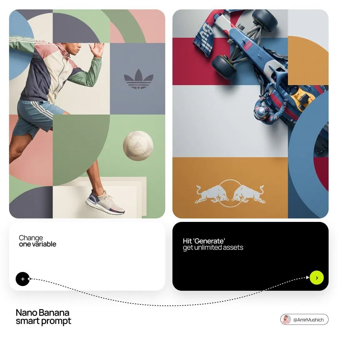
Generate eight to twelve variations quickly, varying one variable at a time: framing, lighting, expression, angle. Do not chase a perfect single output. You are looking for two or three directions that read clearly at small size.
Step 3: Composite rather than accept
Generated images rarely work as final thumbnails on their own. Bring the strongest output into an editor, crop it for the subject, replace the background with something simpler if needed, and add your typography and any real photographic elements such as your own face or product. This is where the design becomes yours.
Step 4: Prepare multiple crops and versions
Export at the correct aspect ratio for each surface you publish on, then export a vertical variant and a square variant. Also keep a version with no text, which is useful for testing and for repurposing in community posts where text overlay competes with surrounding UI.
Step 5: Archive the source file
Keep the layered working file with its fonts and assets. When a thumbnail performs well, you will want to remix it — same template, new subject — in a month. Rebuilding from scratch is the most expensive habit in thumbnail production, and it is entirely avoidable.
Build a Template Library Instead of One-Off Designs
Channels that consistently outperform usually share one trait: recognizable visual systems. Viewers learn the system, and recognition shortcuts the scanning stage described earlier.
Template anatomy
A good template defines fixed slots: a subject zone, a text zone with a set maximum character count, a logo position, and a color family with two or three approved variants. Everything else — image, expression, specific words — changes per video.
Build three templates rather than one: a talking-head template, a demonstration or result template, and a comparison or list template. Three covers most formats and prevents your catalog from looking like wallpaper.
Naming and versioning
Adopt a simple convention, such as topic-template-version, and store exports in dated folders. This sounds bureaucratic until you have thirty videos and need the exact file that produced your best-performing thumbnail. Then it becomes the difference between a twenty-minute remix and a two-hour reconstruction.
Testing: How to Turn Guesses Into Decisions
Most creators change one thumbnail and check back in a week. That produces anecdotes, not knowledge. A slightly more structured approach produces real signal.
Portfolio testing versus head-to-head testing
Portfolio testing means comparing click-through rate across groups of similar videos — all tutorials, all interviews, all shorts — to see whether your system is trending up. Head-to-head testing means swapping two versions of the same thumbnail on the same video and comparing performance.
Portfolio testing answers strategy questions over weeks. Head-to-head testing answers tactical questions over days. Do both, but do not confuse them.
Metrics worth tracking
Track click-through rate, impressions, average view duration, and the percentage of viewers who pass the first thirty seconds. Record each thumbnail's text, dominant color, and whether a face appears. After twenty videos you will have enough data to see patterns — often surprising ones, such as a niche where text hurts rather than helps.
Sample-size honesty
Small channels cannot draw conclusions from tiny samples. A thumbnail that earned two hundred impressions tells you almost nothing. Either accumulate results across many videos before changing your system, or accept that you are making judgment calls informed by design principles rather than statistics.
Common Mistakes and How to Fix Them
Too many competing elements. Fix by removing until one subject dominates. If everything is emphasized, nothing is.
Text that repeats the title. Fix by replacing repeated words with a number, label, or result.
Designing at full size only. Fix by checking every version at phone scale before publishing.
Low contrast between subject and background. Fix by darkening or blurring the background, or by adding a rim light to the subject.
Inconsistent style across a catalog. Fix by consolidating to fewer templates and enforcing the same typography and color rules.
All curiosity, no honesty. Fix by making sure the thumbnail represents something real in the video. Deceptive thumbnails win a click and lose an audience; the short-term metric improves while watch time and return viewers decline.
Ignoring vertical formats. Fix by designing a vertical crop from the start rather than cropping a horizontal design at the end.
Skipping the archive. Fix with a naming convention and a folder structure. It costs minutes now and saves hours later.
A Practical Weekly Checklist
Run through this before every publish. Confirm the thumbnail reads clearly at phone size. Confirm three to five words of text maximum, non-redundant with the title. Confirm one dominant subject and one eye path. Confirm the color separates the thumbnail from the surrounding feed. Confirm critical elements sit inside safe zones. Confirm the file is exported at the correct aspect ratio with a vertical variant prepared. Confirm the layered source is archived with its assets. Finally, note the design decisions in a simple log so future testing has something to compare against.
This takes five minutes and improves outcomes more than any single tip in this article.
FAQ
How long should it take to make a thumbnail? For a templated design, thirty to sixty minutes including generation and cleanup. A brand-new concept might take two to three hours. If every thumbnail takes a full day, your process lacks templates.
Is AI-generated imagery acceptable in thumbnails? Yes, with two conditions: it must accurately represent the video, and it should not be obvious stock-style filler. Composite generation with real photography, real products, or your own face, and it will look intentional rather than generic.
Should every thumbnail have a face? No. Faces help when expression carries meaning and when the face is large enough to read. Product shots, screenshots, and bold single objects can outperform faces in technical, gaming, and demonstration niches.
How often should I change my thumbnail style? Change individual thumbnails often. Change the underlying system rarely — perhaps once or twice a year — and only when data across many videos supports it. Constant system churn destroys the recognition you spent months building.
What aspect ratio should I design for? Start with 16:9 for horizontal platforms and produce a 9:16 vertical variant for short-form surfaces. Export a square version if you publish to community feeds or email.
Does a higher click-through rate always mean a better thumbnail? Only if view duration holds. A thumbnail that attracts the wrong viewers inflates clicks and damages retention signals. Judge thumbnails by clicks and retention together.
How do I make thumbnails that look consistent without looking repetitive? Fix structure, vary content. Keep typography, color family, and layout zones constant, and let the image, expression, and few words of text change per video. Consistency should come from the frame, not from the subject.
Can a thumbnail be too polished? Occasionally, yes. Highly produced, glossy designs can read as advertising and get skipped, especially in niches where authenticity performs. Test a rougher, more candid version against the polished one before assuming polish wins.
The Bottom Line
Thumbnail design is a compounding skill. Every improvement to your system applies to every future video, and every archived template saves time on the next one. The work is not about finding one perfect image; it is about building a repeatable process that produces readable, honest, distinctive thumbnails at speed.
Start with the job the thumbnail has to do. Compose for the smallest screen, not the largest. Constrain typography hard. Use AI to widen your option space, then make deliberate human choices on top of it. Build three templates and stick with them long enough to learn whether they work. Test with honest sample sizes. And never let the thumbnail promise something the video does not deliver — because the best-performing thumbnail over a year is the one attached to an audience that keeps coming back.
