
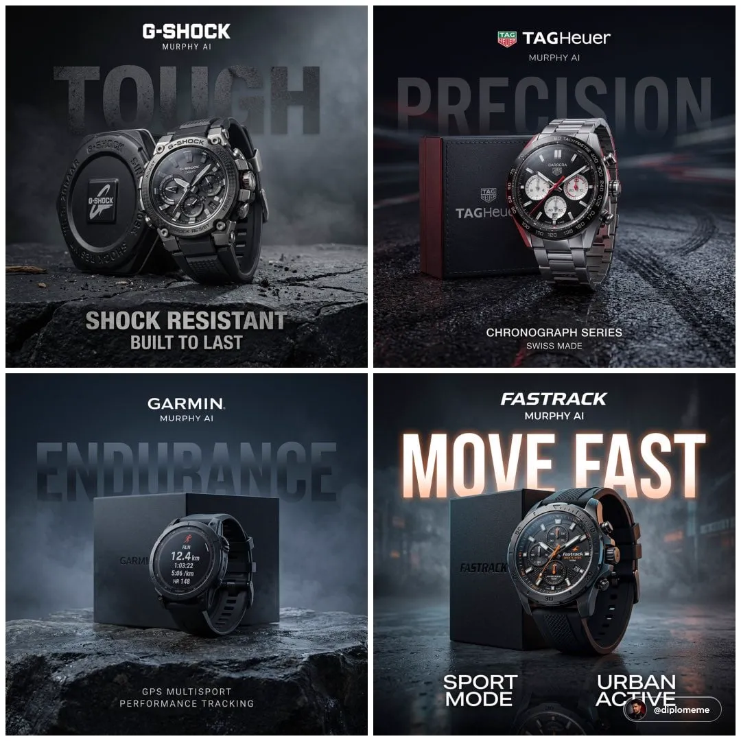
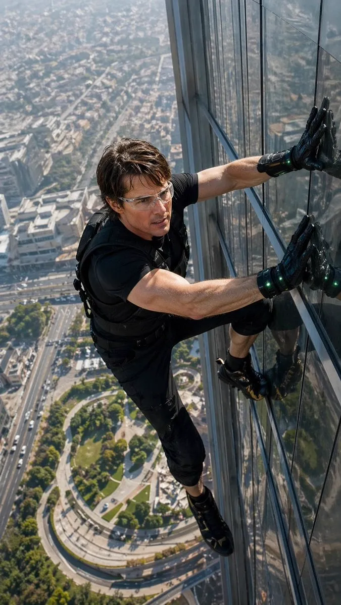
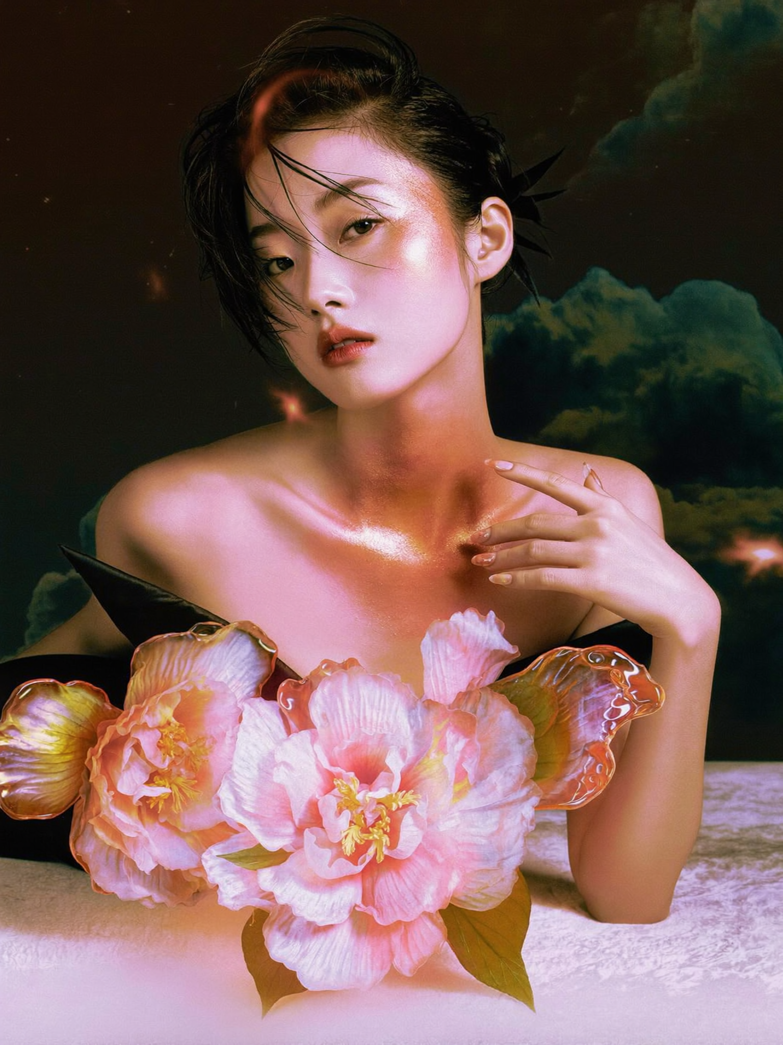
Scroll through any gaming feed and the pattern is brutal: hundreds of videos about the same update, the same skin, the same victory royale. The ones you click have one thing in common — a thumbnail that stops your thumb. For Fortnite creators, the thumbnail is not a decoration. It is the advertisement, the promise, and often the difference between a video that gets clicked and one that gets scrolled past.
This guide breaks down how to design 3D Fortnite thumbnails that stand out: why depth and dimension grab attention, how AI generation fits into the workflow, how to keep a consistent style across a channel, the design elements that make a thumbnail readable at feed size, and the production loop that lets you ship high-quality art quickly.
Why 3D Thumbnails Win the Scroll Test
The feed is a crowded grid of flat images, and the human eye is wired to notice depth. A thumbnail with real dimensionality — a character that pops from the background, lighting that separates foreground from backdrop, a composition with layers — reads differently at a glance than a flat collage. 3D elements trigger the same attention response as real objects in your peripheral vision: they feel like something is actually there.
This is especially true in Fortnite's visual universe, where the game itself is bright, saturated, and full of volume. A 2D screenshot cropped from gameplay blends into the sea of other screenshots. A thumbnail with rendered depth, dramatic lighting, and a character who looks three-dimensional stands out precisely because it looks like more effort went into it — and viewers are right.
The click-through math is simple: a thumbnail that attracts the eye gets the click, the click feeds the algorithm, and the algorithm feeds the video. Design is not a luxury for gaming channels; it is part of the performance.
The Anatomy of a Feed-Size Thumbnail
A thumbnail must survive three harsh conditions: it appears small, it competes with dozens of neighbors, and it is often viewed on a phone while the viewer is distracted. Every design choice should be tested against those conditions.
One focal point. The eye needs a single thing to land on — usually the character's face or the featured item. Secondary elements support the focal point; they never compete with it.
High contrast separation. The subject must separate from the background in value and color. A dark character on a dark background disappears at feed size. Light against dark, or saturated against muted, gives the thumbnail a silhouette that reads instantly.
Bold, limited color. Three or four strong colors beat a rainbow. Pick a palette that echoes the video's mood — Fortnite's default neon palette works, but a deliberate two-color grade makes a thumbnail feel designed rather than captured.
Readable text, used sparingly. One short phrase with a strong outline can add context: "NEW MAP," "RARE SKIN," "SEASON X." More than a few words becomes noise. If the image is strong, the text is optional.
A sense of motion. Even in a still, the viewer should sense action — a character mid-dash, an explosion behind, a dynamic diagonal composition. Static, centered posing reads as a mugshot.
Using 3D and AI Generation Without Losing Control
Traditional 3D thumbnail production meant modeling, texturing, lighting, and rendering in tools like Blender — a skill that takes months to build and hours per image. AI generation compresses the pipeline dramatically, but it changes the designer's role from builder to director. The craft shifts to the choices you make: the prompt, the reference, the selection, and the edit.
The reliable workflow is generation-plus-refinement, not generation-and-pray. Generate a batch of concepts, choose the strongest, refine it with a tighter prompt, and finish with small edits — sharpening the face, boosting the contrast, adding the text overlay. The AI produces the raw material; your taste produces the thumbnail.
For Fortnite specifically, copyright awareness matters. Skins and characters are the game's intellectual property, and third-party tools should be used responsibly. The practical approach is to treat AI generation as concept art and style exploration, and to build original compositions rather than direct reproductions of copyrighted assets. Original characters inspired by the game's aesthetic, and thumbnails that use gameplay screenshots you captured yourself, keep the workflow clean.
Designing for the Fortnite Visual Language
Fortnite has a recognizable look: loud colors, exaggerated proportions, cartoon-realism blend, and constant motion. Thumbnails that speak that language feel native to the feed. Thumbnails that ignore it feel imported from a different genre.
Embrace exaggerated expression. Fortnite characters are expressive, and thumbnails are the place to push it further — wide eyes, an open-mouth reaction, a confident smirk. Subtlety does not survive the feed.
Use the game's iconic elements as visual anchors. The battle bus, a storm wall, a supply drop, a launch pad — these symbols communicate "Fortnite" faster than any text. A thumbnail with a recognizable game element in the background signals the genre instantly.
Play with scale. A giant character looming over a tiny scene, or a character dwarfed by a massive structure, creates the dramatic tension the game itself is known for. Scale contrast is one of the cheapest ways to add visual interest.
Keep motion in the composition. Diagonal energy — a character leaping along a diagonal, a background tilted for dynamism — beats static symmetry. The game never stands still, and neither should the thumbnail.
Building a Consistent Channel Style
Recognition is a compounding asset. When viewers can identify your thumbnail from across the feed without reading the channel name, you have built brand equity. Consistency is how you get there.
Lock a signature treatment. It can be a color grade (always warm and punchy), a character style (always rendered with the same lighting direction), a framing habit (always tight on the character's face), or a recurring badge (the same "NEW" tag in the same corner). Choose one or two signatures and never break them.
Standardize the template. Keep the text position, the badge style, and the aspect ratio identical across videos. Templates free your creative energy for the art, not the layout.
Test consistency with the squint test. Shrink your last five thumbnails to feed size and look at them as a group. If they read as a family, you have a style. If they look like five different channels, pick the strongest one and rebuild the others around it.
The Design Elements That Matter Most
Three technical elements separate professional thumbnails from amateur ones: color grading, depth, and visual hierarchy.
Color grading is the mood control. A warm, saturated grade feels energetic and playful — right for most Fortnite content. A cooler, muted grade feels serious and dramatic — right for ranked pushes and tournament content. Grade intentionally and consistently, not accidentally.
Depth comes from separation. Use a blurred or darkened background, a strong rim light on the character, and foreground elements that frame the subject. The goal is three readable layers: background, subject, and foreground. Flat images fail the feed; layered images win it.
Visual hierarchy is the reading order. The eye should travel: focal point first, supporting element second, text third. If the text shouts louder than the character, the hierarchy is broken. Build the hierarchy in the image, then confirm it at small size.
The Production Loop for Fast, Consistent Output
Speed is a competitive advantage in gaming content, where trends move in days. A production loop that delivers quality in hours instead of days lets you ride the wave instead of chasing it.
Concept. Decide the video's hook and translate it into a one-line thumbnail concept: "character celebrating with a rare skin in front of the battle bus."
Generate. Produce a batch of concept variations. Look for the strongest composition and expression before investing in refinement.
Refine. Tighten the prompt around the winner, or regenerate with locked seed and small changes. Iterate on the specific weakness — face, lighting, background — one variable at a time.
Finish. Grade for mood, add the badge and text, export at the platform's recommended resolution, and pass the small-size test.
Review. After the video publishes, check the click-through data. Thumbnails are testable; let the numbers teach you which directions your audience actually prefers.
Common Mistakes and How to Avoid Them
Thumbnails fail in predictable ways. Recognizing the pattern is half the fix.
Too much going on. Every element shouting for attention means nothing gets it. Cut to one focal point and ruthlessly remove distractions.
Text overload. Long sentences, thin fonts, or text that covers the character. Keep text short, thick, and outlined, and place it out of the focal zone.
The game screenshot look. Cropping gameplay footage without treatment reads as lazy. Add depth, grade, and compose — treat the capture as raw material, not the finished thumbnail.
Inconsistent faces. If the character looks different in every thumbnail, viewers lose trust in the visual promise. Lock a style reference and reuse it.
Designing big, publishing small. A thumbnail that looks great on your monitor can collapse at feed size. Always shrink it and test before publishing.
Building the Toolchain for a Thumbnail Workflow
The practical question every creator asks is: what do I actually need? The answer is a small, deliberate toolchain — not a collection of every tool that exists.
The generation layer comes first. Choose one primary tool for concept generation and learn it well enough to control style and composition. The skill transfers to every other tool, so depth beats breadth. Pair it with one tool that handles style references reliably, because consistency across a channel depends on reference discipline more than on any single model.
The edit layer is where thumbnails are finished. A capable image editor covers the essentials: cropping, contrast and saturation control, sharpening the subject, adding the text badge with a strong outline. You do not need a workstation-class setup; a laptop with a good screen and a calm workflow is enough.
The pipeline layer keeps production repeatable. A simple folder structure per video, a template file for text and badges, and a checklist that runs from concept to export. The checklist is the unsung hero: it turns a creative process into a routine, and routines are what survive busy weeks and trending topics.
Finally, invest in the testing habit. Save your thumbnails at feed size, compare them side by side with your channel's previous work, and watch what the click-through data says after publication. The toolchain exists to serve the loop: concept, generate, refine, finish, review. Every tool in the stack should make one of those steps faster or better — anything else is distraction.
Frequently Asked Questions
Do I need to learn 3D software for Fortnite thumbnails? Not anymore. AI generation plus strong composition skills produces competitive thumbnails. The design judgment matters more than the toolchain.
How many thumbnails should I test per video? Two or three is a practical ceiling for most creators. Generate variations, pick the strongest, and let the click-through data guide future decisions.
Should I use the actual game's skins in thumbnails? For your own captured gameplay, yes. For third-party generation, stay in the conceptual space and build original characters inspired by the game's style. Respect the game's intellectual property.
How long should a thumbnail take? Once the workflow is established, under an hour including refinement is realistic. The concept decision matters more than the rendering time.
What is the single biggest improvement for most channels? Consistency. One recognizable style, applied to every thumbnail, compounds into recognition — and recognition is what earns clicks before anyone reads a title.
The Thumbnail as a Promise
A thumbnail is not an afterthought; it is the first sentence of your video's argument. In a feed full of noise, the 3D look, the bold color, the clear focal point, and the consistent style are how you make the argument in a single frame. The tools have made the craft accessible — generation handles the rendering, and you bring the judgment.
Pick your next video, write the one-line concept, generate a batch, and refine the strongest. Then look at it at feed size and ask the only question that matters: would you stop scrolling for this?
