
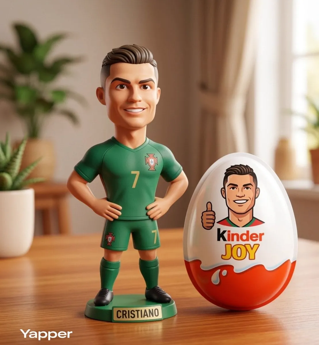
The Rise of AI-Powered Visual Asset Creation
Digital creators face an unprecedented challenge: the demand for visual content grows exponentially while production timelines shrink. Marketing teams need icon sets, illustration libraries, and background assets. Game developers require character variations, environmental textures, and UI components. Design agencies must deliver dozens of brand-compliant mockups. Product teams need rapid visual exploration before committing to final designs.
Manual creation cannot keep pace. Hiring illustrators for a thousand-asset library takes months. Licensing stock imagery limits uniqueness and often violates brand guidelines. Manually designing every variation drains creative energy that could go toward strategic decisions.
This is where AI asset generation transforms workflow. Modern tools can generate hundreds of production-ready visual assets in hours instead of weeks. They enable rapid exploration, maintain consistency across large libraries, and free creators to focus on direction rather than execution.
But raw generation capability doesn't equal practical workflow. The difference between struggling with AI tools and mastering them lies in how you structure prompts, manage consistency, integrate output, and iterate on results.
Understanding AI Asset Generation Architecture
Before diving into workflow, it's useful to understand how these tools work.
AI asset generation rests on foundation models trained on billions of images. These models learn to map text descriptions (prompts) to visual outputs. The process involves multiple steps: parsing your instruction, selecting relevant learned patterns, combining concepts, and rendering output in your requested format.
The sophistication comes from layered control. Modern systems let you specify not just what to generate, but how—style references, color palettes, composition rules, size constraints, and artistic direction.
Underneath, these systems manage complex challenges. They balance computational efficiency (generating in seconds, not minutes). They handle diverse output formats (SVG for scalability, PNG for compatibility, layered files for editing). They support batching, so you can queue hundreds of requests and retrieve results asynchronously.
The practical benefit: generation that once took days now takes hours, with more control and consistency than manual creation.
Defining Your Asset Generation Strategy
Successful asset generation begins before you generate anything. Strategy precedes execution.
Clarifying Your Asset Scope
Start with concrete questions:
- How many total assets do you need? (50 icons? 500 illustrations? 2000 background variations?)
- What types? (Icons, illustrations, patterns, 3D renders, concept art, character variations?)
- What dimensions and formats? (Web needs different specs than print. Mobile apps need different scales than desktop.)
- What's your timeline? (Can you iterate over weeks, or do you need assets this sprint?)
- What's your quality threshold? (Are you exploring rough concepts, or creating production-final assets?)
These answers shape everything downstream. A 50-icon set needs different strategy than a 2000-background library. Exploration work tolerates more variation; production assets demand consistency.
Establishing Visual Constraints
Visual consistency multiplies asset value. When icons, illustrations, or backgrounds share a cohesive style, they feel intentional and professional. When they're visually chaotic, they undermine credibility.
Define constraints early:
Style direction: Flat, 3D, hand-drawn, photorealistic, minimalist, detailed, geometric, organic? Will all assets share one style, or do you want intentional variety?
Color palette: Will you use a fixed set of colors, or allow variation? Do you need specific brand colors, or can the AI choose?
Complexity level: Simple and clean, or rich with detail? This affects readability at intended sizes.
Brand alignment: If you have existing assets, should new generations match them? This requires style references.
Technical specs: What are your final output formats? Web often needs SVG and multiple PNG sizes. Print needs high-resolution raster. Games might need PSD with layers.
Written constraints prevent scope creep and downstream rework. "Generate blue icons" is vague; "flat-style icons in brand blue (#0066CC) and white, 256×256 PNG, 20-pixel line weight, suitable for web apps" is actionable.
Selecting Your Generation Approach
Different tools have different strengths. Some excel with text prompts. Others prioritize visual style transfer. Some offer parameter sliders for fine control. Some work best through iterative refinement.
Understand your chosen tool before committing to a large project:
- Does it support batch processing, or must you generate one asset at a time?
- Can you upload style reference images, or only use text?
- What output formats and sizes are available?
- How fast is generation? (Seconds, minutes, or longer?)
- Can you save and refine variations, or do you start fresh each time?
- What's the learning curve for new team members?
Testing with 10–20 trial assets before committing to a full project often saves weeks of frustration.
Crafting Effective Generation Prompts
Prompt quality directly determines output quality. Vague prompts produce mediocre results. Specific prompts produce assets worth using.
Prompt Structure and Components
A strong prompt typically includes:
- Asset type and purpose ("calendar icon for a productivity app")
- Style descriptors ("minimalist flat design", "hand-drawn watercolor", "3D isometric")
- Color information (specific hex codes if needed, or descriptive: "cool blues and whites")
- Size and format constraints ("256×256 pixels", "SVG vector")
- Aesthetic direction ("clean and modern", "playful and bold", "corporate and professional")
- Optional context ("should work well at small sizes", "needs to stand out against dark backgrounds")
Examples of Strong Prompts
Icon prompt: "Minimalist flat-style notification bell icon, blue (#0066CC) and white, 256×256 pixels, clean lines, no gradients, crisp edges, suitable for mobile app interface."
Illustration prompt: "Warm watercolor illustration of a coffee shop interior, earthy tones (browns, creams, terracotta), soft brushstrokes, inviting and cozy atmosphere, suitable for blog header."
Background prompt: "Geometric abstract pattern, soft gradient from mint green to light gray, 30-degree lines, hexagonal shapes, modern tech aesthetic, 1920×1200 pixels, suitable for website hero section."
Character asset prompt: "Cute isometric character, sitting at desk with laptop, cheerful expression, blue and yellow color scheme, 3D style, 512×512 pixels, suitable for SaaS landing page illustration."
Notice the pattern: specific, descriptive, actionable, with multiple constraint types.
Common Prompt Mistakes
Too vague: "make something cool" or "generate an icon" won't produce usable results. The model has no direction.
Conflicting requirements: "realistic photographic style" and "flat minimalist" contradict each other. Choose one direction.
Overcomplicated: Multiple competing ideas in one prompt confuse the model. Focus on one clear concept.
Missing constraints: "generate an illustration" doesn't specify size, format, style, or purpose. Constraints improve specificity.
Assuming knowledge: The model doesn't know your brand unless you describe it or provide references. Use words.
Execution: The Generation and Refinement Phase
Once you've clarified strategy and crafted prompts, execution follows a predictable cycle.
Initial Exploration
Start by generating multiple variations of your core concept. Don't commit to the first result.
Generate 5–10 variations using your base prompt. Compare them. Notice which ones align with your vision. Most tools let you remix or refine based on a variation you like—this is powerful.
This exploration phase reveals whether your prompt direction is working. If all results miss the mark, adjust your prompt before generating the full batch.
Style Reference Integration
If you have existing assets you want to match, upload them as style references (if your tool supports this feature). Style transfer is one of the most powerful consistency mechanisms available.
Example workflow:
- You have 5 existing icons in your target style
- You upload them as style references
- You generate 50 new icons using the same base prompt
- Output typically matches the reference style closely, even without describing it in the prompt
This scales consistency dramatically.
Batch Generation
Once your direction is validated, generate in batches. Most tools support this:
- Create a CSV with 50 asset names/prompts ("settings icon", "search icon", "menu icon", etc.)
- Upload the batch
- Queue it for generation
- Retrieve results when complete
Batch processing is faster and cheaper than generating one at a time. It also maintains consistency because all assets process through the same model configuration.
Quality Review
Generated assets rarely need zero review, but they rarely need heavy editing either.
Review for:
- Rendering artifacts: Broken edges, weird artifacts, color bleed
- Anatomical oddities: (If generating characters) Strange proportions or anatomy
- Consistency issues: Do all assets feel like they belong in the same family?
- Usability: At actual display size, are icons readable? Do illustrations work with your copy overlaid?
Modern tools produce clean output most of the time. When issues occur, regenerate rather than extensively edit. Regeneration is usually faster and produces better results.
Minor Polish
Use standard design tools (Figma, Photoshop, Affinity Designer, or free alternatives like GIMP) for light refinement:
- Color adjustment (if a generated asset is slightly too saturated)
- Small artifact removal (if there's a stray pixel or line)
- Effect addition (drop shadow, glow, stroke)
- Combination (merging two generated assets into one)
Keep this phase focused. If a piece needs extensive rework, regenerate it.
Export and Organization
Export in appropriate formats:
- Web: PNG (for raster) or SVG (for scalability)
- Animation: Layered PSD or video file
- Print: High-resolution raster (300 DPI minimum)
- Game engines: PNG with transparency
Organize logically:
project/assets/
├── icons/
│   ├── ui/ (navigation, controls)
│   ├── status/ (success, error, warning)
│   └── category/ (by function)
├── illustrations/
│   ├── marketing/ (hero images, blog)
│   └── onboarding/
├── backgrounds/
│   ├── patterns/
│   └── scenes/
└── reference/ (original prompts, style refs)
Save prompts alongside assets. "settings-icon-final-v2.png" + "settings-icon-prompt.txt" means you can regenerate or iterate months later.
Achieving Consistency at Scale
The biggest advantage of AI generation is the ability to create hundreds of visually coherent assets. But consistency requires discipline.
Prompt Templating
For large asset families, create templates:
[style] [subject] [type], [colors], [size], [constraints]
Filled examples:
- "Minimalist flat blue calendar icon, 256×256, clean lines, no gradient"
- "Minimalist flat blue settings icon, 256×256, clean lines, no gradient"
- "Minimalist flat blue notification icon, 256×256, clean lines, no gradient"
The repeated structure signals to the model that all outputs should share the same aesthetic.
Reference Image Anchoring
Generate or collect 2–3 reference images that exemplify your target style. Every time you generate a new batch, provide these references.
This anchors the AI to your aesthetic without requiring page-long descriptions for every asset.
Batch Consistency Checks
For large batches, generate a small sample first (5–10 assets). Verify consistency. Adjust if needed. Then generate the full batch.
This prevents wasting generation on a direction that doesn't work.
Version Control and Documentation
Keep records:
icon_set_v1/
├── assets/ (final PNGs)
├── prompts.csv (prompt used for each asset)
├── style_refs/ (reference images)
└── generation_log.md (date, tool, model, settings)
Future regenerations are much easier when you know which prompts and settings produced which assets.
Integration into Professional Workflows
Generated assets don't exist in isolation. They're part of larger design systems and projects.
Design System Integration
If you maintain a design system:
- Document the asset generation process. How were these icons created? What prompts? What style references? This helps if you need to add assets later.
- Version your assets. If you regenerate using improved prompts, track versions. Sometimes older assets work better in specific contexts.
- Establish guidelines. When can designers use generated assets? When should they hand-design? For a design system, clarity matters.
Team Handoff
If multiple designers use generated assets:
- Create a prompt library. "Here are 10 prompts that consistently produce our target style."
- Provide style references in your design tool (Figma, Adobe Suite).
- Document common mistakes: "Don't ask for photorealistic + flat style in the same prompt."
- Set expectations: "First generation is rarely perfect. Plan for 2–3 iterations per asset."
Automation Opportunities
If your design tool integrates with generation APIs:
- Automate asset creation as part of your design workflow
- Queue batch regeneration overnight
- Keep generation records automatically
This reduces manual steps and maintains consistency.
Practical Examples Across Use Cases
Example 1: Icon Set for a Productivity App
Goal: 80-icon set for navigation, status, and actions
Strategy:
- Style constraint: Minimalist flat, blue primary color, white secondary
- Batch approach: Generate in groups (navigation icons, status icons, action icons)
- Quality threshold: Production-ready; minimal post-processing
Prompt template: "Minimalist flat [ICON_NAME] icon, blue (#0066CC) and white, 256×256 pixels, crisp edges, no gradients, suitable for mobile app."
Iteration: Generate 5 icons first. Verify consistency. Adjust prompt if needed. Generate remaining 75.
Result: 80 icons in 2–3 hours, all visually coherent, ready to integrate into the app.
Example 2: Illustration Library for a SaaS Marketing Site
Goal: 30 illustrations across 6 topics (security, performance, collaboration, analytics, integration, support)
Strategy:
- Style constraint: Warm isometric, 3D, approachable and friendly
- Batch approach: 5 illustrations per topic
- Quality threshold: Exploration-ready; some hand-refinement acceptable
Prompt template: "Warm isometric 3D illustration of [TOPIC_SCENE], blues and oranges, approachable and friendly, 1200×800 pixels, suitable for SaaS marketing website."
Iteration: Generate 3 per topic first. Pick favorites. Generate variations of the best 2. Final curation: pick 5 per topic from best variations.
Result: 30 diverse illustrations in 4–5 hours, with enough quality and uniqueness for a landing page.
Example 3: Background Patterns for UI Components
Goal: 50 background pattern variations for component library
Strategy:
- Style constraint: Geometric, modern, subtle
- Batch approach: Single batch with variations
- Quality threshold: Production-ready; consistent sizing and format
Prompt template: "Modern geometric pattern, [VARIATION_NAME] (mint to gray gradient, soft blues, warm terracotta, cool purples), hexagonal shapes, 1920×1200 pixels, suitable for web component backgrounds."
Result: 50 pattern variations in 1–2 hours. Developers can implement as component background options. Users get visual variety without overwhelming the UI.
Avoiding Common Pitfalls
Pitfall 1: Vague Prompts Expecting Perfect Output
"Generate something cool" won't work. Specificity is foundational. The more descriptive your prompt, the better the result.
Pitfall 2: Ignoring Format and Size Requirements
Generating a 512×512 icon and scaling it to 1024×1024 causes visible quality loss. Generate at your final size.
Similarly, if you need SVG (scalable), some tools export raster only. Verify format support before committing to a tool.
Pitfall 3: Expecting First-Generation Perfection
Rarely is the first generation perfect. Plan for iteration. Some of the best assets come from the 3rd or 5th variation.
Budget time for refinement. Treat generation as collaborative exploration, not automated perfection.
Pitfall 4: Overcomplicating Prompts
There's a sweet spot. Too vague is bad; too detailed with contradictory requirements is also bad. Aim for 2–4 sentences covering style, subject, constraints, and purpose.
Pitfall 5: Skipping Context Testing
An icon might look great in isolation but terrible at actual app size or against your real background colors. Always test assets in their intended context before finalizing.
Pitfall 6: Poor Organization
If you generate hundreds of assets without naming or tagging them, you lose track. Invest in organization from the start. It pays massive dividends.
Frequently Asked Questions
Can I use generated assets commercially? This depends on your tool's license. Most modern tools allow commercial use under standard subscriptions. Check terms of service for your specific tool.
How do I ensure generated assets are unique? Generate multiple variations and choose those that feel sufficiently distinct from your inspiration sources. For most commercial use—icons, illustrations, UI components—this is straightforward. If you're creating assets that closely resemble existing copyrighted work, that's riskier. The safest approach: generate variations until you find something that feels authentically new.
What if a generated asset doesn't work? Regenerate. Adjust your prompt, try a different style reference, or use different settings. Generation is cheap. Iteration is expected. If you've tried 10 variations and nothing works, the concept might need rethinking, or you might need to hand-design that specific asset.
How long does generation typically take? Most modern tools produce results in 5–30 seconds per asset. Batch processing might take a few minutes for 50 assets depending on tool load.
Can I mix generated and hand-designed assets? Absolutely. Many professional workflows do this. Use AI for high-volume, lower-complexity assets (icons, backgrounds, textures, patterns). Use hand design for hero assets, custom branding, or elements requiring unique character. The combination often produces the best results.
What if I need to modify a generated asset significantly? It usually makes more sense to regenerate than to extensively edit. Regeneration is often faster and yields better results than trying to heavily modify an imperfect generated asset.
Which tool should I use? This depends on your specific needs: supported asset types, prompt interface style, style transfer capabilities, export options, and pricing. Test with 10–20 trial assets before committing.
How do I maintain consistency across team-generated assets? Document your prompt templates, style references, and constraints. Provide examples of good results. Create templates that other designers can follow.
Mastering Your Workflow
AI asset generation isn't about replacing designers—it's about multiplying their impact. By automating high-volume asset creation, enabling rapid exploration, and handling visual iteration, AI tools let designers focus on strategy, brand direction, and decisions that require human judgment.
The most effective creators aren't using AI to avoid design work. They're using it to eliminate tedious repetitive tasks so they have more time for creative decisions that matter. A designer who masters AI asset generation workflow can produce more work, explore more ideas, and deliver better results than one working manually.
Start with a clear strategy: define your asset scope, establish visual constraints, and choose the right tool for your needs. Write specific, detailed prompts. Generate multiple variations and refine based on results. Organize thoughtfully so you can regenerate or iterate later. Test in real context. Integrate generated assets into professional workflows.
The payoff: beautiful, consistent, production-ready assets delivered on time and within budget. That's the power of modern AI asset generation when practiced with intention and discipline.
