
Cinematic Quality Is No Longer Reserved for Big Studios
There was a time when the cinematic look, the rich shadows, the deliberate camera moves, the carefully graded colors, required expensive cameras, experienced cinematographers, and days of post-production. Generative AI has collapsed that barrier. With the right prompts and techniques, a solo creator can produce images and video with the visual language of a film production.
The catch is that the tools only respond to what you ask for. If you do not know the vocabulary of cinematography, the AI will default to flat, generic images. The difference between a video that looks like a casual clip and one that looks like a film is not the model; it is the direction you give it. This guide translates the craft of cinematography into practical AI techniques: composition, camera movement, lighting, and color, with concrete prompts and workflows you can use today.
Why Cinematography Matters More Than Ever
As AI video models become more realistic, audiences have raised their standards. A video that merely shows the right subject in focus no longer impresses. Viewers respond to composition, rhythm, and mood, the same signals they have learned from a century of film. The cinematic look has become the baseline expectation for premium content, not a luxury.
Cinematography in the AI context means teaching the model the visual language of film: shot sizes, camera angles, lens characteristics, movement, and lighting design. These elements tell the viewer where to look, how to feel, and what to expect. A close-up creates intimacy. A wide shot establishes scale. A low angle suggests power. A slow push-in builds tension.
The good news is that models understand this vocabulary surprisingly well, if you use it correctly. The craft lies in choosing the right terms for the emotion you want, and combining them into prompts that leave no room for generic interpretation.
Composition and Angles: Speaking the Language of Shots
Composition is the foundation of every frame. Before you generate anything, decide what the shot is saying. The shot size is the first decision: extreme close-up for intensity, close-up for emotion, medium shot for dialogue, wide shot for context, extreme wide for scale.
Then choose the angle. Eye level is neutral and documentary. Low angle makes the subject dominant and powerful. High angle makes it vulnerable or diminished. Dutch angle creates unease and energy. Each choice communicates something specific, and the model will deliver it if you name it.
Use lens language to shape the image further. A wide-angle lens exaggerates perspective and depth. A telephoto compresses space and flattens the background, ideal for portraits. A 35mm or 50mm lens gives a natural, cinematic feel. Specifying the lens in your prompt is one of the fastest ways to move from generic to filmic.
A practical prompt pattern: "extreme close-up of a weathered hand gripping a rope, low angle, 35mm lens, shallow depth of field, dramatic side light." Every term does work. The model knows exactly what to render, and the result will have intentionality.
Camera Movement: Giving the Frame Life
A static frame is a photograph. Movement is what makes a video feel alive, and motion is also where AI generation reveals its limits. The secret is to specify movement with the same precision as composition.
Learn the standard moves and what they communicate. A pan follows a subject across a scene. A tilt reveals vertical information. A dolly push-in draws the viewer toward a subject and builds intimacy or tension. A pull-back reveals context and scale. A tracking shot moves with a subject, creating energy and momentum. A gimbal or handheld feel adds realism and urgency, while a locked-off tripod shot feels calm and deliberate.
In prompts, state the movement explicitly: "slow dolly push-in toward the subject" or "handheld tracking shot following the runner through the market." Also consider speed: slow movements feel contemplative, fast movements feel chaotic. Some platforms expose motion intensity controls that let you tune this separately from the prompt.
When a generation produces unwanted motion, such as jittery camera or warping backgrounds, the fix is usually in the prompt: simplify the action, add the camera movement explicitly, or reduce the motion intensity setting. Test one variable at a time, and keep a log of what works.
Lighting and Shadow: Building Depth and Emotion
Lighting is where the cinematic look is won or lost. Models respond strongly to light descriptions, and the vocabulary of film lighting translates directly into prompts.
Start with the quality of light. Hard light creates strong shadows and dramatic contrast. Soft light wraps around the subject and flattens wrinkles, ideal for beauty and intimacy. Direction matters: front light is flat and friendly, side light sculpts the face, back light separates the subject from the background and creates a rim, low-key lighting with deep shadows builds mystery and tension.
Time of day is a powerful shorthand. Golden hour gives warm, soft, romantic light. Blue hour gives cool, melancholic tones. Night with practical lights, neon, or streetlights creates a specific urban mood. Weather adds atmosphere: fog diffuses everything, rain adds texture, overcast removes harsh shadows.
A rich prompt example: "a detective at a rainy window at night, low-key lighting, rim light on the silhouette, cool blue tones, shallow depth of field, slow push-in." The combination of lighting and color direction tells the model exactly what mood to create.
Color Grading: The Look That Defines the Film
Color is the final signature of a film. Audiences recognize the look of a production before they see the title, and the same principle applies to AI content. A consistent grade across all your scenes is what makes a collection of shots feel like a single film.
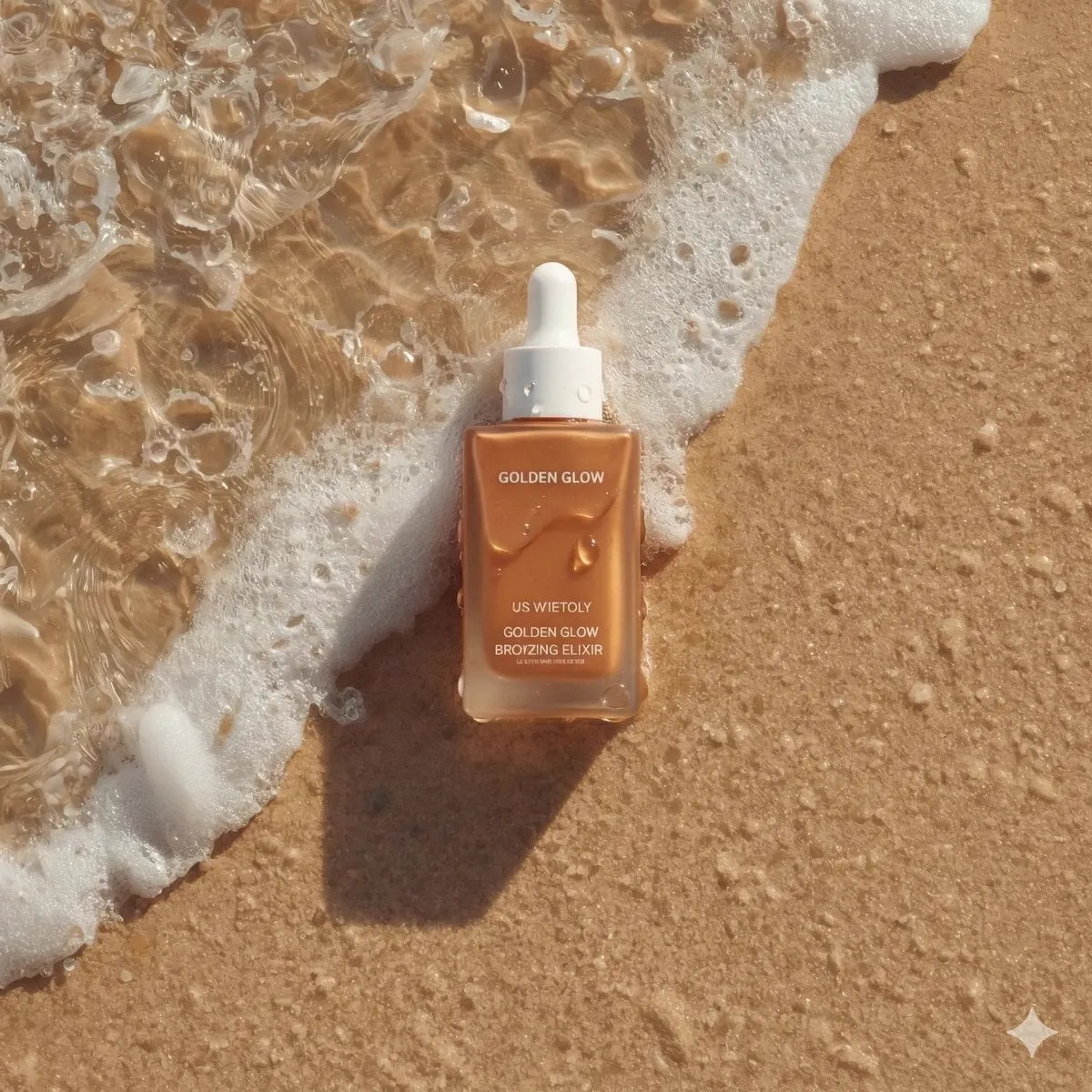
The first tool is the color palette. Decide on a dominant palette before you generate: warm ambers and teals for a summer drama, desaturated greens for a thriller, pastel tones for a dreamy commercial. Include the palette in every prompt so all scenes share the same color DNA.
LUTs and look settings, when your tool supports them, let you apply a consistent grade after generation. This is the safety net: even if the model drifts slightly between scenes, the final grade pulls everything back into the same visual language.
Skin tones deserve special attention. Nothing breaks immersion faster than a character whose skin turns orange or gray between shots. Use consistent light and color descriptions, and check skin tones scene by scene. If a grade is applied, protect the skin range with a targeted correction.
Contrast, Saturation, and the Film Feel
The difference between a video that looks like footage and one that looks like film often comes down to contrast and saturation. Film look lives in the highlights and shadows: compressed highlights that hold detail, deep blacks that are not crushed, and a gentle roll-off between tones.
When generating, describe the contrast behavior: "soft contrast, filmic highlights, rich blacks" for a natural film look, or "high contrast, hard shadows" for a punchy, stylized look. Saturation follows the mood: vibrant colors for energetic content, muted tones for serious or nostalgic material.
In post, learn to read your video's histogram and scopes. The goal is not a formula; it is intentionality. A flat image can be a choice, and a saturated one can be a mistake. Let the story dictate the grade, and let the tools execute your decision consistently across the whole project.
Building a Cinematic Workflow
Craft is habit. A repeatable workflow turns these techniques into consistent output:
- Define the look first. Before generating, write down the palette, the lighting style, the lens language, and the mood. This is your creative brief.
- Create a look book. Gather reference images that capture the palette and lighting you want. Use them as references in every generation.
- Generate keyframes as images. Control composition and color precisely with image models, then animate them with a video model. This is the most reliable path to a consistent look.
- Standardize prompts. Build a prompt template with your look constants, and change only the subject and action for each shot.
- Grade in post. Apply a consistent grade across all scenes, then check skin tones and contrast scene by scene.
- Review as a film. Watch the entire video from start to finish, not shot by shot. Continuity issues are invisible in isolation.
Aspect Ratios and Deliverables
Every distribution platform has its own frame, and a filmic look that works in one format may fall apart in another. Plan the aspect ratios before you generate, not after. The most common are 16:9 for YouTube and presentations, 9:16 for Reels, Shorts, and TikTok, and 1:1 for feeds and thumbnails.
Design the composition so the hero elements survive all crops. If the key subject sits center frame, it will survive vertical and square versions; if it lives on the edges, the crop will destroy it. A useful habit is to generate the wide master, then check the center-safe area in every deliverable.
Aspect ratio also affects motion. Vertical formats reward vertical movement and tight framing, while horizontal formats give space to landscapes and wide action. Match the shot design to the destination format, and generate variations deliberately rather than hoping a single version will crop well everywhere.
Learning From Film References
One of the fastest ways to develop a cinematic eye is to study the films whose look you admire, and to translate what you see into generation vocabulary. When you watch a scene you love, break it down: what is the shot size, the angle, the lens feeling, the light direction, the palette? Write those observations as a prompt and test it.
Build a reference library of frames from films, photography, and even paintings that capture the moods and looks you want. Use them as visual references in your generations whenever the tool supports it. References communicate what adjectives cannot, especially for subtle qualities like texture, light falloff, and color relationships.
This practice does more than improve individual shots. It trains your eye to see the language of cinema, so that your prompts become more precise over time. The people who produce consistently cinematic work are not the ones with secret techniques; they are the ones who studied how light and composition shape emotion, and learned to say it in the model's language.
Common Mistakes and How to Fix Them
- Prompts without cinematography language. "A beautiful scene" produces a generic scene. Name the shot, angle, lens, light, and palette.
- Inconsistent look across scenes. Every scene needs the same color and lighting direction, or the film falls apart.
- Overusing the same shot. A video of all close-ups has no rhythm. Vary shot sizes and camera moves.
- Ignoring light direction. Lighting must be believable and consistent within a scene; the model will not correct contradictions for you.
- Unnatural skin tones. Check faces after grading and correct the skin range.
- Forgetting the story. Cinematography serves the narrative. If the shots are beautiful but say nothing, the film says nothing.
Frequently Asked Questions
Do I need to know cinematography to use AI video well?
It helps enormously, but you can learn the essential vocabulary in a few hours: shot sizes, camera angles, basic moves, and light directions. Each term you add to your prompts is a new control you own.
Which terms give the fastest cinematic improvement?
Lens language, light direction, and color palette. Specifying "35mm lens, shallow depth of field, golden hour, warm palette" immediately transforms a generic prompt into a filmic one.
How do I keep the look consistent across many scenes?
Define the look once, put it in every prompt, and grade in post. Keep a look book of references and use them throughout. Consistency is a system, not an accident.
Can AI handle complex camera movements?
Modern models handle many moves, but complex physics still fail sometimes. Break ambitious moves into simpler segments, add the movement explicitly to the prompt, and regenerate when a shot looks unnatural.
Is color grading necessary if the model generates nice colors?
Often yes. Even good generations drift between scenes, and the grade is what unifies them. Think of the model as the camera and the grade as the lab: both are part of the production.
