
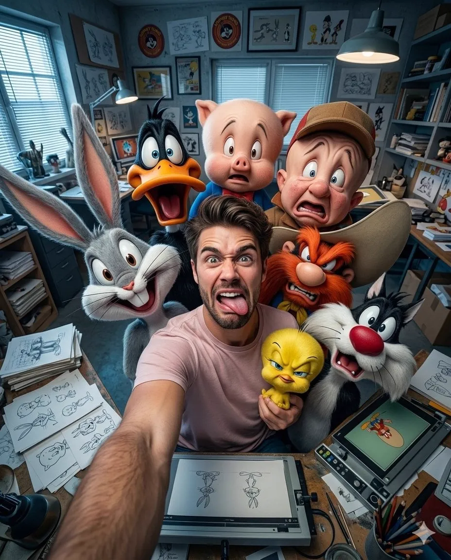
Every Fortnite video competes against thousands of others published the same day. Viewers scroll, and in a fraction of a second they decide what to click. The thumbnail is that decision. A strong 3D-looking thumbnail with dramatic lighting and a clear focal point can multiply your click-through rate, while a flat, generic image buries even a great video.
AI image generators have made it possible for any creator to produce thumbnails that look like they came from a professional 3D art studio, without learning modeling, lighting, or rendering. This guide walks through the whole process: what you need before starting, how to build the 3D look, how to write prompts that deliver, and how to export and test your results.
Why Thumbnails Decide Whether Videos Get Clicked
The thumbnail is the first and often the only impression a potential viewer gets. Platforms show thumbnails in feeds, search results, and suggestions, usually small and always fast. In that context, a thumbnail has three jobs: stop the eye, communicate the topic, and promise a payoff.
For gaming content, the bar is high because the competition is intense. The most clicked thumbnails in the gaming niche share recognizable traits: a clear focal subject, strong contrast, saturated color, a dramatic pose or expression, and depth that makes the image feel dimensional. The 3D look is popular for a reason: it reads as premium, cinematic, and expensive.
AI generation does not remove the need for design judgment. It removes the technical barrier. The difference between a thumbnail that works and one that does not is still decided by composition, contrast, and clarity.
What You Need Before You Start
You need surprisingly little to begin:
- An AI image generator that accepts detailed prompts and reference images. Several mainstream tools fit this description; pick one and learn it deeply before adding others.
- Reference images of the skin or character you want to feature. Screenshots from the game, official art, or your own renders all work. Reference images are the key to character accuracy.
- A rough idea of the scene: a pose, an environment, a mood. You do not need a drawing; a sentence is enough.
- An image editor for final polish: cropping, text overlays, contrast, and sharpening. Free editors are sufficient.
Gather references first. The quality of your output depends more on references and prompting than on the specific tool.
Building the 3D Look
The "3D look" is a combination of techniques, and each one is achievable in a prompt.
Character and skin consistency
If the thumbnail features a specific skin, the character must look right. Feed the generator a reference image of the skin and describe the pose. Consistency comes from the reference, so use the same reference every time. When you find a good result, reuse it as the starting image for variations rather than regenerating from scratch.
Environment and dramatic lighting
Lighting is what separates a flat image from a cinematic one. Use directional lighting: a strong key light, deep shadows, and maybe a rim light to separate the character from the background. Words like "dramatic rim lighting", "volumetric light", "god rays", and "high contrast" push the image toward the cinematic look. A stormy sky, a sunset, or a neon arena gives the environment personality.
Depth, perspective, and posing
Depth makes the thumbnail feel 3D. Describe a strong perspective: the character in the foreground with the environment receding behind, or a dynamic low-angle shot that makes the character look powerful. Pose matters too: action poses, weapon-ready stances, and expressive faces outperform neutral standing poses.
Anatomy of a Great Prompt
A great prompt is structured. Use this pattern and adapt it:
- Subject: "a Fortnite character wearing the [skin name] outfit, [pose description]"
- Environment: "standing in [location], [weather or atmosphere]"
- Lighting: "dramatic key light from the left, deep shadows, rim light, volumetric light"
- Style: "cinematic 3D render, high detail, saturated colors, game art style"
- Composition: "low angle, character in the foreground, depth of field, focal point on the face"
Example prompt: "a Fortnite character wearing a futuristic armored skin, mid-jump with a pickaxe raised, over a stormy island at dusk, dramatic key light, deep shadows, orange rim light, volumetric god rays, cinematic 3D render, high detail, saturated colors, low angle, depth of field, character sharp, background slightly blurred"
Notice what is included: who, what action, where, what light, what style, what composition. Leave nothing to chance. Also say what should be sharp and what should be blurred; generators respond to that guidance.
From Concept to Final Thumbnail: A Step-by-Step Workflow
Step 1: Define the concept
Decide the video's hook and the emotion of the thumbnail: hype, humor, shock, victory. Write one sentence: "the moment I won with zero health." The concept drives the pose and the expression.
Step 2: Prepare references
Collect the skin reference, environment ideas, and any style examples you like. More references mean fewer surprises.
Step 3: Generate a batch
Generate a first batch of four to eight variations. Do not stop at the first result; the first batch is exploration.
Step 4: Select and refine
Choose the best two or three. Refine them by varying one element at a time: a different expression, a different angle, stronger contrast. Repeat until one image stands out.
Step 5: Upscale
If the tool offers upscaling, use it. Higher resolution gives you room to crop and to add text without visible blur.
Step 6: Edit and export
In your image editor, crop to the platform ratio, boost contrast and saturation slightly, sharpen the character, and add text if the video style calls for it. Export at the highest resolution the platform supports.
Aspect Ratios, Resolution, and Export Settings
Different platforms favor different ratios. YouTube thumbnails are 16:9 and display at roughly 1280 by 720, so design for that crop. Short-form platforms use 9:16 for video but often show a 16:9 or 1:1 thumbnail in search and suggestions. When in doubt, design in 16:9 and keep the critical elements inside the center, where every crop preserves them.
Text on thumbnails should be large and few: three to five words max. Small text becomes unreadable at thumbnail size and signals amateurism. If you use text, place it away from the character's face and keep the contrast between text and background high.
Testing and Improving Click-Through Rates
A thumbnail is a hypothesis. Test it.
- Use YouTube's thumbnail testing tools when available; they show which variant earns more views per impression.
- Compare one variable at a time: character versus no character, text versus no text, warm colors versus cool colors.
- Check the analytics after enough impressions, not after a day. Small samples mislead.
- Study winning thumbnails in your niche and identify the pattern: color, focal point, expression, and composition. Then design deliberately along that pattern, not by copying it.
Creators who treat thumbnails as an ongoing experiment outperform those who settle for the first decent image.
One more habit pays off: review your own analytics monthly and delete or rework the thumbnails that consistently underperform. A thumbnail that earned a low click-through rate is not a failure; it is a data point. The creators who improve fastest are the ones who document what they tried, what the numbers said, and what they will test next.
Platform Rules and Practical Considerations
Keep the content within platform guidelines: avoid misleading imagery, and do not present AI-generated art as a real in-game screenshot if the platform or your audience cares about the distinction. Many creators disclose AI assistance in descriptions or community posts, which builds trust.
Also protect your channel identity. Consistent style across thumbnails makes your content recognizable in a busy feed. If every thumbnail looks different, you lose the compounding benefit of a visual brand.
Building a Thumbnail Style Guide
Once you know what works, write it down. A one-page style guide turns your personal preferences into a repeatable system that works even when you are in a hurry or delegating to a collaborator.
A practical style guide covers four things: the color treatment, high contrast, warm or cool grading, and which accents to avoid; the composition rules, where the character sits, where the text goes, and how much empty space is allowed; the character treatment, which skins and poses are on-brand and which are off; and the text rules, font family, maximum words, and placement.
The guide does not need to be long. One page is enough. What matters is that a new thumbnail can be checked against it in thirty seconds, and that every thumbnail you publish looks like it belongs to the same channel. Over time, viewers learn your style at a glance, and recognition becomes part of your click-through rate.
Worked Example: A Victory Royale Thumbnail
Let us walk through a realistic job: a thumbnail for a video about an intense final circle victory.
Concept: the moment of victory, high energy, a close call. You pick a skin with a recognizable silhouette and gather two reference images: a full-body shot and a close-up of the face. Environment: the final zone at dusk, storm clouds, a distant battle bus. Lighting: a strong key light from the left, an orange rim light on the character, deep shadows, volumetric rays through the clouds.
Your first prompt follows the anatomy pattern: the character with the skin, aiming a pickaxe at the camera, low angle, foreground position, stormy final zone, dramatic lighting, cinematic 3D render, saturated colors. You generate eight variations. Two stand out: one with the character facing the camera, one with a three-quarter pose showing more of the environment.
You refine the best one: a stronger expression, slightly higher contrast, a sharper focal point on the character's face. You upscale, then move to the editor: crop to 16:9, boost saturation and contrast, sharpen the character, add a three-word text in the upper third, and export at high resolution.
Before publishing, you set up a thumbnail test with a second variant that uses cooler colors and no text. After the video has enough impressions, the analytics tell you which version earned the higher click-through rate, and you apply the lesson to the next thumbnail.
This workflow takes about an hour. The skill is not in any single step; it is in the discipline of testing and the consistency of the style.
FAQ
Do I need a paid tool to make good thumbnails?
No. Free tiers of mainstream generators are enough to learn and produce solid work. The bottleneck is references and prompting, not the price of the tool.
Can I use a real screenshot instead of AI?
Yes, and many creators combine both: a real screenshot as the character reference, AI for the background and lighting, and an editor for the final composition.
How do I make the character look like the actual skin?
Feed the generator a clear reference image of the skin and describe the pose. Use the same reference repeatedly, and reuse approved outputs as starting images for variations.
How long does a thumbnail take?
Once your references and workflow are set, a strong thumbnail can take thirty minutes to an hour, including iterations. The first few will take longer while you learn your tool.
What if my thumbnails still do not get clicks?
Audit the pattern, not the individual image: is the focal point clear at small size, is the contrast high, does the emotion match the video? Run small tests with different styles and let the data tell you what your audience prefers.
Should the thumbnail match the video title?
They should work as a pair. The thumbnail sets the visual promise and the title sets the verbal promise; when they agree, the viewer clicks with confidence. When they contradict, even a beautiful thumbnail gets skipped.
Can I reuse one thumbnail style for every video?
A consistent style builds recognition, but variety prevents boredom. Keep the style family consistent, colors, contrast, character treatment, and vary the composition and emotion so the feed does not feel repetitive.
