
Photorealism has become the new baseline in digital design. Clients expect product images that look like studio photography, architectural visualizations that could pass for finished photographs, and advertising assets that never trigger the dreaded "this looks AI-generated" reaction. The tools have caught up with the demand: modern image models can render skin texture, fabric weave, metallic reflections, and natural light with astonishing fidelity. What separates professionals now is not access to better tools but the ability to control them. This guide covers the software landscape, the prompt techniques, and the production workflows that turn photorealistic AI image generation into a reliable part of a design practice.
Why Photorealism Became the Baseline
A decade ago, "AI art" meant stylized illustrations and dreamlike abstractions. The aesthetic was part of the appeal. Today the expectation has flipped. For commercial design work, photorealism is often the safe default because it communicates quality, trust, and tangibility. A product rendered in a photorealistic style looks real enough to be evaluated by stakeholders: materials, proportions, and lighting can be judged the way they would judge a prototype photograph.
The deeper reason is economic. Photorealistic renders substitute for expensive photoshoots. An e-commerce catalog, a real estate marketing set, a fashion lookbook, or an architectural presentation can be produced in days instead of weeks, with unlimited revisions and no studio logistics. That speed does not mean lower standards; it means the craft moves from photography skills to direction skills: lighting design, material description, composition, and art direction all become the designer's primary tools.
The Modern Toolbox: What Each Model Does Best
No single model is the best at everything. Building a photorealistic workflow means knowing the strengths of each tool in your stack.
Text-to-image models like Midjourney and Stable Diffusion remain the workhorses for exploratory work. They excel at interpreting rich language prompts and producing diverse compositions quickly. Their outputs, however, need careful prompting and often post-processing to reach true photographic realism.
Flux and similar high-fidelity models push detail further, handling complex materials, realistic skin, and intricate lighting with fewer artifacts. They are the right choice when the final asset needs to survive close inspection: hero product shots, character references, and high-resolution print work.
Dedicated upscalers and detailers add the final layer. Topaz, Real-ESRGAN, and similar tools restore texture and sharpness without the waxy smoothing that ruins many AI outputs. In a professional pipeline, the model generates the direction and the upscaler finishes the surface.
Prompt Engineering for Realism
Prompting for photorealism is different from prompting for style. The goal is to describe the scene the way a photographer would set it up, not the way a painter would imagine it.
Subject and Camera Language
Describe the subject with the specificity of a shot list: the object, its material, its condition, and its environment. Then add camera language: lens focal length, aperture, angle, distance. Phrases like "85mm lens, shallow depth of field, eye-level shot" give the model concrete photographic constraints that push output toward realism. Vague subjects produce generic images; specific subjects produce believable ones.
Lighting and Shadow Vocabulary
Lighting is the fastest path to realism. Name the light source and its quality: "soft window light from the left," "golden hour sun with long shadows," "overcast sky with diffuse light," "single hard spotlight against a dark background." Describe how light interacts with the subject: rim light on the hair, caustics through a glass, bounced light under a chin. Models trained on photography understand these terms precisely, and using them reliably upgrades output quality.
Materials, Textures, and Micro-Detail
Photorealism lives in the details. Instead of "a wooden table," write "weathered oak tabletop with visible grain and worn edges." Instead of "a leather bag," write "full-grain leather bag with natural creases and brass hardware." Material vocabulary — brushed steel, matte ceramic, raw linen, polished marble — directly influences how the model renders surfaces. The more texture language you provide, the less the model falls back on its generic "smooth render" default.
Controlling Composition and Depth
Realism also requires believable composition. Specify foreground, midground, and background elements, and describe depth cues: atmospheric haze in the distance, bokeh behind the subject, a partially blurred object in the foreground. Compositional control turns a technically detailed but flat image into a photograph-like scene with depth and hierarchy. Negative prompting helps here too: excluding "cluttered background," "flat lighting," and "oversaturated colors" steers the model away from its most common failures.
Consistency Across a Series: Characters, Sets, and Style
A single good image is a demo; a consistent series is a deliverable. The hard part of professional work is keeping characters, environments, and style stable across dozens of images. The modern answer is reference-based generation: feed the model reference frames of the character or environment, then constrain every new image to match them. Multi-image fusion techniques take this further by combining several references into a stable identity that can be reused across scenes.
Style consistency works the same way. Define a style sheet in prompt form: color palette, lighting direction, lens language, and post-processing look. Reuse that style sheet across the whole series, and adjust only the content-specific parts. Teams that formalize this step produce coherent campaigns instead of a pile of individually nice images.
From Single Image to Production Pipeline
Concept and Client Approval
Start with a direction phase. Generate a small set of concept images across different compositions and moods, and get stakeholder buy-in before committing to full production. This phase is cheap and fast, and it prevents expensive rework later. Present concepts as a moodboard with clearly labeled options rather than a single image.
Asset Generation at Scale
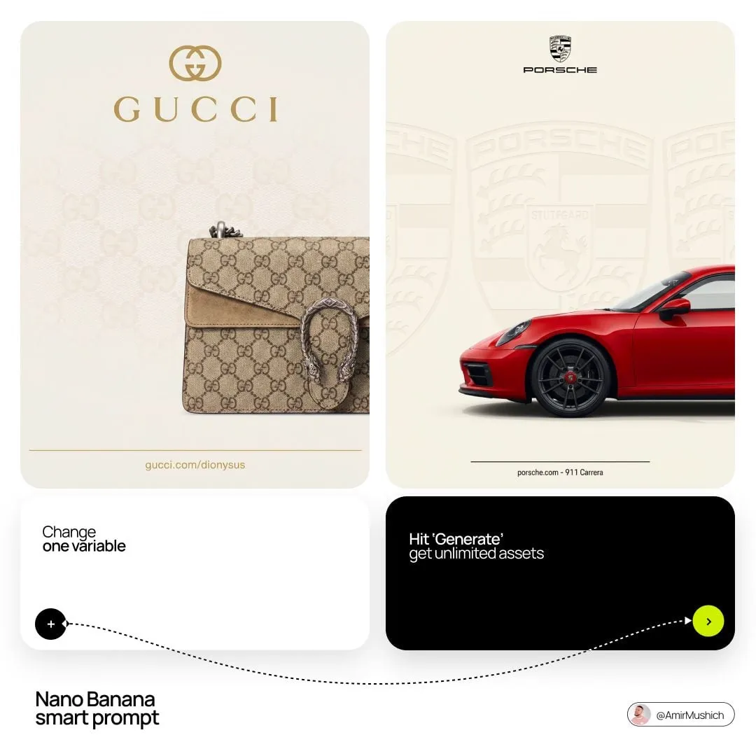
Once the direction is approved, systematize production. Build prompt templates with locked style elements, generate in batches, and review against the style sheet. For catalogs and multi-SKU projects, automate the loop: one template per product type, with the product-specific details swapped in. This is where prompt discipline pays off — teams with good templates produce consistent assets at scale, while teams without them fight drift in every batch.
Refinement, Upscaling, and Finishing
The final stage is where professional output separates from amateur output. Upscale for the target resolution, sharpen details with dedicated tools, and do a last-pass color grade to unify the set. Retouch obvious artifacts: edges, hands, text, and reflections. The goal is an asset that passes inspection at full size, because clients will zoom in.
Practical Tips for Design Teams
Build a shared prompt library. Every effective prompt is an asset; store it with the output it produced, and let the team learn from what works. Standardize camera and lighting vocabulary so prompts stay comparable across projects. Always keep a human reviewer in the loop for final assets; no automated check catches every uncanny detail. And track iteration counts: if a template regularly needs many retries, fix the template rather than the individual generations.
One more habit pays off disproportionately: review in context. A single photorealistic image can look flawless in isolation and wrong next to its siblings — skin tones that clash, light sources that disagree, levels of detail that mismatch. Whenever a project involves multiple assets, review them side by side in the order they will appear, the way an art director reviews a spread rather than a single page. Context review catches the consistency issues that per-image review misses, and it is the fastest way to build the eye for what a coherent set of photorealistic work really looks like.
Common Pitfalls and How to Avoid Them
The most common failure is the "AI look": overly smooth skin, waxy surfaces, and a generic color grade. It comes from under-specified prompts and missing negative constraints. The fix is discipline: name the lighting, name the material, name the lens, and exclude the artifacts in negative prompts.
The second failure is inconsistency across a series. It comes from treating each image as a separate project. The fix is reference-based generation plus a locked style sheet.
The third failure is over-reliance on post-processing. Upscalers cannot fix a fundamentally broken image. Invest in the prompt and the model choice first; use post-processing to finish, not to rescue.
FAQ
Can photorealistic AI images replace photography entirely? For many commercial categories, yes, especially where speed and iteration matter more than physical props. For high-stakes brand campaigns, AI often complements photography rather than replacing it.
Which model gives the most realistic skin? High-fidelity models with strong material rendering, combined with careful lighting prompts and negative constraints, produce the most convincing results. Test a few on your specific subject matter before committing.
How do I avoid legal and ethical issues? Use licensed or proprietary tools according to their terms, respect the rights of recognizable people, and be transparent when AI is used for commercial or editorial content where disclosure is expected.
Is photorealism always the right choice? No. Some brands and products are better served by stylized work. Photorealism is a tool, not a goal — choose it when it serves the message, and choose something else when it does not.
Running a Photorealistic Production
Across Industries
The same core techniques take different shapes in different fields. Product designers use photorealistic renders to evaluate materials and proportions before tooling is cut, catching flaws that a sketch would hide. Architectural and interior visualization teams produce client-ready imagery from CAD models, letting stakeholders walk through a space in feeling before it exists in concrete. Fashion and e-commerce teams build catalog assets at scale, swapping models and backgrounds while keeping fabric behavior convincing. Editorial and advertising teams use photorealism for campaigns that need the credibility of photography without the logistics of a shoot. In every case, the workflow is the same — direction, generation, refinement — but the vocabulary of prompts and the review criteria adapt to the domain's standards.
Budget and Timeline
A photorealistic pipeline changes project economics, and planning for that change avoids surprises. Compute cost is the first variable: premium models and repeated iterations add up, so estimate the generation budget per final asset by tracking iterations during the pilot, then plan accordingly. Time behaves differently than in traditional production: the creative direction phase gets shorter because visuals appear earlier, while the review and refinement phase can expand because revisions are cheap. Teams that plan for the review phase — who approves, on what schedule, against what criteria — finish faster than teams that treat review as an afterthought. Finally, plan for the human cost: prompt engineering, reference curation, and final inspection are skilled work, and the team's hours often move from operating cameras to directing models. Budget for that shift explicitly, and the pipeline becomes a cost saver; ignore it, and hidden labor quietly eats the savings.
Ethics and Disclosure
Working with photorealistic AI means working with realistic representations of people, places, and products, which raises obligations that stylized art rarely triggers. Use only images you have the right to use, both as training references and as source material for generation. Do not create realistic depictions of real people without consent, especially in commercial contexts, and respect platform policies on likeness and content. Where disclosure is expected — editorial work, journalism, client campaigns with disclosure requirements — label AI-generated imagery clearly and honestly. And keep a human accountable for every final asset: the tool generates, but the organization owns the decision to publish. None of this is a reason to avoid photorealistic AI; it is simply the professional discipline that keeps the technology useful without eroding trust.
Building Your Photorealistic Workflow
Start with one pilot project and run it end to end: prompts, references, batch generation, upscaling, and review. Document what works in your prompt library, and let the pilot become the template for the next project. Photorealistic AI image generation is a craft that rewards methodical practice. The models change quickly, but the core skills — lighting language, material description, consistency systems, and disciplined review — compound over time and make every future project faster and better. That is the real advantage of a professional pipeline: not a magic prompt, but a repeatable system.
