
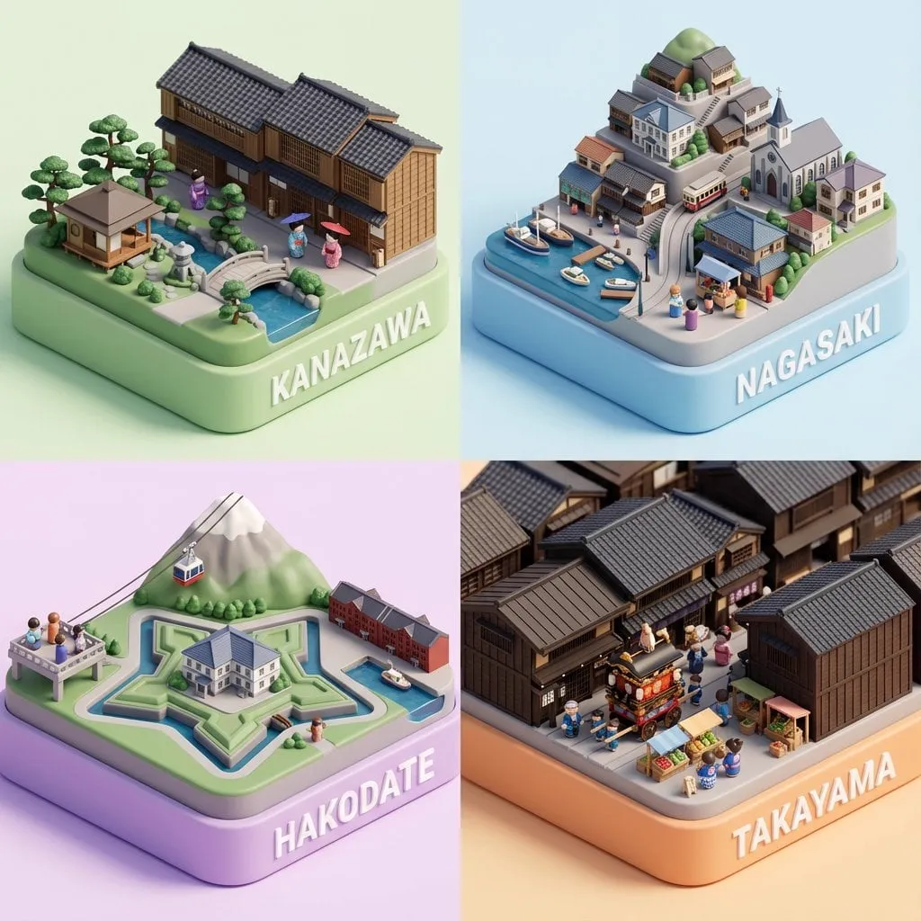
A dense manuscript is a raw material, not a deliverable. Audiences cannot process paragraphs on a slide; they need a few words, one clear idea, and a visual that supports it. Translating a document into a great presentation used to be a slow, manual craft. With AI image generation and smart prompting, you can compress that work dramatically: distill the argument, design a consistent visual language, and generate supporting visuals for every slide. This tutorial shows the prompt architecture that makes the process repeatable.
Why presentation creation is a prompt problem
Most people write a presentation by copying text from the manuscript into slides. The result is a document projected on a wall, and the audience reads instead of listens. The alternative is a translation process: for every slide, decide the single message, the visual treatment, and the supporting detail.
AI fits naturally into that process because it can generate both structure and visuals. The skill is not asking for "a nice slide" but building a system of prompts that produces a coherent deck from start to finish. That system is a prompt architecture: a set of connected instructions that keep style, tone, and message aligned across every slide.
Step 1: Distill the manuscript first
Before any image generation, reduce the document to its skeleton. Read the manuscript once and extract:
- the one-sentence thesis;
- the three to five main arguments or chapters;
- the evidence that supports each argument;
- the call to action or conclusion.
This skeleton becomes your slide list. A rule of thumb: if the manuscript is 20 pages, the deck should be 10 to 15 slides. Each slide carries one idea from the skeleton. Anything that does not serve the skeleton stays in the appendix or gets cut.
If the source material is messy, do a rough pass first: number the paragraphs, tag each with a theme, and group the tags. This cheap step prevents the most common failure, building slides from the document's order instead of from the argument's logic.
Step 2: Define the visual style anchors
The primary failure in AI-generated decks is visual chaos: every slide looks like a different template. Prevent it by defining style anchors before generating anything.
Palette and mood
Choose two or three colors that reflect the tone: conservative blue for finance, warm orange for creative work, dark green for sustainability. Write the palette as an instruction: "background in deep navy, accent in coral, clean and minimal".
Typography and layout
Describe the layout system: "left-aligned headline, one supporting sentence, image on the right third". AI image generators do not set your typography, but they can generate background art, icons, and section images that respect the same layout constraints.
Visual metaphor
Pick one visual language for the deck: photography, flat illustration, data-viz style, or abstract gradients. Mixing metaphors confuses the audience. Keep the same metaphor across all generated visuals.
Step 3: Structure prompts for content translation
Each slide needs a prompt that turns a paragraph into a visual. The key is separating content decisions from style decisions.
The slide prompt template
A reliable structure is:
- role: "You are a presentation designer creating visuals for a business deck."
- slide message: the single idea, stated in one sentence;
- visual treatment: what the image should show;
- style block: the fixed palette, mood, and metaphor from Step 2;
- negative constraints: "no text, no watermarks, no clutter".
Keeping the style block identical across every prompt is what makes the deck feel designed rather than assembled.
One idea per slide
If a paragraph contains three concepts, do not generate one busy image. Split it: the slide carries the main idea, and the details become speaker notes or a supporting slide. Clarity beats completeness on every screen.
Step 4: Prompt for each slide type
Different slides need different visual strategies.
The hook slide
The opening slide must earn attention in seconds. Generate an image that is surprising or emotionally resonant, paired with a bold statement. Prompt for strong composition and negative space so the title sits cleanly over the visual.
The data slide
Data slides should make the number impossible to miss. Instead of asking the AI for a chart (which may render inaccurately), generate a clean background or icon treatment and build the actual chart in your presentation tool. Never trust AI to draw precise data visualizations.
The concept slide
For abstract ideas like "strategy" or "trust", generate a metaphorical image: a bridge, a tree with roots, a compass. Keep the metaphor consistent with the deck's chosen visual language. Abstract slides work when the image reinforces the spoken words rather than replacing them.
The transition slide
Between sections, use simple, calm visuals that signal a change of topic: a color shift, a new scene, a numbered marker. Transitions should be quieter than content slides so the audience feels the structure without being distracted.
The closing slide
End with the call to action and a strong final image that mirrors the opening. Bookending the deck with a visual echo creates a sense of completion.
Step 5: Build the deck and iterate
Generation is the beginning, not the end. Assemble the deck, then review it as an audience would.
Tools that support the workflow
The prompt system works with most AI image generators. For the deck itself, pair generation with a presentation tool that gives you clean layout control. A practical stack: AI image generation for visuals, a design or presentation app for layout and typography, and a chart tool for any real data. Keep the pipeline simple enough that a colleague can reproduce it.
Common mistakes and how to avoid them
- Copying paragraphs onto slides: the fastest way to lose an audience. Distill every paragraph to one sentence before it earns a slide.
- Changing the style block between slides: the main cause of mismatched decks. Copy the style block verbatim everywhere.
- Trusting AI to render real data: charts with invented numbers destroy credibility. Build charts from your data and use AI only for backgrounds.
- Generating before structuring: iterating on visuals for slides that will be cut wastes the budget. Structure first, generate later.
- Overloading slides: one idea per slide is the rule. If a slide needs three ideas, it becomes three slides.
Each mistake is a workflow failure, not a talent failure. The process in this tutorial exists to catch them before the audience does.
Read it fast
Flick through the deck in ten seconds. If a slide cannot be understood at a glance, it needs work. Slides are supporting media for your talk, not the talk itself.
Check visual consistency
Scan the deck in overview mode. Do the colors, imagery, and layouts feel like one system? Replace any slide that breaks the pattern.
Budget your iterations
Image generation costs money and time. Decide before generating how many attempts each slide gets, usually two or three. Iterate on structure with text first, then invest generation budget only in slides that survived the structure review.
Write the speaker notes as you assemble the deck, one or two sentences per slide. Notes force you to clarify what each slide contributes and give you the script for practice. A deck with good notes is a deliverable; a deck without them is a guess.
Example prompt templates
Style block (reuse verbatim)
"Minimal corporate style, deep navy background with coral accent, soft studio lighting, flat illustration with subtle grain, generous negative space, no text, no people, high resolution."
Hero slide
"Abstract visual of a bridge connecting two cliffs at dawn, representing a strategic transition. [style block]"
Data background
"Clean abstract background with subtle grid lines, leaving the center empty for a large number. [style block]"
Transition
"Minimal geometric pattern in coral on deep navy, calm and simple. [style block]"
Diagram slide
"Clean white diagram frame with an upward curve and three labeled nodes, minimal flat style. [style block]"
Copy the style block into every prompt. Consistency is the whole game.
FAQ
Can AI design my entire slide deck automatically?
AI can generate backgrounds, icons, and even outline structures, but the final layout, typography, and narrative should stay in your control. Automated decks look automated; directed decks look designed.
Should I let AI draw my charts?
No. AI image generators render numbers and labels unreliably. Generate chart data with a spreadsheet or chart tool and place it in the slide, using AI only for the surrounding visual treatment.
How long does this process take for a 15-slide deck?
With a distilled outline and a locked style block, most of the work is reviewing and assembling. Expect a few hours including iteration, compared with days for a manual design process.
What if my manuscript is very technical?
Distillation matters even more. Pull out the key numbers and concepts for the slides, and move detailed formulas and tables to handouts or appendix slides. The audience should get the argument in the deck and the evidence in the document.
How do I keep AI visuals from looking generic?
Lock a specific palette, metaphor, and composition system, and reuse the same style block everywhere. Generic output comes from generic instructions; specific instructions produce specific design.
What if I do not have a manuscript but just an outline?
The process works from an outline too. Treat the outline as the skeleton and move straight to the slide list. The style and prompt architecture are identical, and the outline version is usually faster because there is less content to cut.
How do AI-generated visuals affect accessibility?
Use real text, not text baked into images, for all essential information, and check contrast for accessibility. AI imagery is decorative support; the message must live in real text, captions, and speaker notes.
Can I generate the whole deck in one prompt?
No, and you should not want to. The deck's coherence comes from one style block applied across many focused prompts, not from a single mega-prompt. Splitting generation per slide keeps each visual purposeful and keeps your ability to revise one slide without regenerating the rest.
Case study: building a 15-slide deck from a 25-page report
Suppose you have a 25-page market research report and need a 15-slide board presentation. The skeleton step extracts the thesis, the category is consolidating around three winners, three arguments, demand concentration, margin pressure, and platform risk, and the recommendation: invest in the consolidation play.
The slide list writes itself: 1 title, 2 thesis, 3 market context, 4-6 the three arguments, 7-8 evidence, 9-10 implications, 11-12 scenarios, 13 recommendation, 14 risks, 15 close.
Style anchors: navy and gold palette, editorial photography metaphor, generous white space. The style block is locked before generation starts. Generation: the hook slide gets a strong architectural image; each argument slide gets one supporting visual; data slides use clean backgrounds with real charts built in the presentation tool; transition slides use the gold geometric motif; the close reuses the hook image with a color shift.
Total production: about three hours including iteration, versus a day and a half for a manual design pass. The deck reads as one designed system because every visual came from the same style block. The same pipeline works for other formats too: an investor pitch, a training module, or a conference keynote all follow the identical sequence of skeleton, style anchors, per-slide prompts, and structured iteration. Once the system exists, the marginal cost of the next deck is mostly content, not craft.
Conclusion
Turning a manuscript into a presentation is a translation task, and AI makes the translation faster when you build the right prompt architecture. Distill the argument, define style anchors, prompt each slide type with intent, and iterate with discipline. The result is a deck that looks designed because it was designed: by you, with AI as the production partner.
