
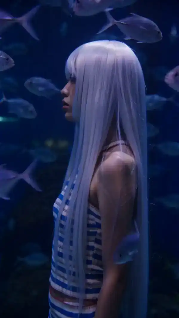
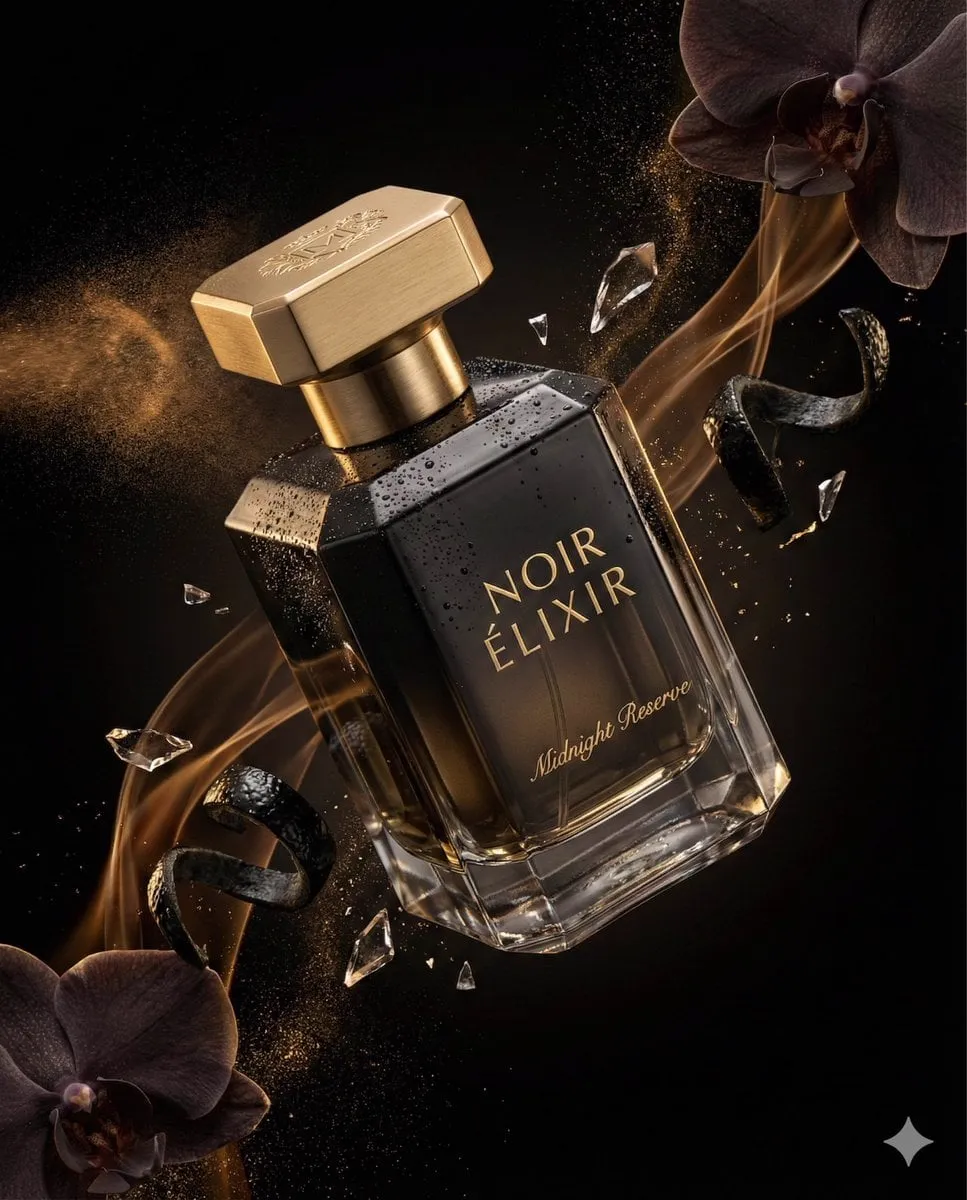
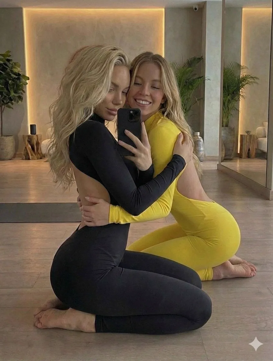
The thumbnail is the first advertisement for your video, and in most cases it is the only advertisement you get. Viewers decide whether to click in a fraction of a second, and that decision is made almost entirely on the thumbnail. AI image generators have changed this field dramatically: what used to require a designer, stock photography, and hours of editing can now be produced in minutes with the right prompt. This guide explains how to design thumbnails that earn clicks, how to use AI image generators effectively, and how to test your way to a higher click-through rate.
The Thumbnail Is the First Advertisement
Before anyone watches your video, they see the thumbnail. Before they read the title, they see the thumbnail. The decision to click happens in about one second, and the thumbnail does most of the work in that second.
The thumbnail has three jobs. It must stop the scroll, communicate what the video is about, and create enough curiosity to earn the click. A thumbnail that fails at any of these jobs costs you reach: the algorithm tracks click-through rate, and videos with low CTR are shown to fewer people over time.
AI image generators are powerful here because they remove the production bottleneck. The constraint on thumbnail quality is no longer design skill or asset availability; it is the clarity of your idea and the quality of your prompt. That is a much easier constraint to work on, and it is directly trainable.
What Makes People Click: Visual Psychology Basics
Clicks are emotional before they are rational. A few psychological triggers consistently raise click-through rates, and they should shape your thumbnail design.
Faces work. Human eyes are drawn to faces, especially faces with strong emotion. A face that expresses surprise, fear, joy, or curiosity creates an instant emotional hook. The closer and clearer the face, the stronger the effect.
Contrast works. A thumbnail that stands out from the feed stands a better chance of being seen. High contrast between subject and background, bright accent colors, and clear separation from the platform's interface all help.
Curiosity works. A thumbnail that raises a question, shows an unexpected element, or implies a payoff the viewer does not want to miss earns clicks. The curiosity must be honest; a thumbnail that overpromises destroys trust and hurts long-term performance.
Specificity works. A generic image of a person at a desk tells the viewer nothing. An image of a person at a desk with a specific expression, a specific object, and a specific setting tells a story. The more specific the image, the more it signals that the video is specific too.
Prompt Engineering for Thumbnails
Writing a thumbnail prompt is different from writing a general image prompt. Thumbnails need composition, emotion, and legibility at small size, and the prompt should reflect that.
Start with the subject and the emotion. Name the character or object, the expression, and the mood. For a face, specify the emotion precisely: not just surprised, but wide-eyed shock with an open mouth, or not just happy, but a sly knowing grin.
Describe the composition for the small screen. Thumbnails are viewed small, often on a phone. Ask for the subject to fill the frame, a close crop, a clear focal point, and negative space where the title text will sit. The design that looks good at full size is not the design that works at 120 pixels wide.
Specify lighting and style deliberately. High-contrast dramatic lighting, a consistent color palette, and a clear style direction make the thumbnail feel designed rather than generated. The style should match your channel's identity.
Finish with a constraint that keeps it thumbnail-appropriate: bold, simple, readable at small size, no fine detail that will be lost. The prompt is a design brief, so write it like one.
Choosing the Right Image Model
Not every image model is equally good at thumbnails, and the differences matter. The right choice depends on the look you need.
Photorealistic models produce images that look like photography. They suit vlogs, tutorials, and content where authenticity is the selling point. Realistic faces, real environments, and believable lighting build trust.
Stylized and illustrative models produce a designed look. They suit gaming, animation, and brand content where a distinctive style is part of the identity. The stylized look also makes the thumbnail feel more crafted, which can raise perceived production value.
Some models are stronger at specific subjects: faces, text, products, or scenes. If your channel is heavily face-based or product-based, test the candidate models on that specific subject before committing.
The practical approach is to run the same prompt through two or three models, compare the results at thumbnail size, and standardize on the one that produces the most clickable image for your niche. Keep the model choice stable so the channel's thumbnails develop a consistent feel.
Composition, Text Overlays, and Branding
The generated image is the base, not the finished thumbnail. The composition and the text overlay are where most of the click-through value is added.
Compose for the title. Leave room in the image for the title text, or design the image so text can sit on a clean area. Thumbnails with text overlay perform well in many niches, but the text must be readable at small size and must not cover the key visual.
Use text sparingly. A few words, three to five, works. The text should add information or curiosity, not repeat the title. If the image already tells the story, text may be unnecessary.
Apply consistent branding. A consistent color accent, a consistent font, or a consistent framing style makes your thumbnails recognizable in the feed. Recognition compounds: viewers who recognize your style are more likely to stop on your content. Build a simple template in your editor and apply it to every thumbnail.
Keeping a Consistent Look Across a Channel
Consistency is an underrated channel strategy. Thumbnails that share a visual language train the audience to recognize your content at a glance.
The easiest way to build consistency with AI is to reuse references. Keep a set of reference images for recurring subjects, characters, or environments, and feed them into every relevant generation. A consistent subject with a consistent look anchors the channel.
Standardize the style settings. Lock the palette, the lighting style, and the model across all thumbnails. The variation should come from the content of each video, not from the visual language of the channel.
Review the channel's thumbnails as a grid. When you can see all of them together, inconsistencies jump out. Aim for a grid that looks like one designer's work, even when the images were generated by an AI.
Testing Thumbnails with Data
The fastest way to improve click-through rate is to stop guessing and start testing. Platforms increasingly support thumbnail testing, and even without native tools, there are practical approximations.
Compare versions deliberately. When a video underperforms, replace the thumbnail with a variant and compare the click-through rates before and after. Change one element at a time: the emotion, the composition, the text, the color. Changing everything at once tells you nothing.
Test at scale by pattern, not by single video. Over time, look for patterns across videos: do faces outperform objects? Does a particular color scheme win consistently? Does text help in your niche or hurt? These patterns, gathered across dozens of videos, are more reliable than any single test.
Watch the early hours. Click-through rate in the first hours after publishing is the most informative signal, because the audience is freshest and the sample is least contaminated by the algorithm's feedback loops.
Common Thumbnail Mistakes
A few mistakes account for most underperforming thumbnails, and they are easy to correct.
Cluttered composition. Too many elements, too much detail, and no clear focal point. At small size, a cluttered thumbnail is unreadable. Simplify.
Low contrast with the feed. A dark thumbnail on a dark interface, or a busy image that blends with everything around it. Contrast is the first filter for the eye.
Inconsistent style across the channel. A channel that looks like five different designers produced it earns less recognition. Standardize.
Overpromising. A thumbnail that promises more than the video delivers earns the click and loses the trust. The click-through rate rises, but the retention and subscription rate falls. Honesty is the long-term strategy.
Ignoring the small screen. Design at the size it will be seen. If the thumbnail does not work at 120 pixels wide, it does not work.
Building a Thumbnail Workflow That Scales
A single good thumbnail is easy; a channel that produces good thumbnails every time needs a workflow. The workflow removes the creative friction so the standard stays high even under deadline pressure.
The repeatable loop has five steps. First, write the thumbnail brief from the video script: the emotion, the subject, the hook, the text if any. The brief is one sentence, and it forces clarity before any generation happens. Second, generate three variants from the brief with different compositions or emotions. Third, select the strongest at thumbnail size, not at full size. Fourth, add the text overlay and branding in the editor. Fifth, review the finished thumbnail in the grid context: next to the thumbnails it will compete with in the feed.
The workflow scales because the decisions are staged. Generation is fast and cheap, so the cost of exploring variants is low. Selection is where the taste is applied, and it is faster with three clear candidates than with an infinite scroll of generations. Overlay and review are the quality gate, and they catch the errors that generation cannot see.
Templates are the scaling force. A channel that settles on a composition template, a text style, and a color accent can produce consistent thumbnails in minutes. The template is not a cage; it is the channel's visual identity, and the content of each video varies within it.
The system also produces a test queue. When a video underperforms, the workflow already has a variant ready to replace the thumbnail. Instead of improvising under pressure, the channel swaps in a candidate that was generated with the same discipline as the original, and the data decides which stays.
The discipline of the workflow matters more than any single design skill. A channel that executes a simple workflow every time will outperform a channel that relies on occasional inspiration.
The workflow also makes collaboration possible. When thumbnails are produced through a documented process, a second person can step in without a long handoff. The brief, the variants, and the review criteria are all on record, so anyone on the team can produce a thumbnail that meets the channel's standard. For solo creators, the same documentation works across time: returning to a channel after a break is far easier when the process is written down. Whether you work alone or with others, the workflow turns thumbnail design from a personal talent into a dependable capability.
Frequently Asked Questions
How important is the thumbnail compared to the title?
Both matter, but the thumbnail acts first. Viewers register the image before they read the title, and a strong thumbnail pulls them into reading the title. Invest in both, but the thumbnail is the first impression.
Can AI generate the text for thumbnails?
Models are improving at text, but generated text is still unreliable for precise wording. Generate the image with AI, then add the text overlay in an editor. That combination is the most reliable.
How many thumbnail variations should I make per video?
Two to three variants is a good working range. Generate a couple of compositions, pick the strongest, and optionally test a second version if the platform supports it.
Do stylized thumbnails outperform photorealistic ones?
It depends on the niche. Photorealistic builds trust for tutorials and vlogs; stylized builds recognition for gaming and brand content. Test both in your niche and follow the data.
How do I know my thumbnail is good before publishing?
The grid test: place it next to the thumbnails that will surround it in the feed. If it stands out, communicates clearly, and fits your channel's style, it is ready.
