
Print design used to be a slow, expensive craft. You needed a skilled designer, hours of retouching, and expensive stock assets to produce a background or visual that would survive the jump from screen to paper. In 2025, generative AI has changed that equation completely. The best AI tools for printable backgrounds and visuals now produce high-resolution artwork with enough textural detail, edge sharpness, and color fidelity for real printing work — if you know which model to use and how to prepare the output. This guide walks through the model landscape, the techniques that keep characters and styles consistent, the budget-friendly and open-source options, and the quality-control workflow that turns a digital image into a print-ready file.
What "printable" really means
Before choosing tools, it helps to understand the technical bar. A print visual needs far more than a pretty image. The three critical requirements are resolution, color profile, and textural depth.
Resolution matters because paper is merciless. A 72 DPI screen image looks fine on a phone but falls apart as a poster. For standard print work you want at least 300 DPI at the final size, which means a 3000 by 4000 pixel file for a typical A4 sheet and much more for large-format prints. Generative models that cap output at small sizes need an upscaling step built into the workflow.
Color is the second trap. Screens work in RGB; most commercial printing uses CMYK. Bright neon colors on screen can come out muddy or shifted on paper. A good workflow either generates with print-safe palettes in mind or includes a soft-proofing step where you check the CMYK conversion before sending the file to the printer.
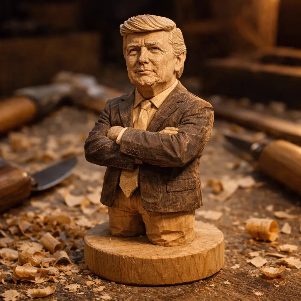
Textural depth is what separates a cheap-looking print from a premium one. Paper shows fine detail, grain, and gradients. Models that produce smooth, plastic-looking surfaces fail the print test. You want models that render realistic grain, fabric weave, paper texture, and subtle lighting variation.
The model landscape for printable visuals
The 2025 model ecosystem splits into a few clear tiers. Understanding the tiers helps you match the job to the tool instead of forcing one model to do everything.
The Flux family for high-resolution stills
The Flux series has become the default first stop for print-oriented image generation. Its core strengths are advanced prompt understanding and style consistency. Flux models handle long, detailed prompts well — you can describe lighting, lens, composition, and material properties in one sentence and get a result that respects most of them.
For print work, the key advantage is crisp edges and fine texture. Flux renders fabric, wood grain, metal, and architectural detail with convincing fidelity, which is exactly what backgrounds for posters, packaging mockups, and editorial layouts need. When you need a hero background with photographic realism, the Flux family is a strong starting point, and its outputs upscale cleanly.
Cinematic backgrounds: Runway Gen-4 and the Sora series
When your printable visual is actually a still extracted from a video project — or when you want backgrounds with real cinematic atmosphere — video-first models earn their place. Runway Gen-4 and the OpenAI Sora series generate frames with strong lighting logic, depth, and narrative mood. Even their text-to-image and image-to-image capabilities produce backgrounds that feel like film stills rather than flat illustrations.
The practical use case: you are designing a poster, an ad key visual, or a packaging scene that needs to feel expensive and story-driven. Generating with a cinematic model gives you atmospheric depth — volumetric light, haze, environmental storytelling — that generic image models often miss. The tradeoff is control: cinematic models are more sensitive to prompt phrasing, so you iterate more.
Style control: Kling and PixVerse
Some projects need a specific, stylized look — flat design, anime, retro, or a brand's custom aesthetic. Kling AI and PixVerse V4.5 excel here because they respect style direction and offer stronger control mechanisms. Kling is particularly good at maintaining a defined visual style across many outputs, which matters when you generate a family of matching backgrounds for a campaign.
PixVerse V4.5 brings useful control features for composition and subject placement. Instead of hoping the model places the product correctly, you can steer the layout. For print designers who need precise composition — a background with an empty area for text, a product centered with negative space — that control is worth the extra setup time.
Keeping characters and styles consistent
One of the biggest practical problems in print work is consistency across a series. If you are producing a set of posters for a café chain or a series of packaging backgrounds, every piece needs the same character, the same palette, the same lighting. Three techniques solve this.
Multi-image fusion is the first. You generate a master keyframe — the hero image that defines character, style, and color — and then generate every other visual against that reference. The model uses the keyframe to anchor faces, clothing, and environments, so the series stays coherent even when the composition changes.
AI director agents are the second. These systems act like a creative lead: they take a project brief, break it into scenes, and keep the style parameters consistent across every generation step. When you tell an agent "same character, warm evening light, brand teal palette," it applies those constraints to each output instead of drifting toward whatever the prompt happens to suggest.
Multimodal reference is the third. Models like Vidu Q1 and Pika 2.2 accept multiple input types — an image, a color palette, a style sheet — and use all of them as references. Vidu Q1 is especially strong at combining a subject image with a scene description. Pika 2.2 handles stylistic references gracefully, which makes it useful when you want "this palette plus this mood" without writing a novel-length prompt.
Budget-friendly and open-source options
Not every print project needs a premium model. For drafts, internal mockups, and high-volume production, the cheaper tier is often the smarter choice.
MiniMax Hailuo 02 is the standout value pick for physical realism. It produces surprisingly convincing physics and material behavior at a fraction of the cost of flagship models. If you need a realistic product scene to test a concept before committing to premium generation, Hailuo 02 does the job well.
The Tencent Hunyuan Video model and the Alibaba Wan series bring customization to the budget tier. Both support fine-tuning and strong prompt adherence, which makes them attractive for teams that want a model trained on their own product catalog. A fine-tuned budget model can outperform a generic premium model for a narrow, well-defined style — and the per-use cost stays low.
Specialized models round out the toolkit. Framepack focuses on consistent frame transitions, which is useful when print visuals must match video frames from the same campaign. LTX Video V0.9.5 is a lightweight, fast model that is great for rapid iteration: you can generate dozens of concept backgrounds in the time a premium model takes to finish one, then send only the winners through the high-end pipeline.
From digital to print: the quality-control workflow
Generating the image is only half the job. The other half is a disciplined pipeline that guarantees the file survives printing. A reliable workflow looks like this:
- Generate at the largest size your model supports, with the print target in mind. If the final output is a 3 by 5 meter banner, plan for upscaling from the start.
- Upscale with a dedicated tool. Generic resize algorithms blur fine texture; dedicated upscalers preserve edge detail and grain. Run upscaling as a separate step, not an afterthought.
- Convert color profiles consciously. Design in RGB, then soft-proof in CMYK, checking which colors shift. Adjust the palette if the brand colors fall outside the printable gamut.
- Inspect at 100% zoom. Print problems hide in the details: banding in gradients, oversharpened edges, noise that looks like dirt. Zoom in on every area of the image before approving.
- Add bleed and safe margins. Printers need a few millimeters of bleed beyond the trim line, and important content should stay inside the safe area. Export with proper marks and specifications.
- Test with a proof. For critical projects, a physical proof is non-negotiable. The screen almost always lies about how the final piece will look.
This pipeline is where most AI-to-print projects fail. Teams generate a beautiful image, send it to the printer as-is, and wonder why the poster looks soft and slightly wrong. The generation step is not the deliverable; the prepared file is.
A practical example: a poster campaign
Let's walk a concrete scenario. You need a three-poster series for a specialty coffee brand, with a warm, editorial look and a recurring silhouette of the brand's roastery.
Start with a master keyframe using a Flux model: the roastery at golden hour, warm tones, subtle grain. Generate a second image of the interior as a supporting reference. Then produce each poster against these references with a cinematic model for atmosphere, or with Kling if you want a more stylized illustration route. Check that the three posters share the same lighting direction and palette — if one drifts, regenerate it against the keyframes instead of fixing it in post.
Upscale each final at high resolution, convert to CMYK, soft-proof, inspect the grain and edges, add bleed, and send a proof. The whole campaign takes a day instead of two weeks, and the result holds up on paper because the pipeline, not just the model, was designed for print.
A quick decision guide
When a new print request lands on your desk, the fastest path is a short decision tree:
- Need a photorealistic hero background for a poster or packaging? Start with the Flux family for the master visual, then upscale and color-manage.
- Need atmosphere and cinematic mood, or a still that will later appear in motion? Reach for Runway Gen-4 or the Sora series and treat the output like a film frame.
- Need a stylized, brand-specific look across a whole family of pieces? Use Kling or PixVerse V4.5 with a defined style reference, and generate the series against one master keyframe.
- Need cheap drafts and concept tests? MiniMax Hailuo 02 for realism at low cost, or LTX Video V0.9.5 for sheer iteration speed.
- Need to fine-tune a model on your own catalog? Hunyuan and the Wan series give you the customization depth without premium prices.
The decision tree collapses to two questions: what does the piece need to feel like, and how much of the budget does it deserve? Everything else is execution.
Common mistakes that ruin print AI work
The most expensive mistakes in AI-to-print projects are easy to avoid once you know them.
The first is generating at screen resolution and hoping it scales. Pixelation and softness on paper are the result — always plan for the target size before you generate.
The second is ignoring color gamut. RGB colors that glow on screen simply do not exist in CMYK. If your brand palette contains vivid neons, decide early whether to shift the palette or accept the printed result.
The third is skipping the 100% zoom inspection. Banding in gradients, oversharpened edges, and noise that looks like dirt only appear at full magnification, which is exactly where print fails.
The fourth is forgetting bleed and safe margins. A beautiful image with the headline cut off at the trim line is a failed deliverable, and it is a mechanical error, not a creative one.
The fifth is treating the raw generation as the final file. The generation is raw material; the prepared, upscaled, color-managed, proofed file is the product. Teams that internalize this distinction stop losing jobs at the printer.
FAQ
What resolution do I need for a standard poster? At 300 DPI, an A4 poster needs roughly 2480 by 3508 pixels; larger formats scale up proportionally. When in doubt, generate and upscale to the target size rather than the reverse.
Can I use AI-generated backgrounds for commercial products? In most cases yes, but check each model's license. Some models restrict commercial use or require attribution for fine-tuned versions. Keep a record of what you generated with which model.
How do I fix colors that look wrong after printing? The cause is almost always the RGB-to-CMYK gamut shift. Soft-proof before printing, keep brand colors within the CMYK gamut, and request a proof for anything customer-facing.
Are open-source models good enough for print? For drafts and internal work, absolutely. For client-facing print, they can be enough if you fine-tune them for your catalog and pair them with a strong upscaling and color pipeline.
Conclusion
The best AI tools for printable backgrounds and visuals are not one magic model. They are a layered system: high-resolution generators like the Flux family for stills, cinematic models like Runway Gen-4 and Sora for atmosphere, style-control models like Kling and PixVerse for brand consistency, and budget options like MiniMax Hailuo 02, Hunyuan, Wan, Framepack, and LTX Video for iteration. The differentiator between a mediocre print and a premium one is not the model choice alone — it is the quality-control pipeline that turns a digital image into a print-ready file. Build that pipeline, and AI becomes a reliable production partner for every print project on your list.
