
There is a myth spreading through online creator communities: that AI video tools have made cinematography and color correction obsolete. The opposite is true. The easier it becomes to generate moving images, the more valuable the classic skills of visual storytelling become. A model can render a beautiful frame on command, but it cannot decide what the frame should mean. That decision lives in composition, lighting, lens choice, and color. This course-style guide covers the fundamentals of cinematography and color grading, and shows how these classic skills apply to AI-assisted production.
Why Cinematography Still Matters in the AI Era
Generative models have collapsed the cost of creating images, but they have not collapsed the cost of creating meaning. Two creators can type the same prompt into the same model and get different results, because they make different choices about framing, emphasis, and tone. Those choices are cinematography.
The craft skills developed over a century of filmmaking remain the vocabulary of visual storytelling. Rule of thirds, leading lines, negative space, motivated lighting, color psychology: these are not arbitrary rules, they are patterns of perception. They describe how human eyes and brains interpret moving images. AI models trained on cinema have internalized many of these patterns, which is why well-composed prompts produce better results. Understanding the underlying principles lets you direct the model instead of being surprised by it.
Composition: Framing, Rule of Thirds, and Visual Balance
Composition is the arrangement of visual elements within the frame. It controls balance, focus, and dynamics. The rule of thirds remains the gold standard: divide the frame into a three-by-three grid and place key elements along the lines or at their intersections. Faces, products, and horizon lines placed on these points feel natural and dynamic.
But composition goes deeper. Leading lines, such as roads, railings, or architectural edges, guide the eye toward the subject. Negative space gives the subject room to breathe and communicates isolation or possibility. Symmetry creates formality and stability; asymmetry creates tension. Headroom and lookroom, the space in front of a person's eyes or direction of movement, determine whether a frame feels cramped or natural.
In AI prompting, composition is expressed directly: "subject positioned at the lower-right third, with negative space above and to the left, leading lines from the lower-left corner toward the subject." When the model understands spatial layout, the output is far more cinematic than a generic centered subject.
Lighting: From Three-Point Setup to Light Direction
Lighting shapes volume, mood, and attention. The classic three-point setup, key light, fill light, and backlight, remains the foundation for understanding how light models form. The key light is the main source, the fill softens shadows, and the backlight separates the subject from the background.
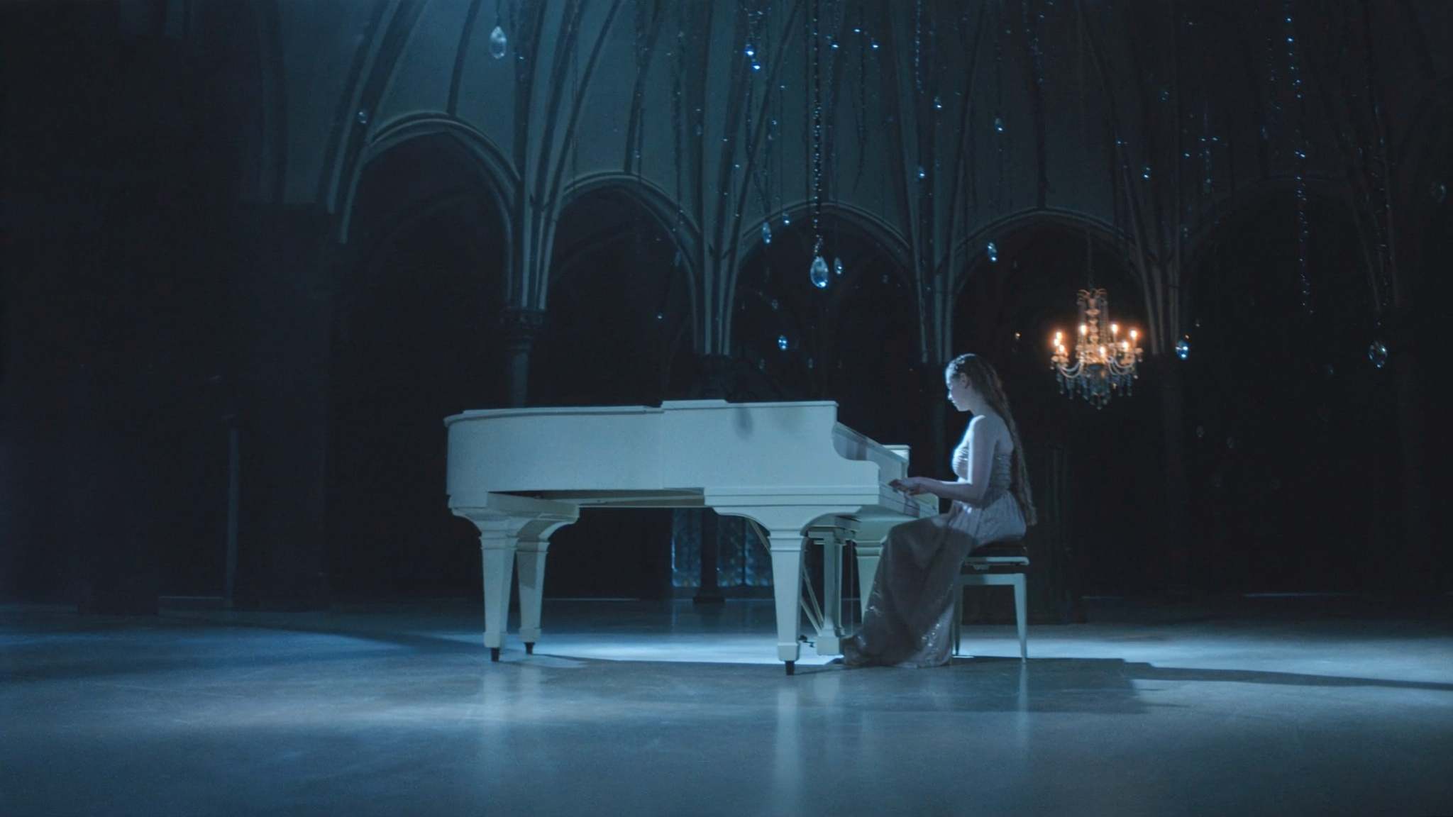
Modern AI video tools have made sophisticated lighting more accessible, but the underlying logic has not changed. Light direction tells the viewer where to look and what time of day it is. Hard light creates drama and texture; soft light flatters and soothes. High-key lighting is bright and optimistic; low-key lighting is shadowy and suspenseful. Motivated lighting, where the light source is visible or implied in the scene, such as a window, a lamp, or a neon sign, makes the world feel real.
When prompting, specify the lighting scheme explicitly: "soft window light from the left, warm fill from the right, cool rim light on the shoulders." The model will respect the direction and quality of light, and your shots will suddenly look intentional.
Lenses and Depth of Field: Building a Visual Language
Lens choice determines how the camera sees the world. Wide-angle lenses exaggerate perspective and spatial relationships; telephoto lenses compress distance and isolate subjects; normal lenses approximate human vision. Each creates a distinct feeling.
Depth of field, the zone of acceptable sharpness, is one of the most powerful tools in the visual language. A shallow depth of field, with a blurred background, focuses attention on the subject and creates intimacy. A deep depth of field keeps the whole scene sharp and suits landscapes, establishing shots, and documentary realism.
In AI video, lens language is expressed through focal length descriptions and blur cues: "shot on a 50mm lens at f/1.8, creamy bokeh in the background." Even when the model does not literally simulate optics, the visual characteristics it produces follow these cues, and the results read as intentional and cinematic.
Color Theory: How Color Drives Emotion
Color is the fastest route to emotion in moving images. Warm colors, oranges, reds, and ambers, suggest comfort, passion, and nostalgia. Cool colors, blues and teals, suggest distance, calm, and melancholy. Complementary colors create vibrancy and tension; analogous colors create harmony.
Color grading, the process of adjusting color in post-production, builds on this psychology. A teal-and-orange grade, popular in action films, pushes skin tones toward warmth while cooling the shadows, creating instant contrast. A muted, desaturated grade communicates realism or melancholy. A saturated, high-contrast grade communicates energy and fantasy.
For AI-assisted projects, decide the emotional target before you generate. "Warm, golden-hour palette with soft contrast" produces a different video than "cold, desaturated palette with deep shadows," even from the same scene description. Color direction belongs in the prompt and in the grade.
Color Grading Workflow: From Correction to Grade
A professional color workflow separates correction from grading. Correction fixes problems: white balance errors, exposure imbalances, contrast issues. Grading creates style: the look that expresses mood and identity. Skilled colorists correct first and grade second, because you cannot stylize a broken image.
The practical workflow starts with exposure and white balance. Set the image to neutral, with blacks that are not crushed and whites that are not blown out. Then address contrast and saturation before touching individual colors. Only after the image is clean do you introduce the creative grade: lift or lower shadows, tint highlights, shift specific hues, and add grain or halation for texture.
Tools like DaVinci Resolve, Premiere Pro, and Final Cut Pro all support this workflow with scopes, curves, and color wheels. Waveform monitors and vectorscopes let you measure what the eye can only approximate: exposure distribution and color accuracy. Learn to read scopes and you will stop guessing.
Color Spaces and Consistency Across Shots
Consistency is what separates professional color work from amateur adjustments. A sequence is only as strong as its weakest match: if every shot has a slightly different skin tone or sky color, the edit feels broken even when each shot is beautiful on its own.
This is where color spaces and references matter. Working in a wide color space preserves information for grading, while delivering in a constrained space like Rec.709 guarantees predictable playback. Reference frames, a hero shot that defines the look, let you match every other shot to a fixed target.
In AI-assisted workflows, consistency starts even earlier. Keep color direction consistent across prompts, reuse the same style references, and build shot lists that define palette anchors. The less the generated footage drifts, the less time you spend matching in post.
Applying These Skills to AI-Assisted Production
AI video tools are not a replacement for these skills; they are a multiplier. The same principles that guide a film set guide a prompt: decide the emotional goal, compose the frame, design the light, choose the lens language, and set the color direction. When the prompt encodes these decisions, the generated footage arrives closer to the final look, and post-production becomes refinement rather than repair.
Practical application: maintain a style guide for every project. Define palette, lighting references, lens language, and contrast targets. Use the same style tokens across prompts so the model produces coherent material. Review generated shots against the guide, and regenerate or adjust the ones that drift.
A Practical Learning Path
If you are new to cinematography and color, do not try to learn everything at once. Start with composition: shoot or generate simple frames and evaluate them against the rule of thirds, balance, and leading lines. Then add lighting: describe light direction and quality in every prompt and photograph you take. Then explore lens language and depth of field. Finally, learn color: first correction, then grading, then consistency.
For AI-assisted learners, the fastest path is comparative prompting: generate the same scene with different composition, lighting, and color instructions, and study how the output changes. Each comparison teaches one principle. Keep a reference library of frames you love, and reverse-engineer what makes them work.
Exercise: Build a One-Minute Mood Film
The fastest way to internalize these skills is to build something small with a defined emotional target. Here is a repeatable exercise.
Pick an emotion: nostalgia, tension, calm, or anticipation. Write one sentence describing the feeling you want the audience to have. That sentence is your creative brief, and every decision below must serve it.
Shoot or generate four shots. Shot one is an establishing wide: a location, clearly lit, with strong composition and a horizon or leading line. Shot two is a medium shot of a subject in that location, framed with the rule of thirds and separated from the background by backlight. Shot three is a detail close-up with shallow depth of field, something tactile, a hand, fabric, a texture. Shot four is a slow push-in on the subject's face or the product's key feature.
Edit the four shots into a sequence with simple cuts. Watch it once with sound off and ask whether the composition supports the emotion. Then grade it: set exposure and white balance first, then introduce the palette that matches your brief, warm for nostalgia, desaturated for melancholy, high-contrast for tension.
Finally, repeat the exercise with the opposite emotion using the same location. The contrast teaches you more than a hundred tutorials: you will see exactly how lighting, composition, and color move the audience, and you will carry that awareness into every prompt and every grade you write from then on.
Frequently Asked Questions
Do I need a real camera to learn cinematography?
No. AI-generated images and video respond to the same visual principles, and studying them is a valid way to learn composition and color. A real camera adds practice with optics and exposure, but the conceptual foundation is identical.
Is color grading different for AI-generated footage?
The workflow is the same, but AI footage can have quirks: color drift between frames, unnatural skin tones, and artifacts in shadows. Clean up the footage before grading, and check consistency frame to frame more aggressively than with camera footage.
Which software should I start with?
DaVinci Resolve is an excellent starting point because its color tools are professional-grade and the core version is free. Premiere Pro and Final Cut Pro are strong alternatives if you are already working in those ecosystems.
How important are color scopes for beginners?
Scopes are the difference between guessing and knowing. Start by watching waveforms and vectorscopes while you adjust exposure and color; within a few sessions you will develop intuition that matches what the scopes show.
Can AI fix a badly composed or badly lit prompt?
Models can correct some problems, but they cannot invent good composition from a vague prompt. The better your direction, the better the output. Skill in cinematography directly improves AI results, which is exactly why the old craft still matters.
How much color correction is enough?
Stop when the image is clean and the grade supports the emotion. Over-grading is as common as under-grading: skin tones that glow unnaturally, skies that turn teal by default, and crushed blacks all read as amateur. Compare your grade against a reference frame from a film you admire, and ask whether every adjustment serves the story.
Should I learn color before cinematography?
No fixed order is required, but composition and lighting shape what color has to work with, so most learners benefit from framing and light first. If you are already comfortable with composition, jump into color; the two reinforce each other quickly.
Conclusion
Cinematography and color grading are not obsolete in the AI era; they are the interface between intention and output. Models generate images, but you generate meaning. Learn to compose, light, and color with intention, and your AI-assisted productions will stand out in a sea of generic generated content. Start with one principle, apply it to your next prompt, and build from there.
