
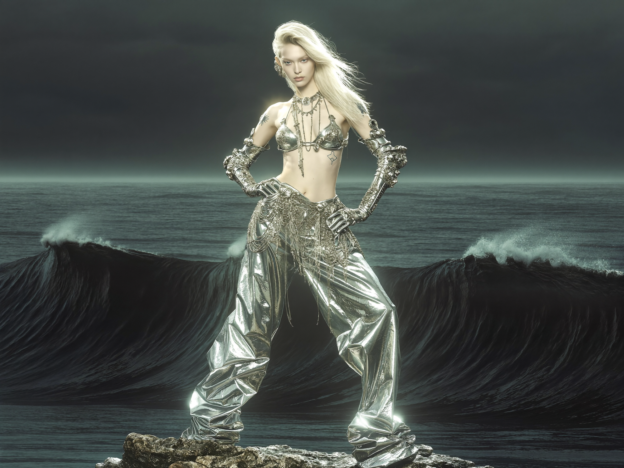
There is a reason classic Hollywood films still hold up decades after release. Beyond the stories and the faces, they were shot with a visual grammar so consistent and so expressive that the imagery itself carries meaning. Rich key lighting, deep pools of shadow, bold color palettes, and elegant grain made every frame feel intentional. For a long time, reproducing that look demanded expensive cameras, specialist lenses, big crews, and patient postproduction. Today, AI filters and generative tools let anyone reach for that same cinematic language from a single computer. This article unpacks the techniques of that classic Hollywood aesthetic and shows you how to apply them with AI, whether you are cutting a short film, building a branded video, or just trying to make your content look deliberate rather than accidental.
The promise is not that you can fake an old movie. It is that you can learn, reproduce, and combine the real principles behind that era's filmmaking, the same principles cinematographers still use today. By the end of this guide you will know how to describe light, lens, color, and texture in terms a generative tool understands, how to keep those choices consistent across an entire project, and how to troubleshoot the common failures that make AI footage look flat or artificial. You will also have a set of reusable recipes for specific looks, from film noir to Technicolor, that you can adapt to any subject.
Why the Classic Look Still Matters
Cinematic style is not nostalgia for its own sake. A well-executed classic look communicates craftsmanship and credibility in a matter of seconds. When a viewer sees dramatic key lighting and controlled color, they subconsciously read the piece as serious, premium, and considered. In a landscape flooded with flat, evenly lit clips, a distinct visual style is a reliable way to stand out.
The classic Hollywood palette also encodes emotion in ways that survive translation. Warm, saturated colors read as optimism and nostalgia; shadow-heavy contrast reads as mystery and danger; muted earthy tones read as grounded and authentic. By deliberately choosing a look, you tell the audience how to feel before a single line of dialogue lands. That is a tool worth having, and AI filters make it practical to wield.
The Visual Ingredients of Classic Hollywood
Dramatic Key Lighting and Chiaroscuro
The single most recognizable trait of classic cinematic imagery is a lighting style built on strong directional light. One main source models the subject, throws sculptural shadows, and creates depth that flat lighting can never match. When that light is pushed to the extreme, with deep blacks and stark contrast, it becomes the chiaroscuro look associated with film noir and dramatic character studies.
Reproducing this in AI means telling the tool where the light is coming from rather than how the image should feel. Name the key light, keep your fill minimal, and let shadows fall where they may. The model will read that structure and produce the sculpted, dramatic result you are after.
Depth of Field and Classic Lenses
Vintage lenses had their own character. They were often softer in the corners, slightly lower in contrast than the tack-sharp digital look, and prone to gentle flares. Above all, the shooting style relied on selective focus, using a shallow depth of field to pull the subject away from the background and make the viewer focus on exactly one plane of the image.
With AI filters you can request lens character directly. Ask for a specific focal length look, mention a wide aperture, and allow the background to fall into creamy bokeh. This instantly imparts a filmic quality regardless of what the underlying footage looks like.
Color Science and More Than a Grade
Classic films did not simply add a color tint. Their look came from light sensitivity of film stocks, from the meticulous work of color consultants, and from release printing, all of which produced specific, deeply layered palettes. Modern AI color tools let you pivot the entire palette of a scene deliberately, controlling shadow temperature, highlight warmth, and overall saturation as elements of storytelling.
The Technicolor era pushed this further with famously saturated, saturated, three-color frames. Recreating that style means high saturation, clean primary colors, and minimal realism muddiness. It is bold, but when used deliberately, it reads instantly as a period choice rather than an accident.
Grain as a Finishing Texture
Grain has a reputation as a shortcut to vintage, but it is better understood as a texture that unifies a frame. Applied lightly, it softens digital edges, blends the seams between generated elements, and gives the whole project a consistent, analog finish. It should never do heavy lifting on its own. The cinematic feel comes from light and color; grain is the layer that holds it together.
How AI Tools Translate These Techniques
The clearest way to think about AI filters is as a stack of controllable decisions. Some filters automate an entire look in one click, applying grade, grain, and vignette together. Others expose individual controls so you can build a style from the ground up, adjusting light reaction, color response, lens character, and texture separately.
The most advanced workflows go beyond filters into generative direction. A direction system can read a written brief and propose camera movements, lighting setups, and compositions, then carry those choices into the model that renders the final video. That means you can describe a classic Hollywood scene and have the tool compose, light, and grade it coherently in one pass, with the same creative intent preserved shot after shot.
Multi-Image Fusion for Consistency
Staying consistent across many shots is the real test of any cinematic workflow. Classic Hollywood maintained continuity through discipline on set. In AI, you maintain it through reference imagery. Multi-image fusion combines several reference frames so that a character's face, a wardrobe, and a specific lighting scheme stay locked as you generate more of the scene. Without this, each clip drifts and the "look" never truly holds.
When you build a project around a classic aesthetic, set your style rules once and reference them in every shot. A short style bible, one line each for lighting, palette, lens, and grain, is enough to keep the entire sequence feeling directed rather than assembled.
Practical Recipes for Specific Classic Looks
Film Noir
Describe hard, high-contrast light from a single strong source, deep blacks, strong silhouettes, and minimal fill, with a palette heavy on cooler shadows and a cigarette-smoke atmosphere. The pinstriped shadows of window blinds and a low single street lamp work beautifully as signature elements. Because noir relies so heavily on shadow, it is an excellent learning tool: it forces you to think about where light is, where it is not, and what the balance between the two communicates.
Golden Age Warmth
Lean on warm highlights, a slightly lifted black level, and gentle contrast. Subjects glow rather than carve. Skin tones stay natural and flattering. The mood is optimistic and romantic. Keep grain fine and unobtrusive. This look flatters a wide range of subjects, which makes it a dependable default for commercial work, but gentle does not mean weak; it still needs a defined key light so the frame has sculpt and range rather than a flat, milky wash.
Three-Strip Technicolor
Push saturation hard while keeping colors clean and true. Aim for the bold primaries of mid-century musicals and adventure films. Even a mundane scene becomes vibrant. Use it sparingly for maximum effect, and try to match the palette across a whole sequence to avoid a jumbled look. The trick is controlled boldness; the saturation amplifies color that is already designed into the set, costume, and props, so build the world to match before you saturate the grade.
Naturalistic Period Drama
Mute the palette, keep shadows soft and brown-leaning, and let light feel motivated and soft from windows or candles. Grain can be a little more present here to evoke celluloid. This is the ideal choice for heritage, historical, or nostalgic storytelling. Because the signature is understated, every choice must be disciplined; small inconsistencies in color that would be hidden by a bold grade become obvious in a muted one, so lock your palette early and honor it scene after scene.
A Workflow for Recreating and Learning the Look
Study a Reference Scene
Choose a two-minute scene with the look you want and transcribe its decisions, not just its style label. Note the key light direction, whether the shots use deep or shallow focus, the dominant colors, and the weight of the grain. This written description becomes your creative brief. Writing it down is the point; the moment you have to describe why a frame works, you begin to internalize the principles rather than just copying a surface.
Lock the Scene Rules
Turn that brief into fixed rules for your project, applied to every shot. Repeating the same light and palette descriptors keeps the aesthetic coherent and teaches you, through repetition, exactly which words produce which results. Keep the rules short enough to paste into every prompt, usually a single sentence for lighting and a single sentence for color. If you cannot state your scene's rules in a sentence, you do not yet understand the look well enough to execute it reliably.
Iterate in Small Passes
Work in short passes, adjusting one variable at a time. Keep every experimental frame in a folder and compare at the end of the session. Focused, repeated refinement teaches far more than running dozens of one-off experiments with no record. Label each pass with its change, such as hard-to-soft light, warm-to-cool shadows, so you build a real reference library of cause and effect instead of an undifferentiated pile of images.
Troubleshooting the Classic Look
My footage looks like a filter was slapped on. The grade is too uniform. Vary shadow and highlight treatment, introduce a defined key light, and let some elements go dark so the frame has range. A look becomes a costume when it flattens everything equally; contrast between lit and shadowed areas is what makes a frame feel intentional.
It looks old but not good. You are relying on grain and sepia alone. Add the missing structural elements, contrast, lens character, and composition. Vintage feel is structural, not cosmetic. If you strip the grain away and the frame still reads as period, you have built the look correctly.
The colors look muddy. Saturation without control produces mud. Choose one dominant hue and hold the palette tight while keeping neutral skin and shadow tones clean. When too many hues compete for attention, the result reads as noise, so discipline the number of colors rather than simply reducing saturation overall.
Different clips clash. This is a continuity problem. Apply one shared style bible to every shot and use multi-image fusion so characters and lighting stay locked. Clashes almost always stem from changing the rules between shots, so first check that the descriptors actually match, then look at the tooling.
The result is too soft to read on a phone. Compression kills fine detail. Slightly increase contrast and keep the key light strong, so the look survives small screens. Test your final grade at the actual delivery format and screen size rather than judging it only on a large calibrated monitor.
Using Classic Technique Across Modern Contexts
The classic Hollywood grammar works far beyond period drama. A luxury product spot can borrow golden-age warmth to feel aspirational. A documentary can use naturalistic muted color for authenticity. A music video can lean on high-contrast chiaroscuro for drama. A brand want to feel timeless might adopt a restrained, filmic grade as its entire identity.
The key is walking the line between period and timeless. The technique is at its most powerful when it reads as deliberate craft rather than costuming. Aim to make your footage feel considered and premium, not like a heritage theme park.
Frequently Asked Questions
Is it hard to get a convincing classic Hollywood look from AI?
The fundamentals, strong key lighting, controlled color, and grain, are very approachable. The hard part is consistency and restraint. Most beginners overdo grain and saturate everything; the convincing results come from being disciplined about a tight palette.
Do I need a powerful computer?
Typical consumer hardware can run filters easily. Generative direction and fusion workflows are heavier, especially for video, so budget for longer render times or a cloud solution as you scale up.
Can I use these techniques in short-form social video?
Yes. In fact, the classic look helps short videos stand out precisely because most short content is flat and evenly lit. Keep the look bold enough to survive phone compression.
Does the classic look work for modern, realistic stories?
It can, if you choose a restrained version, naturalistic muted color with soft motivated light reads as premium realism rather than vintage costuming.
What should I practice first?
Lighting direction. Before worrying about color and grain, learn to state clearly where the key light comes from and how hard or soft it is. Everything else builds on that foundation.
The tools have democratized something the Hollywood studios spent decades and fortunes perfecting. You no longer need a camera department to control light and color with intent. What you still need is the eye to decide what the frame should feel like and the discipline to execute that decision consistently. Learn the vocabulary, lock your scene rules, iterate in small passes, and the classic cinematic look becomes something you can produce on demand rather than admire from a distance.
