
The thumbnail is the front door of every video, and most creators treat it like a formality. They pick a random frame, slap a title on it, and upload. Meanwhile, the channels that grow consistently treat the thumbnail as a miniature poster designed with the same discipline as a film marketing campaign.
The numbers back this up. Studies of video platforms consistently show that a well-designed thumbnail can double the click-through rate compared to an auto-selected frame. In a feed where the viewer decides in a fraction of a second, the thumbnail is not decoration. It is the entire first impression, and often the only one you get.
The good news is that thumbnail design is a learnable craft, and the most effective techniques come from a surprising place: film editing and montage. Composition, depth of field, dramatic lighting, and typography-as-scene-element are all borrowed from cinema. This guide walks through those techniques and shows how AI tools can speed up the design process without replacing your judgment.
Why thumbnails decide whether a video lives or dies
The viewing journey starts before the video plays. The algorithm surfaces a video based on predicted engagement, but the human decision happens in the feed: do I click this or scroll past? That decision is visual, instantaneous, and emotional. The thumbnail either creates a micro-promise that feels worth two minutes of attention, or it does not.
A good thumbnail answers three questions at a glance: what is this about, why should I care, and what will I get. The worst thumbnails answer none of them and rely on noise: too many elements, muddy contrast, tiny text, generic stock energy.
The montage connection matters because editing is fundamentally about selecting and emphasizing. A film editor does not show everything; they show the frame that carries the most meaning. A thumbnail designer does the same with a single image. Every element that does not earn its place should be removed.
Composition: directing the eye with cinematic framing
Composition is the backbone of any successful thumbnail. The goal is to move the viewer's eye to the most important element — usually an expressive face or the focal point of the story — in under a second.
The rule of thirds is the classic starting point. Divide the frame into nine sections and place the focal point on one of the intersections. Faces work especially well in the upper third, where they mimic the natural reading path. Leading lines — roads, arms, sightlines, edges of objects — should point toward the focal point rather than away from it.
Dramatic focus is the montage principle applied to a still: one clear subject, one clear emotion, everything else subordinate. If the viewer has to search for the subject, the thumbnail has already failed. A single expressive face with a clear emotion beats a crowded scene every time.
Negative space is not wasted space. It gives the eye a place to rest and gives the text room to breathe. Thumbnails that cram every pixel with content feel exhausting, which is the opposite of inviting.
Color and contrast: the psychology of the click
Color is the fastest emotional signal available to a designer. It works before the brain processes what the image actually shows. Bright, clean colors with high contrast survive the small screen of a phone feed; muddy colors disappear.
Warm colors — reds, oranges, yellows — communicate energy, urgency, and appetite. Cool colors — blues, purples, teals — communicate calm, mystery, and professionalism. The most effective thumbnails usually create a deliberate contrast between the background and the subject: a bright subject on a dark background, or a saturated subject against a desaturated scene.
The three-second readability test matters more than taste. Shrink your thumbnail to the size it appears in a feed and ask: can I still tell what is happening? If not, increase the contrast, simplify the background, or enlarge the subject. Design at the size it will actually be seen, not at full resolution.
Typography as a scene element, not a caption
Text on a thumbnail is a recurring debate: some creators use it, some avoid it entirely. The evidence suggests text helps when it adds information the image cannot convey, and hurts when it duplicates or crowds the image.
The montage principle here is that text should behave like a scene element, not like a caption pasted on top. It should be integrated into the composition: placed where the eye naturally lands, sized to be readable at feed dimensions, and limited to two or three words. "I tried this" works. A full sentence does not.
Font choice communicates tone. Bold, chunky fonts read as direct and confident. Thin, elegant fonts read as premium and subtle. The font should match the video's personality, and the text color should contrast with the image behind it. A white outline or dark shadow keeps text readable over busy backgrounds.
Depth of field: the fastest way to look professional
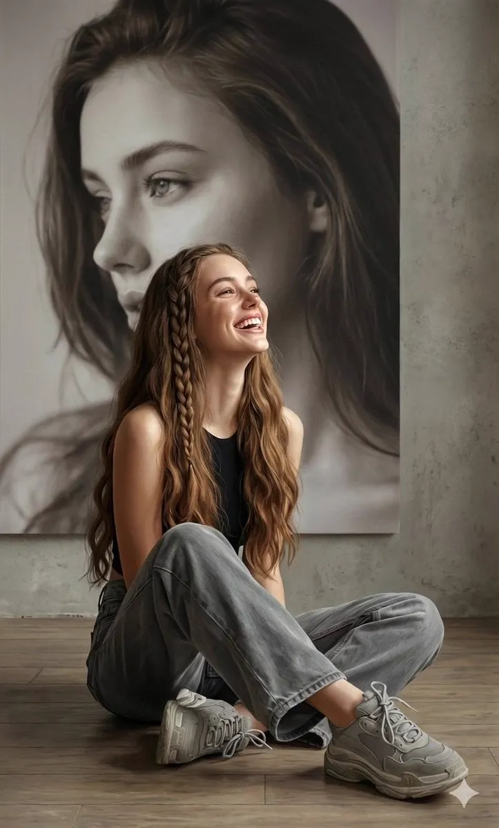
Shallow depth of field — a sharp subject with a blurred background — is one of the most reliable professional signals in visual media. It immediately tells the viewer where to look and gives the image a cinematic quality that flat, everything-in-focus frames lack.
You do not need a real camera lens to achieve this. Most image editors and AI tools can simulate depth of field in a few clicks: select the subject, apply a blur to the background, adjust the strength. The effect is especially powerful for portrait thumbnails, where the face stays sharp and the environment melts away.
Use depth of field deliberately: blur to reduce noise, keep the focal point sharp, and let the background hint at context without competing for attention. The result is a thumbnail that feels like a film still rather than a screenshot.
Dramatic lighting: the mood that sells the story
Lighting direction is one of the most underused tools in thumbnail design. Side lighting creates mystery and depth. Low-key lighting with strong shadows signals drama, danger, or intensity. High-key lighting signals optimism and clarity. The same subject photographed or rendered in different lighting tells completely different stories.
Study the lighting in movie posters and cinematic trailers. The pattern is consistent: one strong light source, visible shadows, and a mood that matches the genre. A horror video needs hard shadows. A tech review needs clean, even lighting. A travel video needs warm, golden-hour tones.
When working with AI image generation, lighting is one of the highest-leverage prompt elements. Adding "dramatic rim light" or "golden hour, low angle" to a prompt changes the entire emotional register of the output. Spend time here; it pays off more than any other single prompt word.
Using AI tools to accelerate the thumbnail workflow
AI image generation and editing tools have made professional-looking thumbnails accessible to everyone. The workflow that works best is a combination: generate options with AI, refine with classic design principles, and validate with a quick readability test.
Start by generating three to five variations of the core concept. Vary the composition, lighting, and emotional tone. Do not settle for the first output; the differences between variations are exactly where your design judgment matters. Pick the strongest base, then iterate on the weak spots: faces, contrast, text placement.
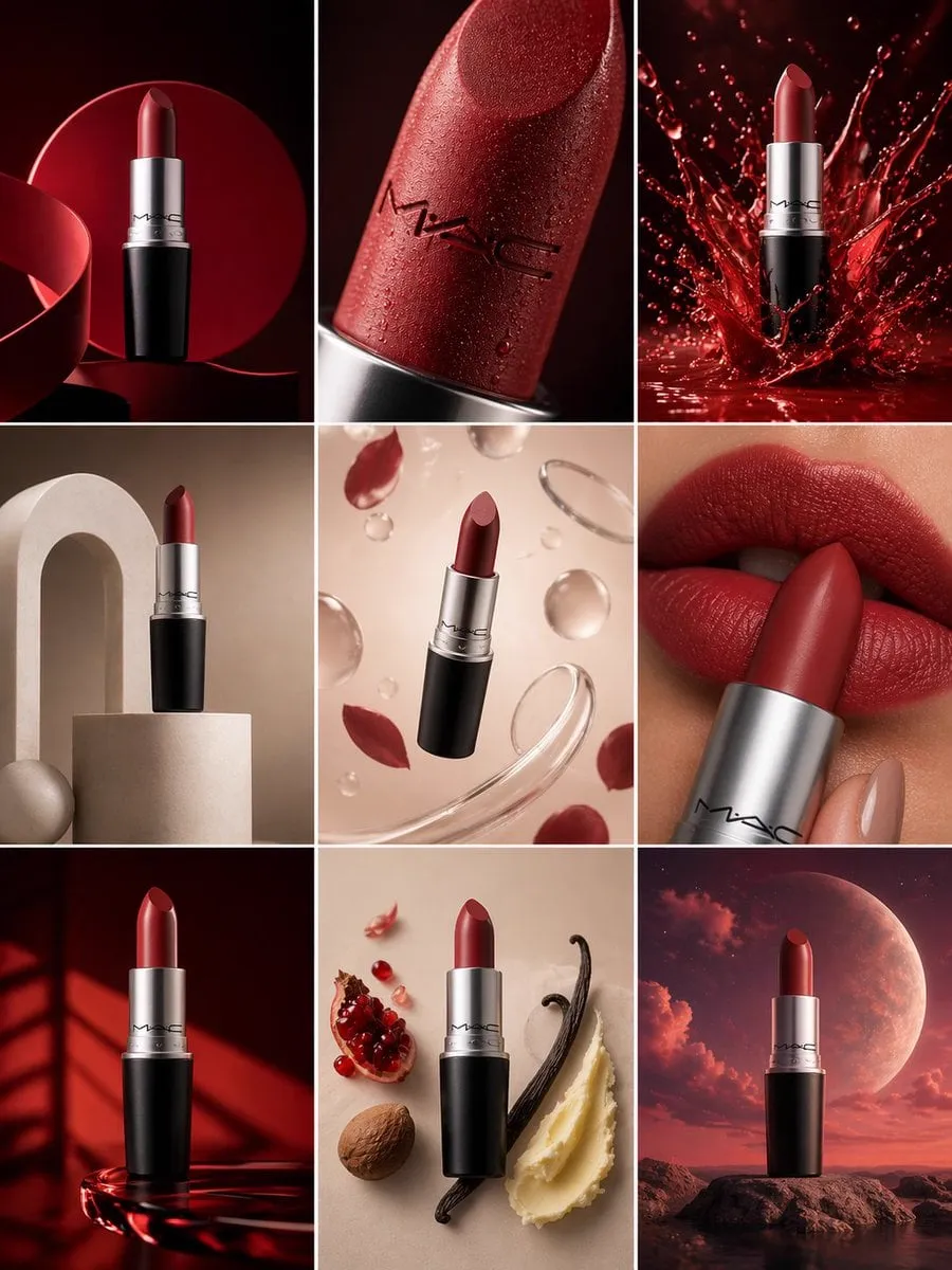
For creators producing thumbnails in series, consistency is a superpower. A recognizable visual system — same character style, same color palette, same text treatment — builds brand recognition over time. Viewers start to identify your videos before they read the title.
AI also helps with the tedious parts: removing backgrounds, upscaling to high resolution, and generating custom backgrounds that match the video's theme. Use the tool for leverage, and reserve your energy for the decisions that shape the result.
Three thumbnail archetypes that consistently perform
Beyond the techniques, real-world thumbnails tend to cluster into a few proven patterns. Knowing the archetypes helps you choose the right one instead of inventing a design from scratch every time.
The story-driven thumbnail shows a moment of tension: a person mid-reaction, a situation frozen at its peak, a "something is about to happen" energy. It works for documentaries, true stories, and experiments. The viewer clicks to find out how the moment resolves.
The result thumbnail leads with the outcome: the finished dish, the transformed room, the before-and-after split, the product in action. It works for tutorials, reviews, and transformations. The promise is immediate and concrete: this is what you will get.
The emotional reaction thumbnail centers a single expressive face with a strong emotion — shock, joy, disbelief. It works for reaction content, opinions, and personal stories. Faces are the fastest emotional signal the human brain processes, which is why this pattern outperforms in crowded feeds.
A useful exercise is to sort your niche's top-performing thumbnails into these three archetypes. You will quickly see which one your audience rewards, and you can build your series around it while keeping the others in your back pocket for variety. Most channels discover that a single archetype becomes their default, with the other two reserved for special videos where the topic demands a different emotional register.
A step-by-step thumbnail workflow
Here is a repeatable process that combines montage thinking with AI speed:
First, define the promise. Write down what the viewer gets from this video in one short phrase. This phrase will inform both the image and the text.
Second, choose the focal point. Pick the single element that best represents the promise: an expressive face, the product, the before-and-after, the shocking result.
Third, generate or select the base image. If you are generating, write a prompt with subject, composition, lighting, and style. If you are selecting from footage, choose a frame where the emotion is clearest.
Fourth, apply the montage pass. Crop for the rule of thirds, blur the background, boost contrast, adjust the color grade. Remove anything that distracts.
Fifth, add text if it earns its place. Two or three words, readable at feed size, placed where the eye lands, with strong contrast.
Sixth, run the readability test. Shrink to feed size, check it in both light and dark mode, and ask the three questions: what, why, what do I get. Compare against your previous thumbnails to see if the new one stands out.
Common mistakes and how to fix them
Too many elements. The viewer's eye has nowhere to land. Fix: reduce to one focal point, one supporting element, one short text.
Low contrast. The thumbnail disappears in the feed. Fix: increase background-subject separation, saturate the subject, darken or lighten the background.
Text that repeats the title. Wasted space. Fix: use text to add a new angle, an emotional word, or a number. "3 tools" adds information; "How to edit" duplicates the title.
Designing at full size. Feed readability is the real test. Fix: always preview at actual display size before publishing.
Ignoring series consistency. Every thumbnail is a different style, so no brand recognition builds. Fix: define a mini style guide for your channel and reuse it.
Frequently asked questions
Should every video have text on the thumbnail?
No. Text helps when it adds information, hurts when it crowds the image. Strong images with a clear subject often work better without text.
How long should I spend on a thumbnail?
Treat it as part of production, not an afterthought. Fifteen to thirty minutes per thumbnail is reasonable for a serious channel. The click-through lift is worth more than most editing refinements.
Can I use AI-generated faces in thumbnails?
Yes, but check the platform's policies and keep them consistent with the video content. A misleading thumbnail that promises something the video does not deliver burns trust and hurts long-term growth.
Do thumbnails matter on short-form platforms?
They matter wherever viewers choose what to watch. In short-form feeds the video preview plays automatically, so the first frame does the job of the thumbnail. Design the opening frame with the same discipline.
What is the fastest way to improve my thumbnails this week?
Pick your last five videos and compare their thumbnails at feed size. Identify the weakest one, redesign it with one focal point, stronger contrast, and integrated text, and use that as the new baseline.
The thumbnail is where editing skill and marketing instinct meet. The same discipline that makes a film cut feel inevitable — selection, emphasis, rhythm — applies to a single frame designed to stop a thumb. Master composition, lighting, and contrast, use AI to generate and refine options faster, and test relentlessly. Click-through rate is a scoreboard; the design system you build is the game.
