

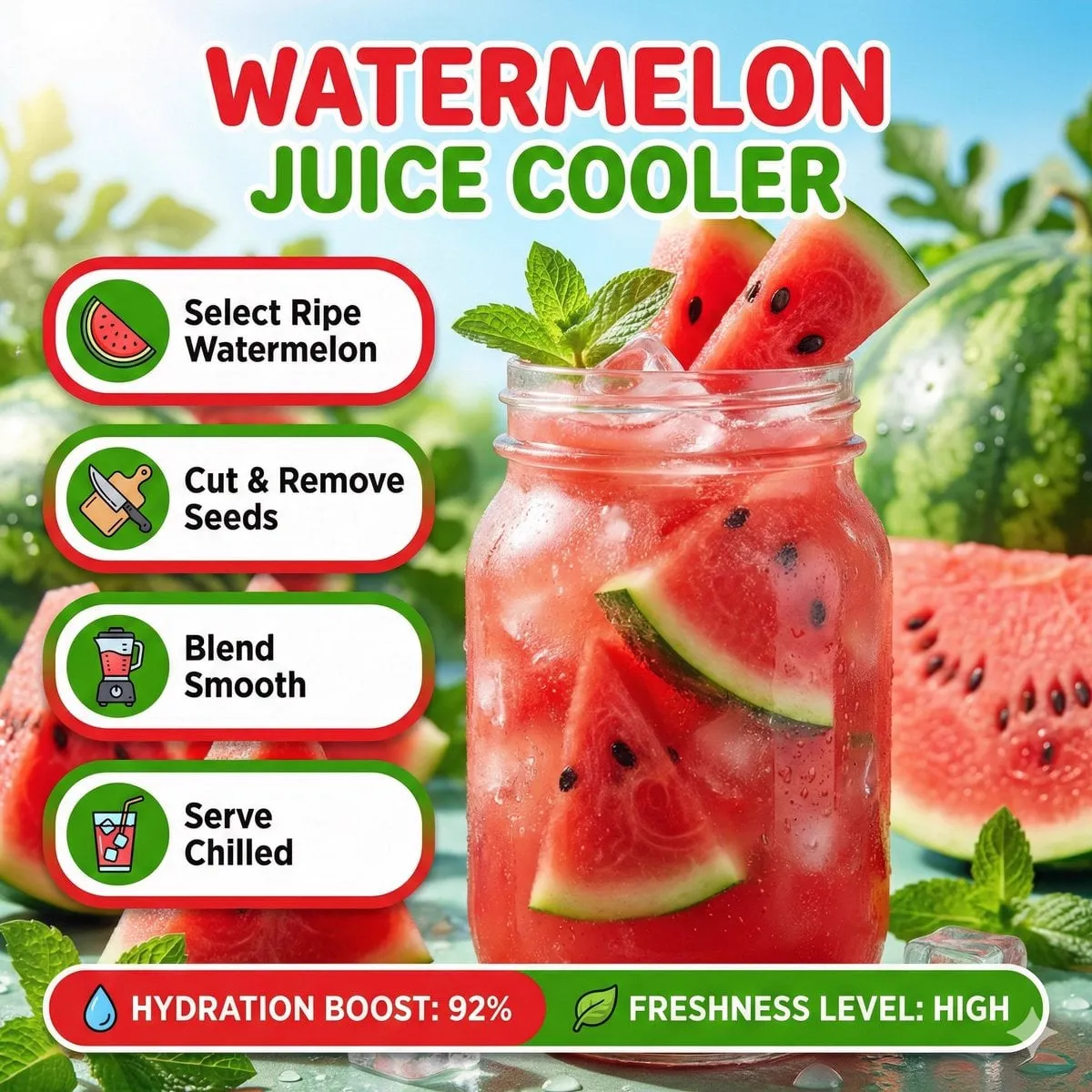
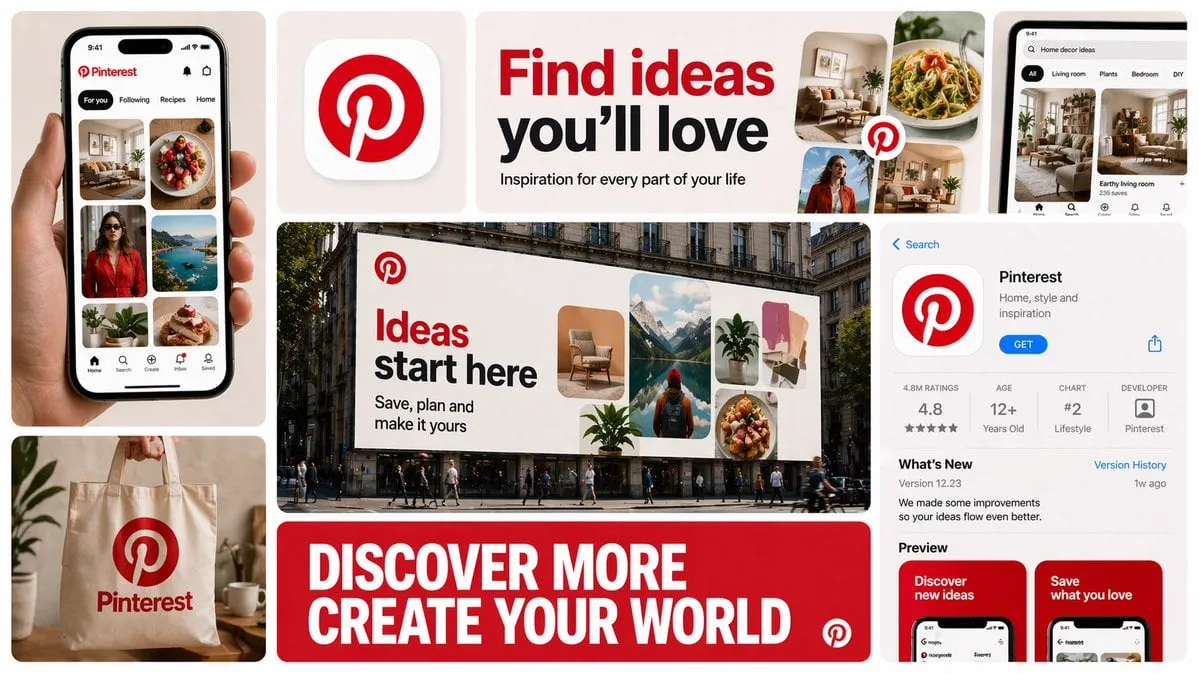
On Instagram, the thumbnail is the first impression, the only impression most viewers will ever get. Scrolling through Reels, users decide in a fraction of a second whether to stop or keep moving, and that decision is made almost entirely on the cover image. A great Reel with a weak thumbnail gets skipped; a decent Reel with a great thumbnail gets watched. The math is brutal, and it explains why thumbnails have become one of the most important design assets in short-form content.
The challenge is that producing high-quality, platform-optimized thumbnails at volume is slow and expensive if done manually. This is where AI-assisted design changes the game. With the right workflow, you can generate, test, and refine thumbnail concepts in minutes instead of hours, and you can do it consistently across an entire content calendar. This guide covers the anatomy of a strong Reel thumbnail, how to set up an AI-assisted design workflow, how to write prompts that produce usable images, and how to run quick A/B tests so your covers improve over time.
Why Thumbnails Decide Reels Performance
Instagram is a visual discovery engine. Users are not searching for content by keyword; they are scrolling a feed and letting their eyes do the filtering. In that environment, the thumbnail is your only advertising slot. If it does not communicate value instantly, nothing else about the video matters, because the video never gets played.
Several factors make this even more important in the current algorithm. Reels are recommended to people who have never heard of your account, which means your cover image must work on strangers with zero context. The first moments of the video matter too, but the thumbnail is the gate. Data from content marketers consistently shows that optimizing the cover image lifts click-through rates substantially, and creators who treat thumbnails as a deliberate design task outperform those who let the platform auto-pick a random frame.
There is also a compounding effect. Higher click-through and watch rates feed the algorithm's engagement signals, which pushes the Reel to more people, which generates more views. The thumbnail is not just a cosmetic choice; it is a performance lever.
The Anatomy of a High-Performing Reel Thumbnail
Before using any tool, understand what makes a thumbnail work. Strong Reel covers share a set of visual properties.
Clarity at a Glance
The thumbnail must communicate the video's topic in under a second. That means one clear subject, minimal clutter, and a focal point that survives the small size of a phone screen. If a viewer has to squint or wonder what they are looking at, the thumbnail has failed. Test this literally: shrink the image to thumbnail size and see whether the subject is still obvious.
Visual Contrast and Color
Feed thumbnails compete with dozens of other images, so contrast is survival. Bright, saturated colors, strong light-versus-dark separation, and a subject that pops from the background all help. This does not mean every thumbnail should be neon; it means the visual hierarchy must be unmistakable. A well-lit face, a bold product shot, or a dramatic scene with clear edges outperforms a washed-out, low-contrast image.
Emotion and Curiosity
Thumbnails that show a human face with a readable expression outperform generic or static covers. Faces draw attention, and expressions communicate the emotional hook: surprise, excitement, a problem being solved. Beyond faces, an unexpected element or a bold claim in the text creates curiosity. The goal is to make the viewer feel they are missing something if they keep scrolling.
Text That Supplements, Not Repeats
Short text on a thumbnail can boost performance when it adds information: a number, a promise, or a category label. Avoid text that merely repeats the caption or takes up half the frame. Keep it to a few words, readable at a glance, with strong contrast against the background. The text should answer one question: why should I watch this?
Platform Fit
Remember the final crop. Reels thumbnails display in a 9:16 vertical frame, and the safe area matters because text and faces can get cut off by the interface elements. Design for the center of the frame and keep critical elements away from the edges. What looks good in your editing software may be cropped differently in the feed.
Setting Up an AI-Assisted Thumbnail Workflow
An AI-assisted workflow turns thumbnail production from a bottleneck into a pipeline. The goal is to produce several strong candidates per Reel, then pick and refine the best one.
Step 1: Define the Visual Direction
Before generating anything, decide the concept. What is the single most interesting moment or idea in the video? What emotion should the cover convey? What style matches your brand, photographic, illustrated, bold graphic, minimal? Write this down as a short creative brief. AI works best when it has a clear target, and this step keeps your output from being generic.
Step 2: Generate Candidates from the Video or Brief
Two approaches work well. The first is frame selection: extract strong frames from the video itself and use them as the base. The second is generative: create new cover images from text prompts based on the concept. In practice, the best workflow combines both. Extract three or four promising frames, then use AI to enhance, recompose, or restyle them, and also generate a couple of fully fresh concepts. You end up with a small set of distinct candidates rather than one lucky shot.
Step 3: Add Text and Brand Elements
Once you have strong base images, add the text overlay and brand styling. Keep the text short and high-contrast, and position it in the safe area. Apply your brand font and colors consistently so the feed starts to look like a cohesive collection. This step is where a template pays off: if every thumbnail follows the same layout rules, your channel builds recognizable visual identity.
Step 4: Review at Real Size
View every candidate at actual phone size before choosing. Zoomed in on a desktop monitor, a thumbnail can look amazing and still be illegible in the feed. Check the subject, the text, and the emotional impact at the size viewers will actually see. This review step is non-negotiable.
Prompting Techniques for Thumbnail Images
When using generative tools, the prompt quality determines the output quality. A vague prompt produces generic images; a specific prompt produces usable covers. Here are the techniques that matter.
Describe the Subject, Style, and Composition
A strong prompt includes what is in the frame, the visual style, and the composition. For example, instead of "a cooking video thumbnail," write "a close-up of a chef holding a cast-iron pan, warm studio lighting, high contrast, shallow depth of field, subject centered, vibrant colors, photorealistic." The more concrete the description, the more control you have.
Include Lighting and Mood Words
Lighting drives the emotional feel of an image. Words like "dramatic side light," "soft morning light," "neon glow," or "high-key bright" change the result dramatically. Decide the mood of the video first, then translate it into lighting language.
Use Negative Descriptions for Control
If the tool supports negative prompts, use them to block common problems: blurry, distorted hands, cluttered background, extra text, watermark. These guardrails save a lot of retry time.
Iterate from the Best Result
Treat generation as an iterative process. Pick the strongest output, then refine: change one element at a time, such as the camera angle, the expression, or the background, and see which variation works better. The final thumbnail is rarely the first generation; it is the product of three or four focused iterations.
Keep a Consistent Style Vocabulary
If you want a recognizable channel aesthetic, reuse the same style descriptors across all your prompts. Write a short style block, like "bold colors, clean composition, subject right of center, space for text on the left," and paste it into every prompt. Consistency across the feed builds brand recognition, which compounds over time.
Adding Text Overlays and Brand Elements
Text overlays are where thumbnails often go wrong, either overcrowded or too timid to matter. The right approach is minimal and strategic.
Choose a Maximum of Four Words
The best thumbnail text is a phrase that creates curiosity or a number that promises value. Four words is a good ceiling. Anything longer becomes a paragraph nobody reads. If the concept cannot be expressed in four words, the concept is too complex for a thumbnail.
Prioritize Readability
Text must be legible at thumbnail size on a small screen. Use bold weights, large relative size, and strong contrast between the text and its background. When the background is busy, add a subtle shadow, outline, or scrim behind the text. Never rely on color contrast alone, because brightness differences matter more than hue differences in a busy feed.
Align Text with the Visual Hierarchy
The text and the subject should not fight for attention. If the subject is a face, place the text where it does not cover the eyes. If the subject is a product, put the text in a consistent corner. Your layout should guide the eye: subject first, text second, both instantly.
Standardize Brand Placement
Treat the thumbnail as a mini-brand asset. Keep your logo placement, font choices, and color accents consistent across the calendar. When viewers see your thumbnail style in the feed, they should recognize it as yours before reading the account name. That recognition is a form of trust, and it improves click-through over time.
Batch Producing and A/B Testing Thumbnails
One of the biggest advantages of an AI-assisted workflow is the ability to test. Individual creators rarely test thumbnails because it feels like extra work, but the payoff is real: a thumbnail that lifts click-through by even a few percent multiplies across every view the Reel gets.
Build a Candidate Pool per Reel
For each Reel, produce at least three distinct thumbnail concepts. Diversity matters: vary the emotion, the text, or the composition so you are testing a real difference, not subtle variations of the same idea. Log each candidate with its concept, so you can learn which directions work for your audience.
Use Stories to Run Quick Polls
Instagram Stories offers a fast, free testing method. Post the candidate thumbnails as a poll and let your audience vote. The sample is small and biased toward existing followers, so treat it as directional feedback rather than scientific proof, but it is surprisingly useful for catching weak concepts before they go live.
Rotate Covers After Publishing
Instagram lets you change the cover image of a published Reel. Use this to run a lightweight post-hoc test: publish with the first choice, then swap to a second candidate after a day and compare early view and profile-visit metrics. This is not a controlled experiment, but it often reveals which cover style performs better with the wider algorithm audience.
Track What Wins
Keep a simple record of thumbnail concepts and their performance: the concept, the text, the style, the click-through or view outcome. Over a few months, patterns emerge. You will learn whether your audience responds to faces, bold text, bright colors, or specific emotional hooks, and you can bias future prompts toward the winners.
Common Thumbnail Mistakes and Fixes
Even experienced creators repeat the same thumbnail mistakes. Here are the most common ones and how to fix them.
Letting the Platform Auto-Pick a Frame
The default cover is a random frame, usually mid-motion and unflattering. Always set the cover manually. The few seconds this takes are the highest-return design work you can do for a Reel.
Cramming Too Much into the Frame
Busy thumbnails fail the glance test. One subject, one message, one focal point. If the image has competing elements, crop or regenerate with a simpler composition.
Illegible Text
Thin fonts, low contrast, and tiny text are the classic text failures. Use bold weights, high contrast, and short phrases, then verify legibility at thumbnail size.
Ignoring the Safe Area
Covers that look right in the editor but get cropped by the interface lose their message. Keep critical content in the central area and test the final crop before publishing.
Inconsistent Channel Style
A feed where every thumbnail looks different reads as scattered and unprofessional. Standardize the layout, colors, and text style so the channel develops a visual identity.
Never Testing
Publishing the first idea without alternatives leaves performance on the table. Build the habit of generating multiple candidates and choosing deliberately.
Frequently Asked Questions
What size should an Instagram Reels thumbnail be?
Design for the 9:16 vertical format at the highest resolution the platform supports, typically 1080 by 1920 pixels. Keep critical content, faces, and text within the central safe area so nothing is lost to interface cropping.
Can I use AI to design thumbnails without design skills?
Yes. Modern AI image tools let you describe the scene you want and generate it, and most platforms also offer templates for text overlays. The skill shifts from drawing to directing: writing clear prompts, choosing between candidates, and making deliberate layout decisions. That is learnable by anyone.
How many thumbnail variations should I make per Reel?
At least three distinct concepts. The point is to test real differences, so vary the emotion, the text, or the composition. For high-stakes content, five or more candidates give you a stronger pool.
Is it better to use a frame from the video or generate a new image?
Both, in sequence. Start with the strongest frames from the video because they represent real content, then use AI to enhance, recompose, or restyle them. Also generate one or two fully fresh concepts for comparison. This gives you authentic and creative options side by side.
How important is the text on a thumbnail?
Text helps when it adds information and hurts when it adds clutter. A short, high-contrast phrase that creates curiosity or promises value can lift click-through. Never repeat the caption, and never let the text cover the subject's face.
How do I know which thumbnail works best?
Combine methods: poll your audience in Stories for quick directional feedback, rotate covers after publishing to compare early performance, and track your own data over time. The patterns that emerge from your own content are the most reliable guide.
Thumbnails are the front door of your Reels, and AI has turned thumbnail production from a slow manual craft into a fast, testable workflow. Define the concept, generate a strong candidate pool, apply consistent text and branding, and test your way toward what works. Do this across your entire calendar, and the feed itself becomes a piece of design: recognizable, clickable, and steadily improving.
