
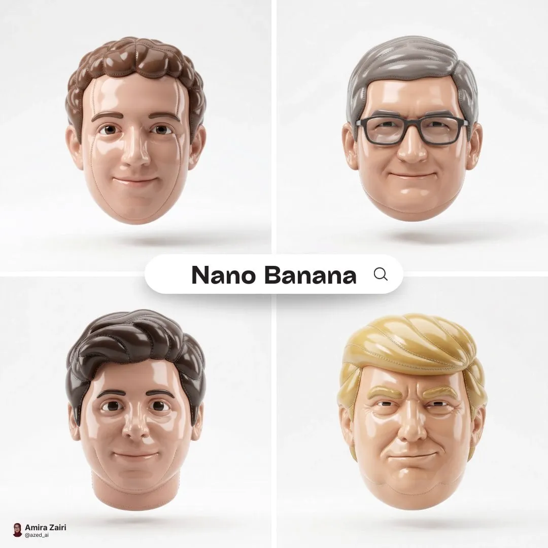


In a world where everyone can produce moving images, looking different has become more valuable than looking technically perfect. Viewers are drawn to content with a recognizable identity, and few effects deliver instant recognition like the blocky, charming aesthetic of brick-built pixel art. Applied to video, this look wraps your footage in a friendly, precise, and immediately memorable package. The technique that makes it possible is style fusion, the process of blending the visual characteristics of a reference style with the content of your own video. This guide explores how Lego pixel effects work, how style fusion gives them consistency, and how you can use them across marketing, education, and creative storytelling.
Understanding style fusion and pixel aesthetics
Style fusion is the creative engine behind most striking AI-generated looks. Rather than overlaying a simple filter, it separates the content of an image or video from its style, then recombines that style with new content. In the case of pixel aesthetics, the style vocabulary includes sharp edges, saturated flat colors, chunky geometry, and a sense of clean, tactile construction that recalls physical building blocks.
When applied to video, this process goes beyond a one-off look. It imposes a consistent visual language across a whole sequence. A figure, object, or environment rendered in the pixel style keeps its block-like contours from scene to scene, which is exactly what gives a piece a coherent identity. Style fusion makes this repeatability possible, turning a single gimmicky frame into a durable aesthetic.
The result is a look that reads at a glance, works on small screens, and carries a positive, nostalgic emotional charge. For creators who want their videos to stand apart, it is a powerful form of visual signature.
Why pixel effects matter now
The pressure to be visually distinctive has never been higher. As generative tools spread, the default output tends to converge on a smooth, generic realism that audiences quickly learn to skim past. Pixel and block-built effects cut against that grain by offering something playful, structured, and unmistakably handmade-feeling.
Three reasons explain the growing appeal. First, recognition: a blocky, colorful treatment is instantly identifiable, which helps a brand or creator be remembered. Second, nostalgia: the look taps into positive childhood associations, making content feel approachable and trustworthy. Third, clarity: simplified geometry communicates ideas more directly, which suits busy feeds and fast-scrolling viewers.
For these reasons, pixel effects have moved beyond novelty. They are now a strategic choice for marketing campaigns, educational explainers, and creative projects that want to signal warmth and craft.
Building technical consistency with the look
A great style is only useful if it stays coherent. Nothing breaks the illusion faster than a character or object that changes appearance from one clip to the next. Achieving consistency requires attention to a few technical practices.
Anchor the style at keyframes
When you apply the effect to a video, work from selected anchor frames that you first match to the target look. Once those anchors are fixed, the frames between them are generated to stay consistent. This keeps the block-like contours of characters and objects stable across cuts and camera movement, which is essential for anything that appears repeatedly.
Track motion instead of recomputing
Flickering is the classic failure of frame-by-frame effects. Better tools analyze motion and carry the style along the movement, rather than re-deriving it independently on each frame. This keeps the pixel structure stable even during fast panning, zooming, or action.
Use a fixed palette and geometry
Consistency also comes from your own constraints. Fix the color palette and the grid density once, and reuse them in every application. Repetition of a defined vocabulary is what makes different clips read as one continuous aesthetic.
Match the look to the medium
A coarse, high-contrast pixel treatment works brilliantly for short vertical clips and quick social content. Longer, more polished projects may want a finer grid that preserves detail while keeping the block character. Choose the density based on where the video will be seen, rather than applying the same settings everywhere.
Creative applications in marketing and branding
The blocky, friendly look earns its keep in marketing because it improves perception. Campaigns using it tend to feel more approachable, which can lift engagement on busy feeds. For brands targeting younger audiences in particular, the aesthetic resonates and feels contemporary.
Product explanations that simplify
Complex products and services become easier to understand when rendered as colored, stackable blocks. A supply chain, a financial model, or a software workflow turns into an intuitive sequence that viewers grasp quickly. Reducing abstract ideas to tangible pieces is one of the strongest applications of the style.
Consistent campaign identity
When every asset in a campaign shares the same pixel look, from a short social ad to a longer explainer, the brand becomes instantly recognizable. That coherence is a direct result of using style fusion consistently rather than applying a random filter per asset.
Nostalgia as a bridge
Nostalgia gives the style emotional warmth. Content that evokes childhood play feels trustworthy and inviting, which supports brand affinity. Used tastefully, it humanizes even technical or B2B messaging.
Storytelling with a unified pixel world
Beyond marketing, pixel effects are a storytelling device. Because the look creates a complete visual world, it is ideal for narratives where every element belongs to the same universe.
Build recurring characters
A mascot or character rendered in the pixel style becomes a reliable anchor for a series. As long as it remains visually consistent across episodes, viewers come to recognize and trust it. Series built around such a character benefit from the strong identity the style provides.
Create clear scene distinctions
The blocky aesthetic makes it easy to differentiate scenes while keeping them visually unified. Different palette choices can signal mood or location changes without abandoning the overall style, letting a story move between settings while staying coherent.
Communicate step-by-step processes
For how-to and procedural content, the style shines at showing sequences. Actions broken into clearly separated, color-coded blocks are easy to follow, which suits tutorials, safety demonstrations, and instructional content where clarity is vital.
Edutainment and training uses
In learning content, engagement and retention go hand in hand. The pixel look helps both by turning abstract or dry subjects into memorable visual metaphors.
Educational clips can present scientific or technical concepts as tangible block constructions, lowering the cognitive load and making ideas easier to recall. Gamified, playful visual language is known to lift retention, and a block-built treatment delivers exactly that without feeling like a distraction. Consistent teaching characters can guide learners across lessons, and data can be shown as color-coded stackable units for quick comparison. The result is material that informs and entertains at the same time.
A practical workflow for adding pixel effects
Applying a pixel style to your own videos is straightforward when you follow a repeatable process.
Step one: define the palette and density
Choose your color palette and how coarse the pixel grid should be. Write these choices down and reuse them. This is the vocabulary that will make all your clips feel related.
Step two: prepare reference visuals
Gather a small set of reference images that show the look clearly. Precise references reduce the model's margin for interpretation and yield more reliable output.
Step three: anchor keyframes first
Style the most important frames first and fix them. Generating the rest of the footage around these anchors keeps characters and objects consistent across the clip.
Step four: control motion
Enable the motion-tracking features so the style is carried along movement rather than recomputed per frame. This is what prevents flicker and keeps the block geometry stable during camera work.
Step five: render for the target medium
Export at the resolution and grid density suited to where the video will appear, whether that is mobile-first social content or a higher-detail presentation.
Step six: unify with a light grade
Apply a consistent color grade across all clips so the series reads as one piece. Uniform color is a subtle but powerful signal of professional production.
Technical integration into your production pipeline
A reliable result depends on the technical environment that runs the effect. Backend design matters because applying style to many frames is computationally demanding and requires stable, scalable processing.
A modular backend lets the heavy image-processing work run separately from the parts that manage user requests, so a busy render queue does not slow down the rest of the application. A consistent data model built on a reliable database keeps track of projects, assets, and styling parameters without drift. Load-balancing across compute resources means long or complex jobs complete reliably, and fast operations stay responsive even under load.
For teams building their own pipeline, optimizing the resource-intensive steps is the difference between a smooth experience and a sluggish one. Caching rendered results, pre-generating frames where possible, and isolating compute-heavy tasks all contribute to a production workflow that feels fast even as demands scale.
Testing and refining the look before you commit
A great look is the result of iteration. Rarely does the first pass deliver exactly the treatment you imagined. Budgeting time to test and refine is what separates a professional result from a lucky accident, and it protects you from building an entire campaign on a style that does not hold together.
Test on representative shots
Before committing to the whole piece, apply the style to a few shots that represent your content's variety, such as a close-up, a wide action shot, and a slow camera move. If the look holds across these different conditions, it is far more likely to hold across everything else. Testing on a varied sample reveals weaknesses a single easy shot would hide.
Iterate one variable at a time
When something feels off, change a single element: the palette, the grid density, or the motion setting. Changing several things at once makes it impossible to know which adjustment fixed the problem. A disciplined, one-variable approach gets you to a polished result faster and teaches you which levers matter for your specific content.
Keep the winners
Save the exact settings, palette, and keyframe choices that produced the look you like. When the effect works, you want to be able to return to it. A short, organized reference of what worked becomes the foundation for every future project, saving hours of rediscovery.
Review on the target screen
Finally, check the styled footage on the screen where your audience will see it. Detail that reads on a large monitor can vanish or look coarse on a phone, and vice versa. Confirming the look on the actual delivery screen is the last, essential step before production.
FAQ
Do I need specialized technical skills to apply pixel effects?
For most creators, no. Ready-made tools expose the effect through simple controls for palette, density, and motion. Deeper control, like building a custom pipeline, requires more technical comfort, but it is not needed to start producing striking results.
How do I stop characters from changing between clips?
Anchor the look at fixed keyframes, reuse the same palette and grid settings every time, and use tools that carry the style along motion. Consistency comes from repeating the same vocabulary and constraints.
What is the best density for my content?
It depends on the medium. Short vertical social clips handle a coarser, high-contrast treatment well. Longer or more polished projects generally want a finer grid that keeps detail while preserving the block character.
Can the look work for professional or technical topics?
Yes. The style is very effective at simplifying and clarifying complex subjects, especially in marketing and training. A tasteful, moderated palette keeps it professional while still delivering the engaging, friendly quality.
Is style fusion the same as a standard filter?
No. A filter applies a fixed transformation. Style fusion learns the essential characteristics of a reference style and recombines them with your content, which is what allows consistent character and scene identity across a whole video.
Final thoughts
Lego pixel effects, powered by style fusion, give creators a fast route to a distinctive and memorable visual identity. The look is recognizable, warm, and clear, and it works across marketing, storytelling, training, and branding. Its real power lies in repeatability: anchored keyframes, a fixed palette, and motion tracking keep characters and scenes consistent, so a single aesthetic can span an entire campaign or series. Whether you are producing social clips, explainers, or a full narrative, building a small, repeatable workflow around palette, density, and consistency will help your videos stand apart and stay coherent from start to finish.
