
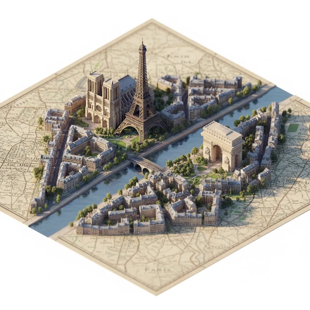
Every feed is full of realistic video. Hyper-realistic AI generation raised the bar for fidelity so high that realism stopped being a differentiator. The eye-catching content now is often the opposite: deliberately stylized, visibly artificial, and instantly recognizable. Lego pixel style transfer sits squarely in that niche. It converts ordinary footage into a world of chunky brick-like pixels, giving a video a playful, tactile identity that stands out in any feed. This guide explains how the technique works, why it is powerful for branding, and how to build a repeatable workflow around it.
What Lego Pixel Style Transfer Is
Style transfer takes the visual character of one image and applies it to the content of another. Classic style transfer mapped textures: the brushstrokes of a painting onto a photograph. Lego pixel transfer does something similar with a very specific target: the look of a world built from interlocking plastic bricks.
The result is footage where objects read as blocky constructions. A car becomes a brick-built car. A face becomes a mosaic of colored tiles. The motion stays recognizable, but the texture, palette, and geometry are translated into the toy aesthetic.
The appeal is that the style is unmistakable. A viewer identifies the Lego-like look in a fraction of a second, which is exactly what a brand wants from a signature visual. The style carries nostalgia, playfulness, and craft, and it transfers those associations onto your content.
How the Pixelation and Style Algorithms Work
Understanding the mechanics helps you control the outcome. Traditional style transfer operates on high-frequency texture mapping: it tries to reproduce the fine details of the style image.
Lego-style transfer works differently. Its core is a constraint on geometry and color. The algorithm analyzes the style reference, which shows how the world is divided into brick-like blocks, the palette of plastic colors, and the stud pattern on surfaces. It then imposes that structure onto the video frames.
The key step is block-level quantization. The image is divided into blocks of a defined size, and each block is assigned a color from the brick palette. This creates the mosaic effect. The block size is the master control: large blocks produce a coarse, abstract look, while small blocks preserve more of the original detail.
The palette matters as much as the geometry. Real brick colors are slightly muted and varied, and the algorithm maps the video's colors into that range. The result is a cohesive look that feels physical, not like a filter that was slapped on top.
Achieving Temporal Consistency Across Frames
Video style transfer has a classic failure mode: flicker. If the style is applied frame by frame, the blocks shift and the colors dance, and the result looks like a broken render.
Lego-style transfer has a natural advantage here because block-level coherence is stable. A large block that covers a face or a car body stays roughly in place from frame to frame, because the underlying content does not change its geometry quickly. The block boundaries move with the content instead of flickering independently.
Still, motion creates challenges. When the camera moves or a subject crosses the frame, the block grid must adapt smoothly. The algorithms handle this by anchoring the grid to the content where possible, using tracking information, and by temporally smoothing the palette so colors do not jump between frames.
The practical tip for creators: keep motion moderate in the source footage. Slow pans and steady subjects give the transfer stable material to work with. Fast cuts and rapid motion are harder for any style transfer, and Lego pixel is no exception.
Why Stylized Beats Realistic for Branding
For brand identity, distinctiveness beats fidelity. A realistic video of your product looks like every other realistic product video. A Lego-pixel version of the same product is immediately memorable.
The style creates a recognizable world. When a brand consistently uses the same visual language, audiences learn to identify the content before they read the name. This is the same logic behind mascots, signature colors, and logo sounds, applied to video aesthetics.
The style also changes the emotional register. The brick look is playful, warm, and accessible. It softens the formality of corporate content and makes complex topics feel approachable. For brands targeting families, education, or entertainment, this is precisely the tone they want.
The durability matters too. Realism dates quickly, as each generation of video raises the bar for fidelity. A stylized aesthetic is timeless because it never claims to be real. The same branded look can run for years without feeling outdated.
The style also travels well across formats. The same blocky treatment works in a square social post, a vertical story, and a widescreen ad, because the identity lives in the look rather than in the layout. That flexibility makes the style an efficient brand investment: one visual system, many placements.
The Implementation Workflow
The workflow for a Lego pixel video has five stages: source, reference, transfer, review, and finish.
Source preparation comes first. Choose footage with clear shapes and moderate motion. Close-ups of objects, characters, and products transfer best because the block structure maps onto recognizable forms. Busy scenes with fine detail become mushy, so prefer clean compositions.
Style reference is the second stage. Define the block size and the palette that will become your signature. The block size should reflect the scale of your subjects: larger subjects can take larger blocks. The palette can be pulled from your brand colors, which makes the style a brand asset rather than a generic effect.
Transfer is the mechanical stage. Apply the style to the sequence, usually in a batch process. If your tool supports it, run a preview on a few frames first to tune the block size and palette before committing to the full render.
Review is where you check temporal consistency. Play the result in motion, look for flicker, and confirm the look holds across scene changes. Fix issues at the source or the settings level, not by patching frames.
Finish is post-production: color grade if needed, add sound, and deliver. The style does most of the visual work, so the finishing pass is light.
Choosing Your Style Reference and Tuning
The style reference is your creative control. It determines whether the video reads as classic brick, custom build, or something in between.
Start with block size. Small blocks preserve detail and read as intricate builds; large blocks read as bold, abstract art. For brand content, a middle size usually wins: recognizable objects at a glance, with enough block texture to make the style obvious.
Then the palette. The default brick palette is familiar, but you are not limited to it. Map the palette to your brand colors for a cohesive identity across all your content. Keep the palette small, six to ten colors, because a small palette is what makes the mosaic look intentional.
Finally, the surface details. Some implementations can render the studs and the plastic sheen, others just approximate the color blocking. Decide how much texture you want; more texture is more convincing but slower to render and harder to keep stable in motion.
Review, Refinement, and Iteration
The difference between a demo and a deliverable is the review pass. Do not ship the first render.
Review in motion, not as stills. The eye forgives a lot in a single frame and catches everything in a moving sequence. Look specifically for palette jumps between frames and for blocks that snap into place after a cut.
Compare against your brand reference. If your content has an established look, the transfer should sit inside it, not clash with it. The style is a tool of the brand system, not a random effect.
Iterate on the variables one at a time. Change the block size and only the block size, render, compare. Then the palette. Then the motion handling. Changing everything at once makes it impossible to know what fixed the problem.
Monetizing Stylized Content
A distinctive style is not just a look; it is a product. Stylized content has commercial value in several directions.
For a brand, the style becomes the visual identity of campaigns, reusable across ads, social posts, and packaging. The investment in the style pays off every time it is reused. For a creator, the style becomes a niche: audiences come for the look, and the look is exclusive to you.
There is also a market for the style itself. If you develop a particular implementation, a tuned palette, or a signature block treatment, other creators may want to license it. Custom style models are a real category: define the parameters, document the results, and sell access.
The principle is the same as any brand asset: the style is worth building well, documenting clearly, and protecting. A signature visual is a moat, and Lego pixel transfer is a fast way to build one.
Tools, Parameters, and a Starter Checklist
The exact tool matters less than the parameters you understand, so learn the controls before chasing new software.
The three controls to master are block size, palette, and temporal smoothing. Block size sets the granularity of the mosaic. Palette sets the color world. Temporal smoothing sets how aggressively the effect stays stable across frames. Everything else is refinement.
A starter checklist for your first project: choose footage with one clear subject and moderate motion; set the block size so the subject reads at a glance; map the palette to six to ten colors that fit your brand; enable temporal smoothing from the start; preview three stills before the full render; play the first render in motion and check for flicker; adjust one parameter at a time; and document the winning settings as your house style.
The documentation step is the one most people skip and the one that turns a one-off effect into a repeatable asset. Once the settings are written down, the next project starts from your best result instead of from zero. Over a few projects, the house style becomes a genuine competitive advantage: a look that no one else can accidentally reproduce.
FAQ
What kind of footage works best for Lego pixel transfer?
Clear, well-lit footage with identifiable shapes and moderate motion. Product shots, character close-ups, and simple scenes work far better than dense, fast-moving action.
Can I use my brand colors in the style?
Yes. The palette is one of the main controls, and mapping it to your brand colors is the fastest way to turn a fun effect into a branded asset.
Why does my stylized video flicker?
Flicker comes from frame-by-frame inconsistency. Reduce motion in the source, use a stable block grid, and enable temporal smoothing if your tool supports it.
Is the style transfer process expensive to run?
It is heavier than a simple filter but lighter than full video generation. The cost scales with resolution and the amount of surface texture. For social content, it is very affordable.
How is this different from applying a pixelation filter?
A filter applies a uniform effect; style transfer learns from a reference. The difference shows in the palette, the block structure, and the temporal stability. The result looks built, not pixelated.
How long does a stylized video take to render compared to normal video?
Expect meaningfully longer renders, because the transfer adds a processing pass over every frame and temporal smoothing adds another. The exact ratio depends on resolution and texture settings. Plan the pipeline so the render is not blocking the rest of the production.
Can I use the style on live-action footage of people?
Yes, and it is a common use: the blocky treatment makes people look like brick-built characters. Review the result carefully, because faces are where viewers notice inconsistency first. Slower, steadier shots of people transfer much better than fast cuts.
Can I combine Lego pixel with other styles in one video?
Yes, but use the blend deliberately. A scene that starts realistic and transitions into the blocky look can be a strong storytelling device. Keep the transition point intentional and smooth, and test it in motion before committing to the edit.
