
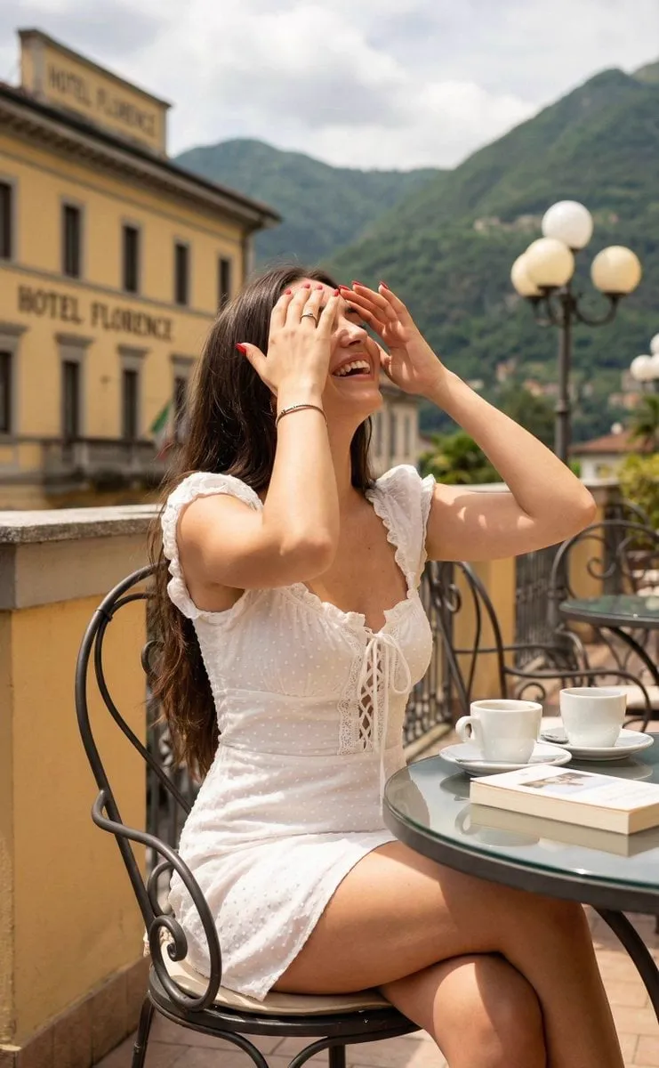
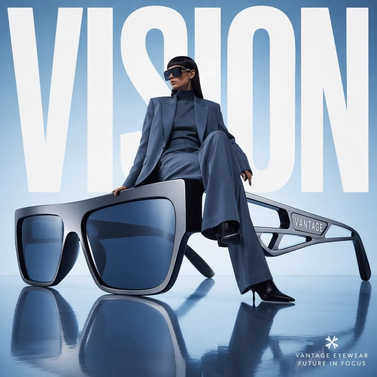
![Create an infographic image of [LANDMARK], combining a real photograph of the...](https://storage.brightvectorlabs.com/prompts/bright/photography/2007809144397648042-0.webp)
Most people try Midjourney, generate a few images, and conclude that AI art always has a tell: slightly too smooth skin, impossibly clean surfaces, lighting that does not quite make sense. Then they watch someone else produce images that look like they were shot by a professional photographer, and they assume it must be a different tool or a secret prompt. It is neither. Photorealism is a skill, and it is built from a specific vocabulary: the language of cameras, lenses, lighting, and materials. This tutorial teaches that vocabulary and shows you how to combine it into a repeatable workflow for photorealistic images.
Why Most AI Images Still Look Like AI
Before learning what to add, it helps to understand what is missing. AI image models are trained on enormous datasets, including millions of photographs, but they are also trained on illustrations, paintings, and every other kind of image on the internet. When your prompt is vague, the model averages toward the middle, and the middle is generic.
The classic tells of AI images are not random accidents; they are signs that the model guessed. Skin that is too smooth means the model averaged skin textures instead of choosing one. Perfectly parallel walls with no wear mean the model guessed architecture instead of rendering reality. Lighting that illuminates everything evenly means the model guessed lighting instead of simulating a light source.
The fix is to stop treating the prompt as a description of what you want to see and start treating it as a technical specification of how the image was made. A photograph is not just a subject; it is the record of a camera, a lens, a light source, and a material world. When you specify those, you give the model the information it needs to stop guessing.
Speak Camera and Lens Language
The fastest way to make an AI image look like a photograph is to describe the camera and lens. Photographers do not say "a person in a field"; they say "85mm portrait, f/1.4, shallow depth of field". Those terms carry information about compression, background blur, and subject separation that the model understands.
Start with the lens. A telephoto lens like 85mm or 135mm compresses the background and isolates the subject, which is why portraits look like portraits. A wide lens like 24mm or 35mm includes more environment and creates a different sense of space. Interior shots benefit from wide lenses with a careful angle; product shots often work better with a mid telephoto.
Add the aperture. Terms like f/1.4 or f/2.8 signal shallow depth of field, with creamy background blur. Terms like f/8 or f/11 signal a deep focus where everything is sharp, typical of architectural photography. Combine lens and aperture with a camera type like "full-frame DSLR" or "medium format" and you are speaking the model's native language. The image immediately reads as photographed rather than painted.
Lighting Terminology That Actually Works
Light is what separates a snapshot from a photograph, and the same is true in AI generation. The word "nice lighting" tells the model nothing; it will guess. The terms that work describe the light source, its direction, its quality, and its color.
Source terms include "golden hour", "window light", "neon sign", "candlelight", "overcast sky", "studio softbox", and "hard midday sun". Each one produces a different mood and a different set of shadows. Direction terms like "side lighting", "backlight", "rim light", and "top light" control where the shadows fall, which shapes the subject and adds depth.
Quality and color matter too. "Soft diffused light" creates gentle gradients; "hard light" creates crisp shadows. "Warm tungsten" shifts the image orange; "cool daylight" shifts it blue. A complete lighting specification might be: "golden hour, warm side lighting from a large window, soft shadows, subtle rim light on the hair". That one sentence gives the model everything it needs to simulate a real scene instead of guessing at one.
Texture and Material Control
Photorealism lives in the details of materials. A photograph of a wall is never just a flat surface; it shows the grain of the plaster, the weathering near the baseboard, the way light catches the texture. AI images look fake when surfaces are too clean and too uniform, so your prompt should describe materials with their imperfections.
Name the material precisely and add a descriptor. Instead of "wooden table", try "weathered oak table with visible grain and scratched varnish". Instead of "concrete wall", try "raw concrete wall with formwork marks and subtle staining". Instead of "fabric", try "linen with visible weave and natural wrinkles". The model understands these descriptors, and the specificity forces it to render texture instead of smoothness.
Imperfections are your friend. Words like "worn", "scratched", "weathered", "patina", "dust", "water stains", and "imperfect edges" add the realism that perfect rendering destroys. A photorealistic image should look like the world actually is: slightly imperfect, slightly used, slightly alive. Adding a controlled amount of imperfection is one of the highest-leverage moves in the entire workflow.
Advanced Parameters That Change Everything
Beyond words, most image generators have parameters that control the generation itself. These are not secrets, but they are underused because most tutorials skip them. Understanding a few core ones transforms your control.
The stylization or style parameter controls how much the model applies its own aesthetic interpretation. Lower values stick closer to your prompt; higher values make the image more artistic. For photorealism, start low, because you want the model to follow your technical specification, not add painterly flair. The chaos or variation parameter controls how different each image in a batch is; use high values for exploration and low values for refinement.
The aspect ratio and resolution parameters control composition. A 3:2 or 4:3 ratio reads as photographic, while very wide or very tall ratios feel like banners or posters. The quality parameter trades generation time for detail, which matters when you are about to present a final image. Finally, the seed parameter lets you reproduce or vary a specific result, which is essential when you find a direction you want to iterate on.
Image References and Character Consistency
The most powerful tool for photorealism is not a word at all; it is an image. Reference images tell the model exactly what you mean, removing the ambiguity of language. This is the technique professional users rely on for consistent characters, consistent environments, and consistent style across a series.
To keep a character consistent, generate or provide a reference image that defines the person: face, hair, clothing, and the general scene. Then use that image as the starting point for new generations. The model preserves the character while you change the pose, the background, or the lighting. This is how you build a series of images that look like a single photo shoot instead of a collection of unrelated pictures.
The same logic applies to environments and products. A reference image of a room lets you iterate on decor without rebuilding the room. A reference image of a product lets you place it in new scenes while keeping its look exact. Build a small library of approved reference images for your recurring subjects, and every future generation becomes faster and more consistent.
Behavioral Prompting: Telling the Model What to Do
One advanced technique deserves special attention: behavioral prompting, which means describing the camera behavior and the photographic intent rather than just the subject. Instead of "a coffee cup on a table", you describe the photograph: "a close-up photograph of a coffee cup on a wooden table, shot at eye level, steam rising, soft morning window light from the left, 50mm lens, shallow depth of field".
The camera behavior gives the image a point of view, which is exactly what makes a photograph feel real. Eye-level feels documentary. Low angle makes subjects feel larger. Overhead is the food-and-lifestyle shot. A slight dutch angle adds tension. Each choice is a photographic decision, and naming it tells the model which decision you made.
Behavioral prompting also includes the photographer's intent: "candid", "posed", "in motion", "caught mid-action". These words change how the model treats the subject. A candid description produces natural, slightly imperfect framing. A posed description produces a more formal composition. The more you think like a photographer deciding how to shoot, the more your prompts read as photographic instructions, and the more photographic the output becomes.
Post-Processing: The Final 20 Percent
Even the best generation benefits from a finishing pass. Photographers do not publish raw files; they grade, retouch, and sharpen. AI images deserve the same treatment, and this is often the difference between "impressive" and "believable".
The usual finishing steps are simple. Adjust the color grade to match a consistent mood, cool the shadows and warm the highlights for a filmic look. Add a touch of film grain to break up the digital smoothness that screams AI. Sharpen selectively, especially the eyes in portraits and the texture in product shots. Remove the small artifacts the model always leaves, like strange text, extra fingers, or melting edges, with inpainting or a quick manual fix.
Do not overdo it. The goal is to make the image look like a photograph, not like a heavily edited photo. A light touch on grain and grade, plus artifact cleanup, is usually enough. This finishing pass takes minutes and reliably lifts the perceived quality of the final image.
A Repeatable Photorealism Workflow
Consistency comes from process, not luck. Build a workflow with five stages. First, define the brief: subject, mood, and usage, in one or two sentences. Second, gather references: any images that capture the look you want, plus the reference images for recurring subjects. Third, write the technical prompt: subject, camera and lens, lighting, materials, and parameters, in that order.
Fourth, generate and iterate: start with low stylization, generate a batch, pick the strongest direction, then refine with more specific language and a seed. Fifth, finish: grade, grain, sharpen, and clean up artifacts. Save the final image and the prompt that produced it, because that pair is your reusable asset.
The workflow looks like more work than "just prompting", and it is. But it is also what produces images that pass as photographs, and that is exactly the skill that separates a hobbyist from a professional, whether you are creating for clients, for products, or for your own brand.
Common Failure Patterns and How to Diagnose Them
When an image still looks like AI, the problem is usually diagnosable. The most common failure is plastic skin, which means the prompt did not specify texture, lighting, or imperfection, so the model averaged toward smoothness. The fix is material vocabulary: add skin pore detail, natural blemishes, directional light, and avoid over-idealized descriptors like "flawless" or "perfect".
The second pattern is impossible geometry. Extra fingers, warped reflections, or furniture that does not connect to the floor usually mean the scene was too complex for the model to resolve coherently. Simplify the composition, reduce the number of interacting objects, and generate the main subject separately before combining elements. The third pattern is overcooked color: images that look like a filter, not a photograph. This usually comes from over-describing mood without anchoring it in a real light source, so the model guesses a stylized grade. Anchor every mood in a concrete lighting scenario, and the color will follow.
The fourth pattern is inconsistency across a series. If you generated one strong image and the next three drift, you skipped the reference stage. Go back to the best image, make it the reference, and regenerate from there. The diagnosis habit matters because it converts failure into learning: every bad image tells you which part of the workflow was missing, and fixing that part makes the next generation better.
FAQ
Which Midjourney version should I use for photorealism?
Use the latest version you have access to, because realism improves with each generation. Pair it with the technical vocabulary from this guide; the model does the heavy lifting, but the vocabulary directs it.
Is there a secret prompt for photorealistic images?
No. The results come from a combination of camera language, lighting terms, material detail, parameters, and reference images. There is no magic phrase, only a technical vocabulary used consistently.
Why do my images look too smooth?
Smoothness usually means the model is guessing textures. Add material descriptors and imperfections, lower the stylization parameter, and use reference images when the subject repeats.
How do I make a series of images that look like one shoot?
Create a reference image for the subject and the environment, then reuse it across generations. Keep the camera and lighting language identical in every prompt, and vary only what the shot requires.
Do I need to edit AI images after generation?
For serious use, yes. A short post-processing pass with color grade, grain, and artifact cleanup makes the difference between an AI demo and a believable photograph.
