
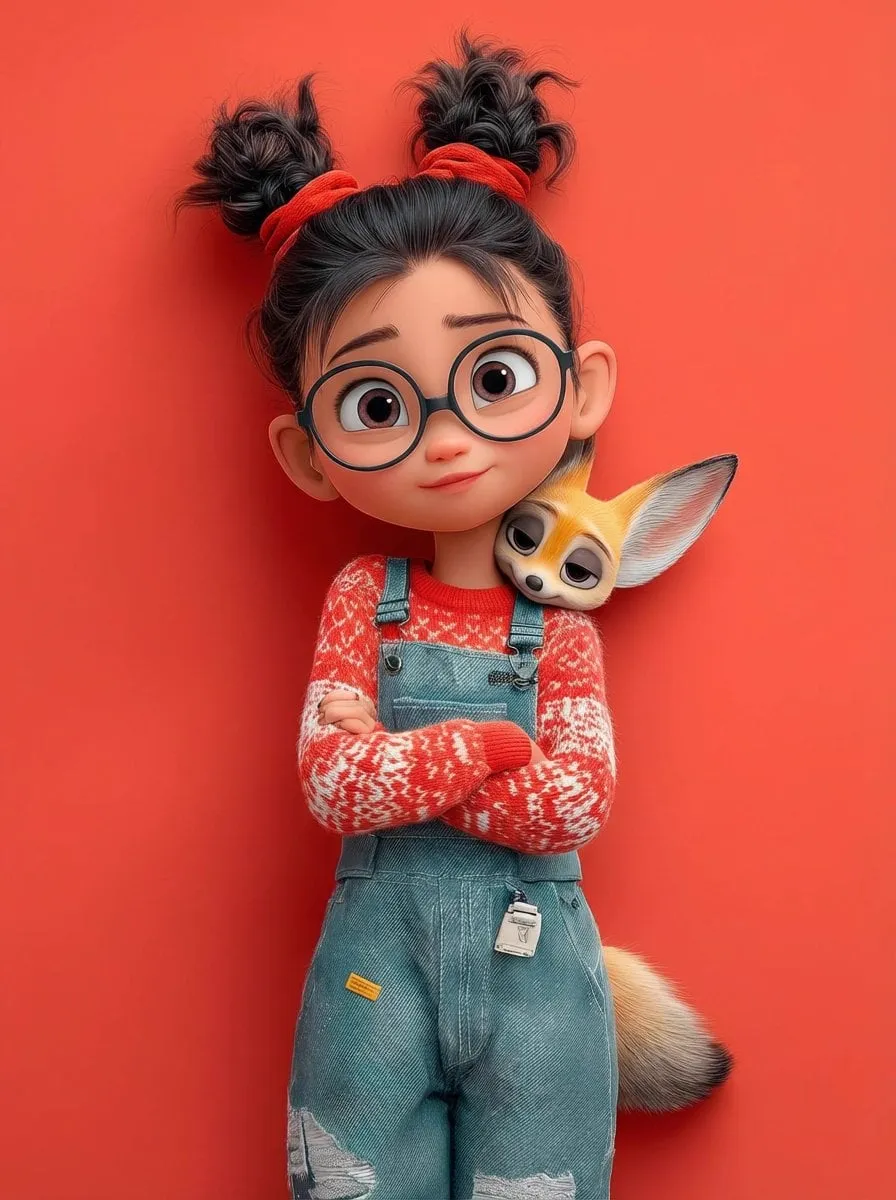

Photorealistic AI images have crossed an uncomfortable line: they are now hard to distinguish from photographs. The good news is that this opens up enormous creative and commercial possibilities. The bad news is that most people still write prompts like they are ordering a coffee: short, vague, and dependent on the barista's mood. With image models, the barista is a neural network with no mood at all, and it will happily interpret your vague request in a way you did not intend.
The difference between an image that looks obviously AI-generated and one that could pass for a professional photograph is rarely the model. It is the prompt. This guide breaks down the anatomy of effective prompts for photorealistic output, the vocabulary that photographers and cinematographers actually use, and the practical workflow for getting consistent, high-quality results across multiple generations.
What Makes an AI Image Look Photorealistic
Photorealism is not one thing. It is a stack of details that together convince the eye: correct lighting and shadows, believable materials and textures, natural skin, realistic depth of field, and coherent geometry. AI models have gotten very good at individual elements, but they still struggle when the prompt does not give them enough structure.
Think of a photograph as the result of hundreds of decisions made by the photographer: where the subject stands, how the light falls, what the lens sees, what is in focus, what the color palette communicates. A photorealistic prompt has to supply the model with enough of these decisions that it has no room to improvise poorly. Vague prompts leave the model to fill in the blanks, and its defaults are often plastic-looking, over-smooth, and clichéd.
The Anatomy of a Strong Prompt
A strong photorealistic prompt has four layers, and they should appear roughly in this order.
First, the subject. Be specific about who or what is in the frame: a middle-aged fisherman, a vintage leather travel bag, a concrete apartment building. Include the details that matter: age, expression, clothing, material, condition. This layer defines what the image is about.
Second, the environment and details. Where does the scene take place, and what surrounds the subject? A portrait is completely different in a rain-soaked street at night versus a sunlit studio. Describe the setting, the props, and the ambient details. This layer gives the image context.
Third, the visual and technical style. This is where you choose between photorealistic styles: documentary, commercial product shot, cinematic still, editorial fashion, street photography. Specify the look without falling back on generic words like "beautiful" or "high quality", which carry almost no information for the model.
Fourth, lighting and composition. This is the layer most people skip, and it is often the difference between amateur and professional output. Describe the direction and quality of light, the mood it creates, and how the frame is composed. This layer is where the image gains depth and believability.
Speaking the Language of Photographers and Cinematographers
Models trained on massive image datasets understand photographic terminology surprisingly well. Using it is the fastest way to push your results from "AI-looking" to "photographic". The vocabulary is not difficult, but it is precise.
Lens language matters. Mentioning a specific lens or lens type, such as a 50mm prime, an 85mm portrait lens, or a wide-angle 24mm, changes perspective and distortion characteristics. Focal length information also implies how much of the scene appears in the frame.
Aperture and depth of field go hand in hand. A low aperture value produces a shallow depth of field with a creamy background blur, perfect for portraits. A high value keeps everything sharp, appropriate for landscapes and product shots. If you want the subject to pop from the background, say so in aperture terms.
Shutter speed conveys motion. A fast shutter freezes action; a slow shutter creates motion blur, which can suggest speed or time passing. Lighting terms like softbox, golden hour, rim light, and practical light tell the model exactly where the light comes from and how it feels.
Film and sensor language controls the character of the image. Terms like 35mm film, Kodak Portra, grain, and color negative evoke specific color science and texture. You do not need to be a photographer to use these words, but you should learn what they mean so you can use them deliberately.
Controlling Texture, Materials, and Surface Detail
Photorealism lives in surfaces. A face without pores, a leather bag without scratches, or a marble countertop without veins instantly reads as fake. The fix is to describe surfaces at a granular level instead of using generic material names.
For skin, use phrases that imply real biology: visible pores, fine wrinkles at the corners of the eyes, subtle skin texture, natural imperfections. For fabric, describe the weave: coarse linen, smooth silk with a soft sheen, heavy denim with visible stitching. For stone and metal, describe how light interacts: polished marble with faint veins, brushed aluminum with a matte finish, oxidized copper with green patina.
The same principle applies to light itself. Real photographs rarely have perfectly uniform lighting. Soft diffused light, hard directional light casting long shadows, mixed lighting from warm and cool sources, subtle bounce light from a nearby wall: these details add the complexity that makes an image feel captured rather than rendered.
Keeping Characters Consistent Across Generations
Character consistency is the hardest skill in AI imagery, and it matters the moment you need a series of images featuring the same person. The most reliable approach is reference-driven: start every generation from the same base image of the character, combined with a stable textual description.
Write a fixed character sheet and reuse it verbatim. Describe the face, hair, body type, clothing, and distinguishing features in the same order every time. Any change in wording is a chance for the model to drift. When a model supports image references, use the same reference image for every generation, and describe only the new situation in the prompt: the pose, the setting, the emotion.
Expect to generate multiple variants. Even with references, no single generation is guaranteed to match. Generate several takes, compare them against your reference, and select the one that stays closest. Over time, you will learn which parts of your character sheet matter most to your chosen model.
Advanced Controls: Weights, Negative Prompts, and Parameters
Once the basics are solid, you can refine results with three advanced controls.
Prompt weighting lets you emphasize specific concepts. In many interfaces, putting a phrase in parentheses or appending a weight value increases its influence on the result. This is useful for locking in the most important elements, like the subject's face or the lighting setup, while letting secondary details breathe.
Negative prompting tells the model what to avoid. Common negative terms for photorealism include blurry, low resolution, cartoon, illustration, oversaturated, plastic skin, extra fingers, and text artifacts. A good negative prompt is often worth more than a longer positive prompt.
Parameters such as resolution, sampling steps, and seed give you reproducibility. Saving the seed of a great generation lets you reproduce it exactly or explore small variations. Higher sampling steps usually mean more refinement, though the gains diminish beyond a certain point. These parameters are model-specific, so check the documentation of the tool you use.
Scenario Walkthroughs
Theory helps, but examples are faster. Here are three scenarios and the prompts that work for them.
Portrait with dramatic studio lighting: a close-up portrait of a woman in her forties with visible skin texture, wearing a charcoal wool coat, lit by a single softbox from the left with a subtle rim light on the right, dark gray seamless background, shallow depth of field, 85mm lens, shot on 35mm film with fine grain.
Product shot for an e-commerce brand: a matte black ceramic coffee mug on a light oak table, soft window light from the left, shallow depth of field, a small espresso beside it, minimal styling, sharp focus on the mug's handle, commercial product photography style, high-key background.
Environmental scene with storytelling: an old fisherman mending a net on a weathered dock at dusk, golden hour light raking across the water, visible rope texture and weathered skin, distant fishing boats in soft focus, cinematic composition, muted color palette, 35mm film look.
Night street scene with cinematic mood: a lone cyclist crossing a wet city street at night, neon reflections on the asphalt, dramatic backlight from a shop window, shallow depth of field, slight motion blur on the wheels, cinematic color grade with deep blues and warm highlights, 35mm film look. This scenario is a good test of lighting vocabulary: the difference between "a street at night" and the version above is exactly the kind of specificity that separates flat results from atmospheric ones.
Common Mistakes and How to Fix Them
Plastic-looking skin. Replace vague terms like "beautiful skin" with specific surface descriptions and add imperceptible imperfections. Check your negative prompt for terms that smooth everything out.
Everything is in focus. If you want depth, use aperture language and say what should be blurred. A photograph has a focal plane, and so should your image.
Lighting that makes no sense. Describe the light source explicitly. If shadows and highlights conflict, the model has no reference for where the light comes from.
Text that appears in the image. Add text-related terms to your negative prompt, and avoid describing signs, labels, or documents unless the text is the point of the image.
Images that are too clean. Real photography has grain, slight imperfections, and uneven color. Add film grain and color-grade language if your results look sterile.
Building a Prompt Library and Iterating
The fastest way to improve is to treat prompts as reusable assets instead of one-off text. Start a file with sections for lighting setups, surface descriptions, lens language, and character sheets. Every time a generation works, copy the prompt, the model settings, and the seed into the library with a note about why it worked. Within weeks you will have a personal reference that makes every new project faster.
Iteration is the second half of the skill. Photorealistic results rarely come from a single attempt. The pattern is: generate, compare against a reference photograph, identify what is wrong, adjust one variable, generate again. Change only one thing at a time. If you adjust the prompt and the settings together, you will not know which change fixed the problem. This discipline is what separates people who get lucky occasionally from people who get good results on demand.
FAQ
Do I need to know photography to write good prompts? No, but learning basic photography terms pays off immediately. A few hours spent understanding aperture, lighting, and lens effects will improve your results more than any tool upgrade.
Why do my images look AI-generated even with detailed prompts? Usually because the surface details are missing. Add texture descriptions, film grain, realistic lighting, and imperfections. Also review your negative prompt.
How do I keep the same character in a series of images? Use a fixed character sheet, the same reference image, and consistent wording. Generate variants and pick the best match.
Is prompt weighting worth learning? Yes. It is one of the highest-leverage skills for controlling stubborn models. Start with weighting the subject and lighting, then experiment.
Which is more important, the prompt or the model? Both matter, but the prompt is where you have the most control. A skilled prompter gets better results from a mid-tier model than a vague prompter gets from a top-tier one.
What settings should I keep fixed between generations? Keep the seed, the model, and the base parameters fixed while you refine the prompt, so you can see exactly how wording changes the result. Change the seed only when you want a fresh variation.
How many images should I generate before picking one? As a rule of thumb, four to eight variants per concept. Fewer and you miss the good ones; more and you are usually chasing diminishing returns.
