
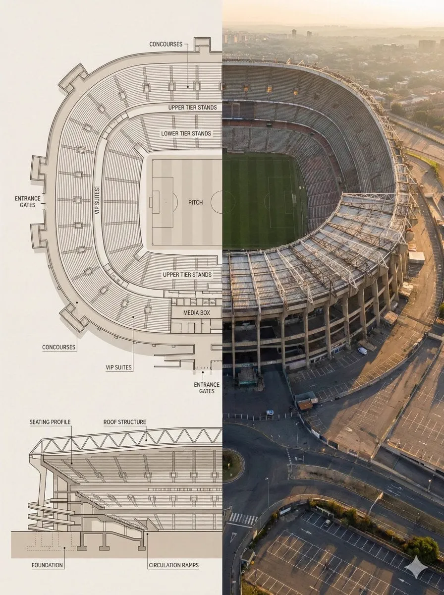
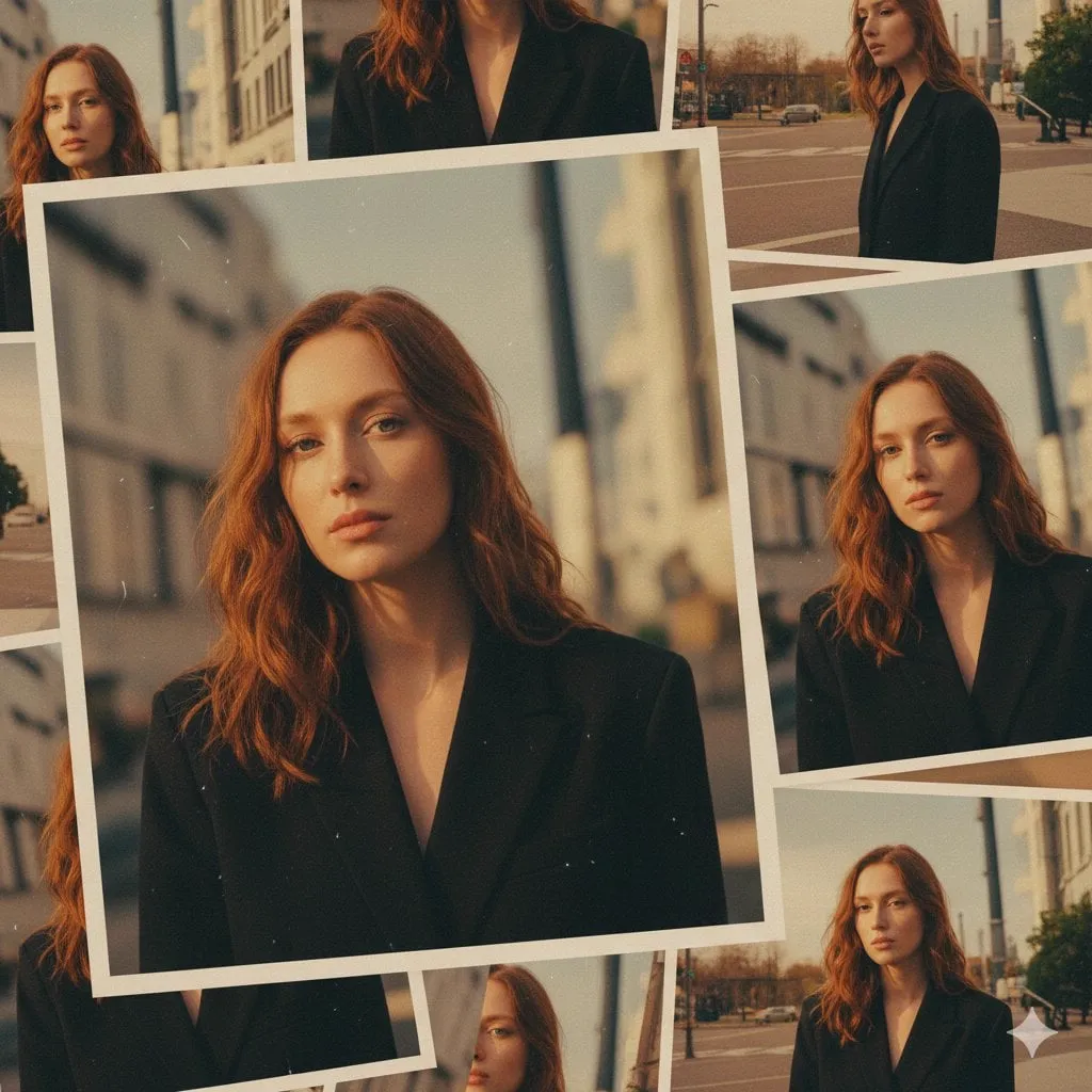
Photorealistic AI images have moved from a novelty to an everyday production tool. What used to require a photo studio, a lighting rig, and hours of retouching can now be produced from a single well-crafted prompt. The catch is that the gap between an average result and a genuinely convincing image is not about the model you use. It is about how you prepare an idea, how you translate it into visual language, and how you iterate on what the model returns.
This guide walks through the full pipeline: taking a rough concept, shaping it into a visual brief, writing prompts that produce believable light and texture, keeping characters consistent across several images, and refining results until they survive close inspection. You will finish with a repeatable workflow you can apply to product shots, editorial illustrations, concept art, and social media visuals.
Why Photorealism Became the New Baseline
Audiences are no longer impressed by an AI image that merely looks interesting. After years of exposure to generated content, viewers can spot the telltale signs of a synthetic render within seconds: waxy skin, unnatural reflections, garbled text, or anatomy that bends in impossible ways. The bar has moved, and photorealism is now the entry point rather than the achievement.
For creators and brands this raises the stakes. A photorealistic image carries instant credibility. It looks like evidence, like something that could have been photographed, and that is exactly why it performs so well in advertising, editorial design, and product visualization. But the same quality that makes these images powerful also makes the failures obvious. A single distorted hand or a reflection that obeys no physics will destroy the illusion and, with it, the trust of the audience.
The practical consequence is simple: the craft is now in the details. Learning how to control light, lens behavior, texture, and composition matters more than chasing the newest model release. Every section below is built around that idea.
Before You Generate: Turning an Idea Into a Visual Brief
The most common reason a generation fails is not a bad prompt. It is a fuzzy goal. If you cannot describe what you want in plain language, no model will rescue you. The fix is to write a short visual brief before you open any image tool.
A good brief answers five questions:
- What is the subject? A person, a product, an environment, an animal, an abstract concept.
- What is the setting? Indoors or outdoors, time of day, weather, era, location.
- What is the mood? Calm, dramatic, nostalgic, clinical, luxurious, gritty.
- What is the camera doing? Eye level, low angle, close-up, wide shot, shallow depth of field.
- What must stay true? Brand colors, a specific character, a logo, a real product shape.
Write these answers as short phrases, not paragraphs. For example, a brief for a coffee brand might read: a ceramic pour-over dripper on a walnut counter, morning sunlight through a window, steam rising, warm neutral palette, eye-level product shot, shallow depth of field, the brand's matte green finish must be exact. That single paragraph already contains almost everything the model needs. The prompt you build later is just this brief translated into the language of photography.
Choosing the Right Model for the Job
Model choice matters, but not in the way most people assume. There is no single best model. There are models that excel at specific tasks, and the smart move is to match the task to the model.
Some families are famous for raw realism and are often the first stop for photorealistic product and portrait work. Flux models, for instance, are widely praised for their sharp detail, strong text rendering, and stable anatomy, which makes them a reliable default when you need a clean studio look. Other models prioritize style transfer, artistic interpretation, or speed. If you need a quick iteration loop for mood boards, a fast model is worth more than a slightly sharper one.
Practical guidance:
- For product shots and still life: choose a model known for texture and reflection accuracy.
- For portraits: prefer a model with strong anatomy and skin detail.
- For stylized or cinematic looks: pick a model with a distinctive aesthetic rather than fighting it.
- For concept exploration: use a fast model to generate many variations, then switch to a higher-quality model for the final pass.
Do not let model selection become analysis paralysis. Pick one strong default, learn its quirks, and only switch when a specific job demands it. Knowing one model deeply will produce better results than sampling ten models superficially.
Prompt Engineering for Photorealism
Prompt engineering for realism is really about speaking the language of photography. Models trained on millions of photographs understand that language, but only if you use it.
Camera Vocabulary: Lens, Focal Length, and Aperture
The fastest way to make an image feel like a photograph is to describe the camera, not just the scene. Mentioning a focal length changes perspective and compression. A 35mm lens feels natural and reportage-like, while an 85mm lens compresses the background and flatters a portrait. A 24mm wide angle exaggerates space and can distort edges.
Depth of field is equally powerful. Phrases like f/1.8, shallow depth of field, or background bokeh tell the model to blur the background, which instantly reads as a real photo taken with a real lens. Sharp-everywhere images feel synthetic because most real photographs have at least one blurred plane.
Lighting: The Fastest Way to Sell the Scene
Lighting is the single most important element in photorealism. Golden hour sunlight, soft window light, overcast sky, harsh midday sun, neon glow, candlelight. Each one changes the mood and the believability of the scene.
Be specific about the light source and its quality. Soft light creates gentle shadows and smooth skin; hard light creates crisp shadows and drama. Describe the direction too: rim light from behind, key light from the left, fill from a warm lamp. Reflections and highlights must have a source the viewer can believe in. An interior scene lit like an outdoor scene is one of the fastest ways to break the illusion.
Materials, Textures, and Fine Detail
Realism lives in texture. A leather jacket should show grain and creases. A glass bottle should show refraction, condensation, and a specular highlight. Concrete should have pores, stains, and variation in tone. Add texture words to your prompts: weathered, matte, glossy, brushed, porous, cracked, frosted, polished.
It also helps to state what is absent. Many image models default to a clean, idealized look. If you want realism, say so: natural skin texture, visible pores, imperfect, candid, unposed. Negative prompting can remove unwanted gloss, plastic skin, or overly saturated colors, depending on the tool you use.
Keeping Characters and Scenes Consistent
One of the most common production needs is a series of images featuring the same person, product, or character across different scenes. This is where photorealism gets hard, because a model generating from scratch will happily change a face, a jacket, or a logo between generations.
The most reliable solution is reference images. Most modern image tools allow you to upload one or several reference images that anchor the identity of the subject. A single strong portrait can fix the face, while a second reference of the full outfit can fix the wardrobe. Some tools call this image-to-image, others call it character reference or style reference, but the principle is the same: give the model something to stay faithful to.
When reference images are not available, consistency depends on prompt discipline. Repeat the same physical description in every generation: the same hair color and cut, the same clothing, the same setting details. Small variations in wording cause small variations in output, so copy and paste the description of the subject verbatim between prompts. Keep a snippet library of these stable descriptions and reuse them across projects.
Reference Images and Style Anchors
Beyond character consistency, reference images can anchor an entire visual style. If you have a brand campaign with a specific color grade, or a photo series with a distinctive look, uploading a style reference keeps every new image in the same family.
Style anchors work well for:
- Matching an existing brand aesthetic across dozens of product renders.
- Continuing an editorial series with consistent lighting and color grading.
- Adapting an old photograph into new compositions while preserving the era.
- Building a mood board where every image shares a palette and texture language.
The key is to combine the style anchor with a precise prompt. The reference controls the look; the prompt controls the content. When they disagree, the model may compromise and produce something that is neither faithful nor interesting. Experiment with the strength or weight controls that most tools provide for references, starting around a moderate value and adjusting until the output matches your intent.
The Iteration Loop: Generate, Critique, Refine
Professional results never come from the first generation. They come from a short, disciplined loop: generate a batch, critique it like an art director, then refine.
When you critique, look for the specific tells of synthetic images:
- Hands, fingers, and other anatomy under close inspection.
- Text on signs, labels, and packaging.
- Reflections and shadows that contradict the light source.
- Unnatural symmetry in faces or architecture.
- Oversharpened edges or a waxy, airbrushed finish.
Pick the strongest image from the batch and identify one or two concrete problems. Then adjust the prompt for those problems only. If the light looks flat, change the lighting phrase. If the product shape is wrong, strengthen the reference image or describe the shape more precisely. Do not rewrite the whole prompt; targeted edits preserve what already works.
Many tools support variations or inpainting, letting you regenerate a specific region of an image while keeping the rest intact. That is ideal for fixing a single distorted hand or a broken reflection without throwing away a composition you like.
From Still Image to Motion
Once you have a photorealistic still, the natural next step is motion. Video generation models can take a reference image and animate it with camera movement, subtle character motion, or environmental effects like rain and steam.
The best stills to animate are the ones with clear spatial depth and a defined light source. A static camera push-in on a well-lit product works beautifully; an image with confused reflections and ambiguous geometry will only amplify its flaws in motion. If you plan to animate, keep the initial still simple: one subject, one light direction, and a background with enough depth for parallax.
The same prompt discipline applies. Describe the motion explicitly: slow push-in, orbit around the subject, steam rising, fabric moving in a light breeze. Video models are more sensitive to ambiguous prompts than image models, so clarity pays off even more.
A Practical Checklist for Every Photoreal Render
Before you call an image finished, run this checklist:
- Does the lighting have a believable source and direction?
- Are reflections and shadows consistent with that light?
- Is the depth of field natural for the focal length described?
- Do materials show appropriate texture and wear?
- Is any visible text spelled correctly?
- Are hands, eyes, and anatomy structurally sound?
- Does the subject match the reference images and the brief?
- Would the image survive a quick glance in a feed or a full screen?
If any answer is no, go back to the iteration loop. Fix the weakest element first, because that is the one the audience will notice.
FAQ
How long should a photorealistic prompt be?
Long enough to describe subject, setting, camera, lighting, and texture, and no longer. A dense paragraph usually beats a rambling paragraph. Quality of detail matters more than sheer length.
Why do my images look too clean or plastic-like?
This usually means the prompt is missing texture and imperfection cues. Add natural texture, visible pores, weathered details, and unpolished phrasing, or use negative prompting to suppress glossy, airbrushed output.
Can I keep the same person across many images?
Yes, with reference images. Anchor the face with one strong portrait reference and repeat a fixed physical description in every prompt. Consistency without references is possible but fragile.
Which model should I start with?
Pick a widely used model known for realism, such as a Flux-based model, and learn its strengths and limits. Master one model before experimenting with others.
Do I need a powerful computer?
No. Most modern image generation runs in the cloud. You need a good prompt, not a good GPU.
Is photorealistic AI imagery acceptable for commercial use?
It depends on the tool's license and the content itself. Always check the terms of the platform you use and avoid generating real people or trademarked designs without permission.
