

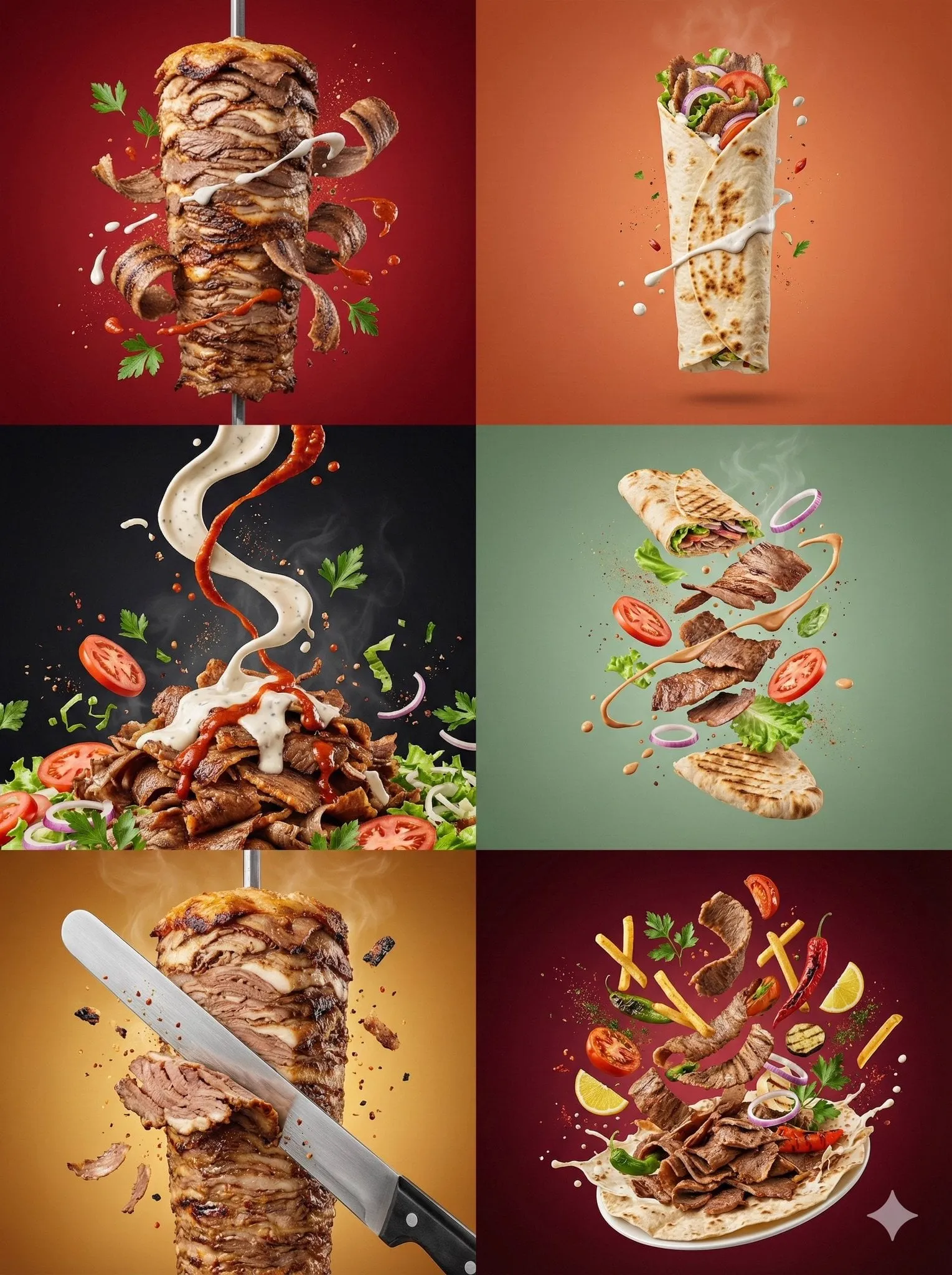
Photorealistic imagery stopped being a novelty the moment audiences learned to spot it. A campaign either looks like it was shot on a real set with real people and real products, or it reads as synthetic — and that second verdict quietly drains conversion. What follows is a practical production pipeline for AI-generated stills and video that survive close inspection on a phone screen, a product page, and a printed poster.
Why photorealism became the baseline for marketing visuals
Attention is the scarce resource in every channel. Feed algorithms reward dwell time, and dwell time is largely a function of whether a frame looks worth stopping for. Synthetic-looking images create a subtle friction: the viewer may not consciously identify what is wrong, but they scroll anyway because something in the image fails the brain's quick authenticity test.
There is also a trust dimension. Product photography, testimonial imagery, and lifestyle scenes carry an implicit promise that what is shown resembles what will be received. When skin looks waxy, when hands merge with objects, when shadows fall in contradictory directions, that promise weakens. The viewer does not file a complaint — they simply do not buy.
The economics changed the calculus further. A studio shoot for a multi-market campaign involves talent, location, permits, styling, retouching, and reshoots for every variant. AI-assisted production collapses the marginal cost of a new variant to minutes. The strategic question is no longer whether to use generated imagery, but how to keep quality high enough that the cost advantage actually reaches the bottom line instead of producing a pile of assets nobody wants to publish.
Finally, differentiation matters. As more teams adopt the same handful of tools with the same handful of generic prompts, default aesthetics proliferate: over-saturated gradients, symmetrical faces, soft-focus glamour lighting. Realism with intentional art direction is now a competitive position, not just a technical setting.
What photorealism actually requires from an AI pipeline
"Photorealistic" is not one property. It is a bundle of cues that a viewer's visual system checks almost simultaneously. Break the bundle anywhere and the illusion collapses, even if everything else is flawless.
Skin, texture, and micro-detail
Real skin has pores, uneven tone, fine vellus hair, slight asymmetry, and specular highlights that shift with movement. Generated skin tends toward smoothing, which reads as plastic under scrutiny. The fix is rarely a single prompt word. It comes from combining descriptive language about skin character with lighting that reveals texture, and from choosing models that preserve high-frequency detail instead of averaging it away.
Materials deserve equal attention. Fabric weave, brushed metal, condensation on glass, dust on a surface, scratches on a lens — these micro-details anchor a scene in physical reality.
Light, lens, and optics
A photoreal frame obeys optics. Depth of field falls off predictably. Highlights bloom rather than clip abruptly. Shadows have softness that matches the apparent size of the light source. Focal length changes perspective in ways viewers feel even when they cannot name them.
Most realism failures are lighting failures: two key lights from different directions, shadows that do not connect to objects, reflections that show nothing, or a flat frontal wash that removes all dimensionality.
Motion and temporal coherence
Video adds time, and time is where generated footage exposes itself fastest. Watch for identity drift across cuts, clothing that changes between frames, background elements that warp, and unnatural cadence in walking or hand movement. Temporal stability is a separate engineering problem from frame quality, and it deserves separate attention in review.
The end-to-end workflow: from brief to approved asset
A repeatable pipeline beats heroic one-off efforts every time. The sequence below works for a single hero image and for a fifty-asset campaign.
Step 1: Brief and shot list
Start with the commercial objective, not the prompt. Define the channel, aspect ratios, the message, and the emotional register. Then translate that into a shot list: hero product on a marble surface, model applying the product in a bathroom mirror, wide environmental shot suggesting morning routine.
Each shot entry should include the deliverables, the required crop, whether it will be animated, and the brand guardrails (color palette, wardrobe restrictions, prohibited contexts). Getting this on paper first prevents the classic spiral of generating beautiful assets that cannot be used anywhere.
Step 2: Reference gathering and prompt architecture
Collect references for lighting, palette, and composition — not to copy, but to create a shared visual vocabulary between the creative lead and whoever writes the prompts. Then write prompts as structured briefs rather than word soup.
Step 3: Generation, selection, and iteration
Generate in batches with deliberate variation along one axis at a time. If you change the lens, the pose, and the wardrobe simultaneously, you learn nothing about which change produced the improvement. Review against the shot list, shortlist, then refine the winners with targeted adjustments.
Step 4: Finishing, grading, and delivery
Treat generation as capture, not completion. Clean up edges, remove accidental artifacts, unify color temperature across a set, add grain at a consistent level, and export per-channel masters with correct compression. A coherent grade across a campaign is often what separates a professional set from a collection of unrelated images.
Prompt architecture for photorealistic stills
Good prompts read like a photographer's note to an assistant: subject, action, environment, light, camera, mood. Order matters less than completeness, but every element should earn its place.
Subject and wardrobe specificity
Vague subjects produce averaged faces. Instead of "a woman in her thirties," describe distinguishing features: a slightly crooked front tooth, freckles across the bridge of the nose, hair pulled back with a few loose strands, an unpressed linen shirt with the top button undone. Specificity creates individuality, and individuality creates believability.
Avoid piling on contradictory details. "Youthful features and weathered hands" will produce a compromise that satisfies neither.
Camera, lens, and lighting language
Name the optics: 35mm environmental portrait, 85mm with shallow depth of field, 50mm at f/2. Use recognizable lighting setups: soft window light from camera left, golden hour backlight with lens flare, overhead diffused light box for product clarity. Mention the resulting quality of shadow — soft falloff, hard-edged, dappled.
If a shot is meant to feel documentary, add imperfect framing cues: slight handheld tilt, subject partially cropped at the edge of frame, available-light exposure with mild noise. Perfection is suspicious; controlled imperfection is convincing.
Negative prompts and failure phrases
Use negative prompts to suppress recurring artifacts — extra fingers, distorted hands, warped text, plastic skin, floating objects, duplicated jewelry. Keep the list short and specific. Long negative lists often introduce their own strange side effects, and many modern models respond better to positive, concrete descriptions than to long prohibitions.
Directing motion: making AI video feel shot rather than generated
Video generation rewards restraint. Long, complex actions with multiple characters and camera moves give the model more opportunity to drift. Break scenes into short, motivated beats: a hand reaches for a bottle, a glass is set down, a model turns toward the light.
Match the shot to the content. Product macros with slow push-ins read as premium. Lifestyle sequences with natural handheld energy read as authentic. Anything that asks the model to render complex physics — pouring liquid, folding fabric, hair moving in wind — will need more attempts and closer review.
Control the camera explicitly. State whether the camera is locked off, on a slow dolly, or orbiting. Locked-off shots are the safest and often the most cinematic when the subject carries the interest.
Sound is not an afterthought. Even simple ambience, cloth movement, and room tone transform perceived realism. If the tool generates audio, review it as carefully as the picture; mismatched audio destroys the illusion faster than a visual artifact.
Finally, cut on action. Editing can hide a great deal of instability if the cuts land where motion is already happening.
Consistency across a campaign: characters, products, environments
A campaign with a recurring character is more memorable than a series of unrelated images, but consistency is where most teams struggle.
For characters, establish a canonical reference set before producing campaign assets: front, three-quarter, and profile views under neutral light, plus notes on wardrobe, hair, and distinguishing features. Reuse that reference whenever the character appears, and treat deviations as defects.
For products, shoot or generate a master set of angles first, then place the product into new environments using those masters as references. Packaging text and logo geometry should be preserved exactly; if the model cannot hold them, composite them in post rather than accepting warped letterforms.
For environments, define a small palette of recurring locations — the kitchen with the pale oak counter, the studio with the concrete wall — and reuse them. Familiarity across a campaign builds a sense of a coherent world.
Store everything in a structured library: references, prompts, seeds or settings, and approved outputs. Without a system, a reshoot six weeks later becomes archaeology.
Quality control checklist for photorealistic output
Before anything is published, run a consistent review pass. Doing this against a checklist rather than by feel catches the failures that survive casual viewing.
- Anatomy: fingers, wrists, ears, teeth, and hairline all plausible; no merged limbs or duplicated features.
- Optics: depth of field consistent with stated focal length; highlights bloom naturally; no impossible sharpness at every plane.
- Lighting: one coherent light direction; shadows attach to objects; reflections show a plausible environment.
- Materials: fabric weave, metal sheen, glass refraction, and liquid behavior all behave as expected.
- Text and logos: legible, correctly spelled, undistorted, correctly colored.
- Temporal coherence: identity, wardrobe, and background stable across the clip; motion cadence believable.
- Brand fit: palette, tone, and context aligned with guidelines; no accidental competitor cues.
- Technical delivery: correct aspect ratios, safe areas respected, compression clean at target bitrate.
View every asset at 100% zoom and at thumbnail size. Artifacts that vanish when zoomed out are acceptable; artifacts visible in a feed thumbnail are not.
Tool selection and decision criteria
Most teams end up with a small stack rather than a single tool, because different jobs have different strengths. Evaluate candidates on these axes.
Fidelity ceiling. How good is the best output on a hard case — a face at close range, a reflective product, a busy street? Generate the same five test prompts across candidates and compare like for like.
Control granularity. Can you specify camera, light, and composition precisely, and can you iterate from a previous result without starting over?
Consistency mechanisms. Reference images, character locking, style reuse, and seed control matter more for campaigns than raw novelty.
Video capability. Native motion generation, frame-level control, duration limits, and whether audio is handled.
Commercial terms. Licensing, usage rights, and whether outputs can be used in paid media are non-negotiable filters.
Integration and speed. How fast can a team produce a hundred variants, and does the output drop cleanly into your editing, DAM, and ad platforms?
Cost per usable asset. The real metric is not the price of a generation, it is the total effort divided by the number of assets that actually ship.
A reliable pattern is a strong general model for ideation, a specialized model for hero shots and faces, and a dedicated video tool for motion. Specialization usually beats trying to force one tool to do everything.
Common mistakes and how to avoid them
Chasing realism through prompt adjectives. Adding "hyper-realistic, 8K, ultra-detailed" to an otherwise vague prompt changes little. Describe the physical scene instead.
Skipping art direction. Without a defined palette, lighting philosophy, and composition rule, twenty assets will look like twenty different campaigns.
Changing too many variables at once. Iterate along one axis — light, or lens, or wardrobe — so you can attribute improvements.
Ignoring post-production. Grading, cleanup, grain, and consistent export settings are where adequate assets become publishable ones.
Publishing before a checklist pass. Hand errors, duplicated props, and mangled text are the most common reasons realistic assets get rejected by brand teams.
Overusing the same prompts. Homogeneous output across a market makes every advertiser look interchangeable. Vary framing, environment, and casting deliberately.
Neglecting disclosure requirements. Some channels and regions require labeling of synthetic media. Check the rules for each market before launch and build the label into the template.
FAQ
How many attempts does a photorealistic hero image usually take?
Expect ten to thirty generations for a genuinely usable hero shot, and more when hands, text, or reflective products are involved. Shortlisting is fast; the refinement of the winning candidate is where the time goes.
Can AI-generated people be used in advertising?
In many markets, yes, provided there is no implication that a real, identifiable individual is endorsing the product and any required synthetic-media labeling is applied. Check local advertising rules and platform policies, and avoid generating recognizable likenesses of real people.
What causes the "uncanny" look, and how do I fix it?
Usually it is a lighting and texture mismatch: too-smooth skin, contradictory shadow direction, or perfectly symmetrical features. Fix lighting first, then add texture and asymmetry, and consider a light grade with grain to unify the frame.
Should I generate video directly or animate stills?
Direct generation wins for natural motion in a specific scene. Animating a still — subtle camera moves, parallax, or slow zooms — is cheaper, more controllable, and often enough for social formats. Use the heavier approach only when the story requires real movement.
How do I keep a campaign consistent across many assets?
Build a reference library first, lock character and product references, document prompts and settings, and review every new asset against the same checklist. Consistency is a process outcome, not a prompt trick.
Do I still need a photographer or retoucher?
The strongest teams combine both. Art direction, casting judgment, and finishing skills determine whether generated output looks premium. The tooling changes the capture step; it does not remove the need for taste.
What is the fastest way to raise quality across an existing asset library?
Apply a single unified grade, standardize grain and contrast, clean up the two or three most obvious artifacts, and re-export with correct compression. Coherence across a set often matters more than the quality of any individual frame.
