
![minimal studio shot on pure white background, real [Food Name] emerging from...](https://storage.brightvectorlabs.com/prompts/bright/food-and-drink/2034640645877321998-0.webp)
Why Some Prompts Look Real and Others Don't
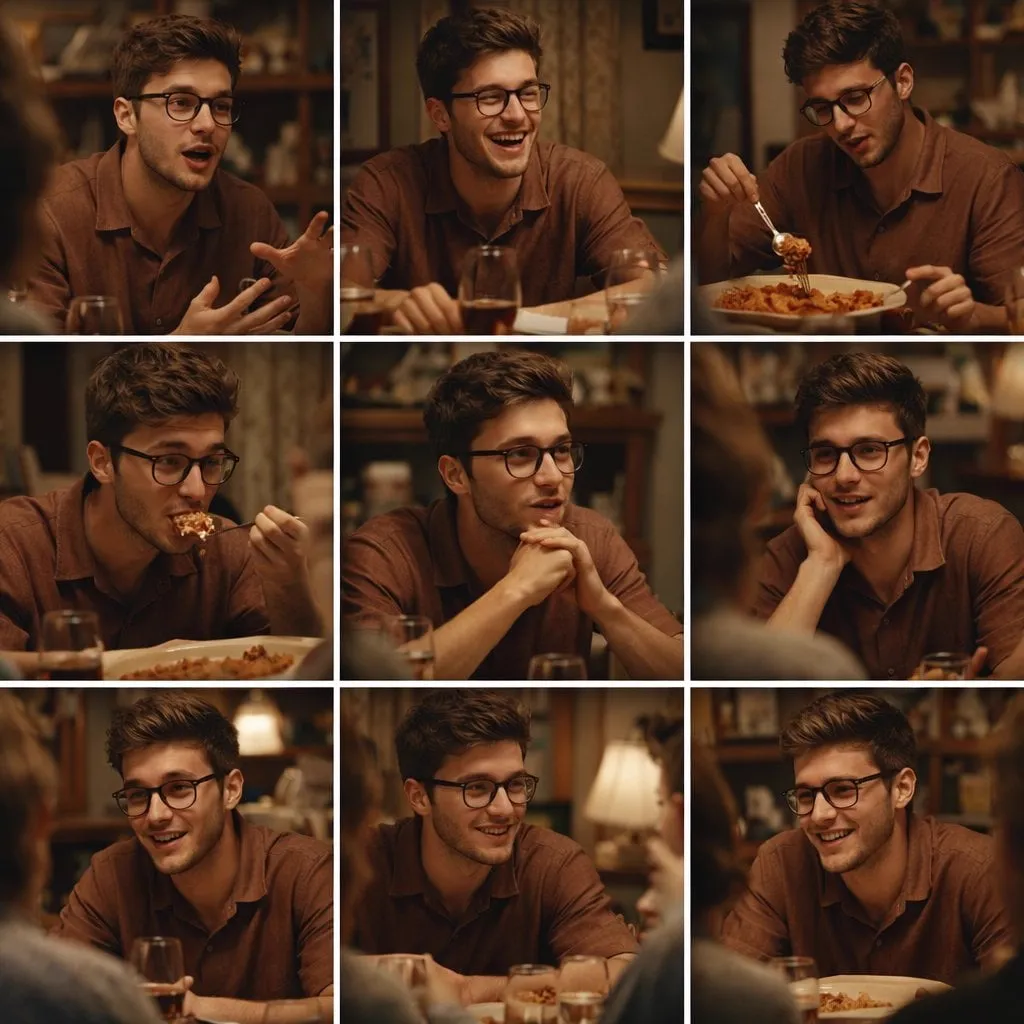
Two people can describe the same photo to the same AI model, and one result looks like a photograph while the other looks like a cartoon with extra steps. The difference is rarely the model. It is the information in the prompt. Photorealistic output comes from describing the things a camera and a photographer actually deal with: light, lens, exposure, texture, and atmosphere. Models have learned enormous amounts about photography, but they only use what you ask for. A prompt that mentions none of these things leaves the model to fill the gaps with its most generic guess, and the generic guess is never a photograph.
The fix is structure. A photorealistic prompt is not one long sentence of adjectives. It is a layered description where each layer answers a specific question. Once you learn the layers, you can write prompts that consistently produce images and videos that look like they were shot, not generated.
The Layered Prompt Structure
Think of a prompt as five layers stacked together. Each layer adds a different kind of information, and skipping a layer produces a specific kind of failure.
Subject first
The subject is what the image is about, and it should be specific enough to matter. "A woman" is not a subject; "a woman in her sixties with short gray hair and a denim jacket" is. The model needs concrete details about appearance, clothing, and state, because those details are what make the output feel observed rather than invented. If the subject is an object, describe material, age, wear, and surface: "a vintage brass desk lamp with a chipped green shade." Worn and imperfect details read as real.
Scene and environment
The environment answers where and when. Place the subject in a specific setting: "in a small café kitchen with worn tiles and a steam-covered window." Time of day matters more than most people expect: morning light is different from noon, and dusk is different from night. State the environment before the lighting, because the environment determines what the light can do.
Style and medium
The style layer tells the model which visual language to speak. For photorealism, the useful words are photographic: "shot on 35mm film," "documentary photography," "natural light portrait." These activate the model's photographic knowledge. If you want a specific era or look, name it: "1970s photo," "editorial fashion photograph." Avoid the word "photorealistic" as a substitute for description; the word alone does less work than "natural skin texture, film grain, no retouching."
Camera and optics
This layer is about the lens and how the camera sees. Focal length changes the feel: 35mm is a natural, documentary perspective; 85mm is a classic portrait look with flattering compression; 24mm is wide and environmental. Aperture controls depth of field: "f/1.8 shallow depth of field" isolates the subject, while "deep focus" keeps everything sharp. Camera height and angle belong here too: "shot at eye level," "low angle," "straight-on." Each choice reads as intent.
Lighting and atmosphere
Lighting is the layer with the largest effect. Name the light source and its quality: "soft window light from the left," "hard noon sun casting strong shadows," "warm practical lamp light," "cool overcast light." Add atmosphere to give the air itself a presence: "light haze," "dust in the sunbeam," "rain-slicked streets reflecting neon." A scene with named light and atmosphere feels photographed; a scene without it feels rendered.
Photographic Vocabulary That Works
Certain words consistently push output toward realism, and it is worth building a vocabulary list. Texture words help: "film grain," "natural skin texture," "fine hair detail," "imperfections." Light quality words help: "soft," "diffused," "hard," "golden hour," "blue hour," "rim light," "practical light." Lens words help: "35mm," "85mm," "shallow depth of field," "bokeh," "vignette." Motion and moment words help for video: "candid moment," "mid-stride," "caught mid-gesture." Negative guidance also helps: "no plastic skin," "no oversharpening," "no text" are common fixes that prevent the obvious tells of generated media.
Writing Prompts for Video
Video prompts use the same layers, plus one addition: motion. Describe what moves and how: "she turns her head slowly toward the camera," "leaves drift across the foreground," "camera pushes in gently." Name the camera move as part of the optics layer, because a video with no described movement defaults to motion that does not serve the moment.
Keep the action singular. One clear action per prompt generates better motion than a list of events. "He walks through the market, pausing to look at a stall" is one action with a beat. "He walks, stops, buys, smiles, and leaves" is five actions that the model will likely smudge together.
Model-Specific Optimization
The same prompt behaves differently across models because they were trained differently. Learning the preferences of each tool is part of the craft. The Flux series responds well to detailed physical description and photographic language, and it rewards careful lighting layers. Runway Gen-4 is strong with prompts that combine subject, scene, and camera in natural language, and it handles longer action descriptions. The Sora line benefits from clear physics and motion wording, since it is trained to understand how things move. Kling and PixVerse tend to reward concise, vivid prompts, while Luma's Ray series shines when you describe natural human motion explicitly.
The practical approach is to keep a personal playbook. When a prompt works on one model, note what you changed and why. When a prompt fails, change one layer at a time instead of rewriting everything. Over a few dozen generations, you will know which words each model respects.
Advanced Controls: Depth, Focus, and Motion
Beyond basic layers, a few advanced controls separate good prompts from excellent ones. Depth of field can be pushed hard for cinematic effect: "very shallow depth of field, face in sharp focus, background melted into bokeh." Rack focus, where attention moves between planes, can be requested directly in video. Camera height changes power dynamics: "camera at ground level" makes scenes feel different from "camera at chest height." Motion blur and shutter feel add realism: "slight motion blur on the passing traffic" sells speed and presence.
Use these controls deliberately and sparingly. Each one is a choice, and choices are what make the output feel directed.
Example Prompt Library
Here are complete prompts that combine the layers, useful as starting points for your own work.
Portrait: "a woman in her sixties with short gray hair and a denim jacket, sitting by a rain-streaked window in a small café, soft diffused window light from the left, 85mm lens, shallow depth of field, natural skin texture with fine wrinkles, film grain, candid, contemplative mood."
Street scene: "a delivery cyclist crossing a wet Tokyo intersection at night, neon signs reflecting on the asphalt, hard practical light mixed with blue shadows, 35mm lens, deep focus, slight motion blur on the wheels, cool teal and magenta palette, documentary style."
Product shot: "a vintage brass desk lamp with a chipped green shade on a worn wooden desk, late afternoon sunlight raking across the surface, dust visible in the light beam, macro detail on the brass texture, warm tones, shallow depth of field."
Landscape: "a lone farmhouse in rolling golden fields at blue hour, low mist over the ground, last warm light on the horizon, wide 24mm lens, deep focus, subtle film grain, quiet and vast atmosphere."
Common Mistakes
The most common mistake is stacking adjectives without information: "stunning, beautiful, amazing" tells the model nothing and produces generic imagery. Replace every adjective with a detail. The second mistake is forgetting the environment, which leaves subjects floating in an unlit void. The third is ignoring lighting, which is the single largest realism lever. The fourth is writing video prompts without motion, which produces slideshows. The fifth is skipping negative guidance, letting text artifacts and plastic skin creep in. The sixth is treating the first generation as final; photorealism is iterative, and the second and third passes are where the magic appears.
A smaller but expensive mistake is hoarding prompts instead of learning from them. Every time a generation fails, the reason is almost always one missing layer: no environment, weak light, absent motion. Name the missing layer, fix it, and move on. That habit turns every failed generation into a lesson, and the lessons compound quickly.
Building a Personal Prompt Library
The fastest way to get consistent results is to stop writing every prompt from zero. Keep a library of prompts that worked, organized by type: portrait, street, product, landscape, action, and video. Each entry stores the prompt, the model it was written for, and a note about what changed to make it work.
When a new project arrives, start from the closest library entry and adapt it layer by layer. Swap the subject, keep the lighting structure, adjust the environment. This is faster than a blank page, and it keeps your quality bar stable because you are reusing proven language. Review the library monthly and retire prompts that newer models have made obsolete.
Testing and Iterating Like a Photographer
Photographers do not expect one exposure to be perfect, and neither should you. The iterate loop is simple: generate, compare against the reference image or the intent, change one layer, generate again. Keep the changes small. If the skin looks plastic, adjust the texture and lighting layers, not the subject. If the colors feel off, change the atmosphere layer, not the composition.
Track what changed between versions, even in a short note. "V1 flat light, V2 added rim light, V3 switched to 85mm" is a history that teaches you which words move which results. After a dozen generations, you will have a personal sense of the model's behavior that no tutorial can give you.
Frequently Asked Questions
How important is the model compared to the prompt?
Both matter, but prompt structure is the multiplier. A great prompt on a decent model beats a weak prompt on a great model, every time.
Do I need to know photography to write these prompts?
It helps, but you mainly need the vocabulary in this article. Learn one layer at a time and practice naming what you see in real photos.
Why does my image still look fake?
Almost always the lighting layer is missing or weak. Add a specific light source and quality, and add negative guidance against plastic-looking skin.
How many versions should I generate?
Plan for two to five per image or shot. Each pass with one targeted change is how the result converges on realistic.
Can I use these prompts for commercial work?
Yes, and the licensing question is about the tool and model you use, not the prompt itself. Check the terms of each service.
What is the fastest way to improve?
Reverse-engineer real photographs: look at a photo you admire, write a layered prompt for it, generate, and compare. The gap between the photo and your result tells you exactly which layer to work on.
Should I use the same prompt across different models?
No. Models interpret language differently, and a prompt that sings on one can fail on another. Keep one master prompt per concept, then tune per model: adjust the camera vocabulary, the level of detail, and the negative guidance until each model produces its best version.
How do I keep a video consistent when the scenes are very different?
Lock the identity elements and vary the mood elements. The character keeps the same face, clothing, and reference portrait in every scene; the location keeps the same palette and key references. What changes between scenes is light, atmosphere, camera treatment, and action. Consistency of identity plus variety of mood is what makes a long piece feel both coherent and alive.
Is photorealism always the right goal?
No. Match the realism level to the purpose. Product shots and brand work often need strong photorealism, while stylized projects are better served by a consistent aesthetic that is not trying to be a photograph. The layered structure works for both; you simply choose different words in the style layer. Realism is a tool, not a default.
