
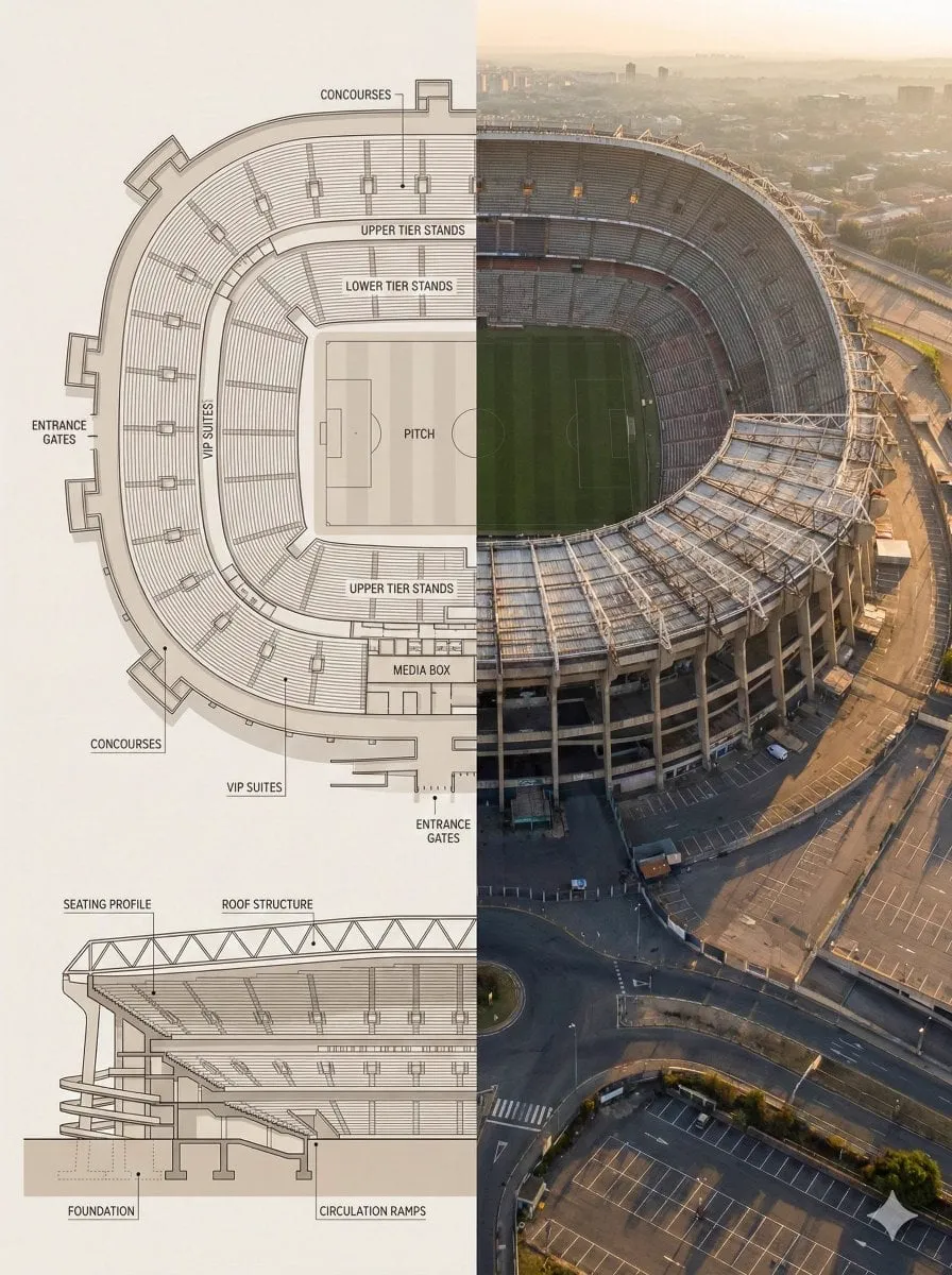
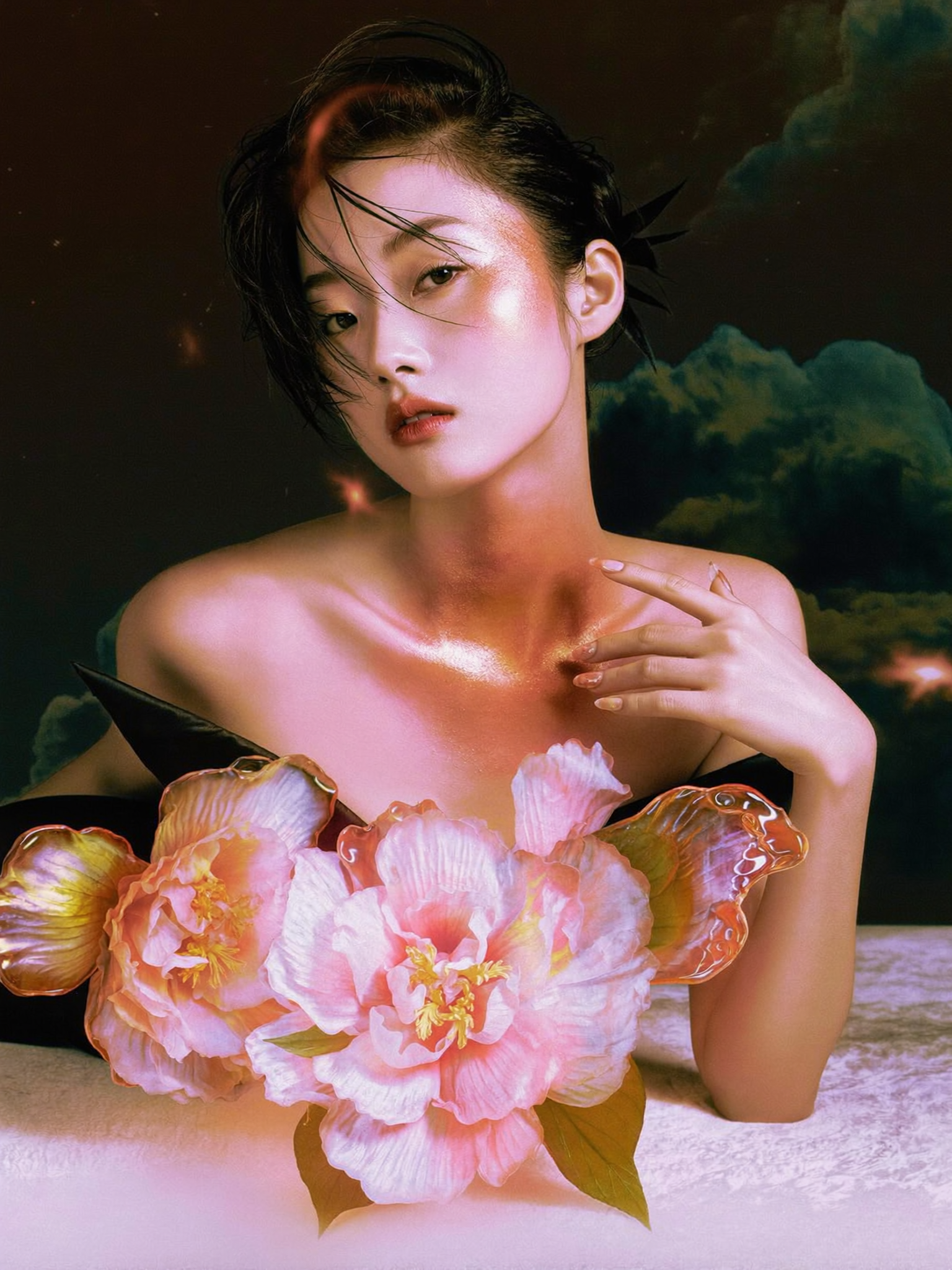
A poster is a promise of an idea. It compresses a story into a single frame: composition, color, typography, emotion. But in a feed that never stops moving, static images fight for attention with less and less success. The natural next step is motion — turning that poster into a video that breathes, moves, and tells the story frame by frame.
This is not a new ambition. Designers have animated posters for decades, but the process was slow, expensive, and required specialized skills. Generative AI has changed the math. Today, a single image can be the starting point for a full video sequence, and the gap between "static design" and "moving film" has never been smaller. This article walks through a practical creative workflow for turning photo montages and poster designs into compelling videos, covering asset preparation, model selection, consistency, and post-production.
Why static-to-motion is the new creative standard
The shift from static to motion is being driven by distribution, not aesthetics. Every major social platform now prioritizes video. A poster that took a designer a day to craft will be seen by fewer people than a fifteen-second motion version of the same idea, because the algorithm simply gives video more reach.
But there is a deeper reason: motion communicates hierarchy. In a static image, the viewer decides where to look. In a video, the director decides. That shift of control is exactly why brands and creators are willing to invest in animation, and it is why the ability to convert static designs into motion is becoming a core creative skill rather than a specialty.
The practical consequence is that poster designers, illustrators, and art directors now have a second career path available: motion. The design thinking they already possess — composition, contrast, narrative — transfers directly. What they need to add is a working knowledge of video generation tools and the discipline of a motion workflow.
Reading a poster like a filmmaker
Before generating anything, analyze the poster as a filmmaker would. A poster is not a random collection of elements; it is a designed hierarchy. Your job is to discover what the poster is saying and decide what motion will amplify that message.
Start with the focal point. What is the first thing the eye lands on? That element is your hero — the subject the camera should move toward, hold on, or reveal. Next, identify the layers: foreground, midground, background. Depth is the raw material of camera movement. A simple parallax effect, where background moves slower than foreground, instantly gives a flat image a sense of space.
Then look for implied motion. A flag that appears mid-wave, hair caught in the wind, a road that curves into the distance — these are invitations. The poster has already suggested movement; your video simply completes it. Finally, note the negative space. Empty areas are where you can place text, let the camera breathe, or add atmospheric elements like dust, light, or rain.
Ask yourself three questions before you start: What is the emotional center of this image? What should move, and what should stay still? What story does the sequence of frames tell that the single frame cannot? The answers define your shot list.
Preparing your assets for motion
Clean input produces clean output. The quality of your final video depends heavily on the quality and structure of the source image, so spend time on preparation.
First, work from the highest resolution you have. A 4K source gives the video model room to interpret details without inventing them. If the poster was designed at screen size, consider rebuilding key elements at higher resolution before generating. Second, separate elements where possible. If you have the original design files, export the background, characters, and text as distinct layers. This gives you options: animate the character while keeping the background static, or push the background into depth while the character holds still.
Third, clean the image. Remove compression artifacts, stray pixels, and anything you do not want the model to treat as intentional. Models reproduce what they see, including mistakes. Fourth, decide on text. Text in posters is often essential to the design, but AI video models frequently mangle text. The safest approach is to generate the video without the text, then overlay the typography in post-production where it stays sharp and controllable.
Finally, establish a color reference. Note the poster's palette and the mood of its lighting. You will use this language in your prompts, and it is the glue that keeps the video faithful to the original design.
Choosing your generation path: text-to-video or image-to-video
There are two main routes from poster to video, and they are not interchangeable. Image-to-video starts from your actual poster and asks the model to animate it. Text-to-video starts from a description and asks the model to build a scene from scratch. Each has strengths.
Image-to-video is the right choice when the poster itself is the brand asset: a movie key art, an album cover, a campaign visual. The model preserves composition and identity, and you direct the motion — camera push-in, parallax, object movement, atmospheric effects. The trade-off is control: the model may add or alter details in ways you did not intend, and complex compositions can drift.
Text-to-video is the right choice when the poster is a starting point rather than the deliverable — when you want a related scene, a different angle, or a wider shot of the same world. It gives you more freedom but demands precise prompting, because the model is building everything from your words.
The most effective workflows use both in sequence. Generate a key scene with text-to-video, extract a strong frame, refine it in an image editor, then run image-to-video on that refined frame to add motion. This hybrid loop — generate, extract, refine, animate — is the heart of modern AI motion design.
Keeping characters and style consistent
The single biggest failure in poster-to-video work is consistency. A character that changes face between shots, a color palette that drifts, a logo that mutates — these break the illusion and force reshoots. Consistency is not a luxury; it is the technical core of the craft.
The first tool for consistency is the reference image itself. Image-to-video models anchor strongly to the source, so a well-chosen, consistent set of reference frames is worth more than any prompt. When you need multiple shots of the same character, generate them from the same base image rather than describing the character in words every time.
The second tool is multi-image fusion: providing several reference images together — different angles of the same character, the poster plus a detail crop, a style frame plus a content frame — and asking the model to merge them into a coherent output. This is how you keep a character's face identical while changing the background, or keep the background identical while changing the action.
The third tool is a shared style sheet in your prompts. Maintain a reusable block of style descriptors: lighting direction, color palette, lens feel, atmosphere. Paste it into every generation for the project. It will not guarantee consistency by itself, but it reduces drift dramatically.
The fourth tool is discipline in post. When the model drifts, fix it in the edit: cut around the problem, use a matched frame from a previous shot, or re-generate just the offending segment. Consistency is a pipeline, and the pipeline includes human judgment.
Directing camera movement without a camera
Cinematography used to require a camera. In AI video, you direct the camera with words and parameters. Learning the vocabulary of camera language is the fastest way to improve your results.
Push-in: the camera moves toward the subject, increasing intimacy. Pull-back: the camera moves away, revealing context. Pan: horizontal rotation, useful for revealing a wide scene. Tilt: vertical rotation, moving from a detail to the full subject or vice versa. Dolly: physical camera movement, creating depth. Orbit: moving around the subject, adding drama. Static with motion inside the frame: the camera holds while elements move, which is often the most "designed" feeling option for poster-like material.
Match the movement to the message. A luxury poster wants slow, deliberate moves. A music visual wants kinetic energy. A product launch wants a confident push-in on the hero object. And remember: the best camera move is the one the viewer does not notice. It serves the story, it does not show off.
Speed and ease matter too. Most models let you control motion intensity. Start subtle. A gentle push-in with soft parallax is almost always more effective than an aggressive camera sweep that makes the image feel like a screen recording.
Post-production: sound, graphics, and polish
The generated video is a raw material, not a finished product. Post-production is where it becomes professional. Budget at least as much time here as you did for generation.
Sound comes first. A motion piece without sound feels dead, and music can transform a mediocre animation into an emotional one. Use royalty-free libraries or AI music generation to find a track that matches the poster's mood, then time your cuts to the beat. If the piece has narration, keep it simple: clear voice, consistent tone, and enough headroom in the mix for the music.
Typography is the second priority. If your poster has text, this is where it returns. Overlay the original type at full sharpness, animate it subtly, and never let the video model render it. Text that snaps into place at the end of the move looks intentional; text that shimmers and mutates looks like an error.
Color and finishing come third. A slight grade can unify frames that drifted in tone. Add film grain or vignette for a cinematic feel. Export at the highest resolution your platform supports, and remember the format: vertical for Reels and Stories, horizontal for YouTube, square for feeds. One poster can become three videos.
A repeatable five-step workflow
Turn the process above into a routine you can run on any poster in a day.
Step one: analyze. Spend fifteen minutes reading the image — focal point, layers, implied motion, negative space. Write down the shot plan and the emotional goal.
Step two: prepare. Upscale, clean, separate layers, remove text. Build your style sheet and reference set.
Step three: generate. Start with image-to-video for the hero shot. Extract the best frame. Refine it if needed. Generate supporting shots with text-to-video or additional image-to-video passes. Keep all generations for the same project in one place.
Step four: assemble. Edit the clips together, cut to music, add text overlays and sound design. Reject anything that breaks consistency, even if you like it in isolation.
Step five: finish and distribute. Grade, export in the required formats, and publish with a caption that points to the original design. Track which variants perform, and feed those lessons back into step one.
Common mistakes and how to avoid them
The first mistake is over-animating. Everything moving at once is exhausting; the viewer needs still points to rest. Pick one or two primary movements and let the rest stay calm.
The second is ignoring the original design intent. The poster's designer made deliberate choices about hierarchy and color. Motion should respect them, not fight them.
The third is accepting drift. When the character's face changes between shots, do not hope the audience will not notice. They will. Fix it with references, or cut it.
The fourth is skimping on sound. Silent motion looks unfinished. Even a simple bed of music changes everything.
The fifth is forgetting the platform. A beautiful horizontal piece posted vertically will be cropped into mediocrity. Design for the format from the start.
FAQ
Can I animate any poster? Most posters can be animated, but designs that rely on precise text or geometric symmetry are harder, because AI models struggle with both. Plan around those constraints.
How long does a poster-to-video project take? After you are comfortable with the tools, a single hero shot takes minutes to generate and an hour or two of post-production. A full multi-shot piece is a day of work.
Do I need expensive hardware? No. All the generation happens in the cloud; you need a decent computer for editing and a stable connection.
What if the model changes my brand colors? Include a precise color reference in the prompt and check every frame against the brand palette in post. Drift is fixable with a quick grade.
Is AI video replacing motion designers? It is changing the entry bar, not the craft. Designers who add AI motion to their toolkit produce more, faster, and remain in control of the vision.
Turning a poster into a video is one of the most satisfying workflows in modern content creation, because it combines the precision of design with the emotion of motion. The tools have matured to the point where the bottleneck is no longer technical — it is creative judgment. Analyze the image. Prepare it well. Choose the right generation path. Protect consistency. Finish with sound and typography. Follow that discipline, and every poster in your portfolio becomes a potential film.
