

Getting a short video to go viral is rarely an accident. Behind most breakout clips is a repeatable system: a thumbnail that earns the click, an opening that holds the viewer past the first three seconds, and a distribution strategy that gives the algorithm something to reward. In the current landscape, where every feed is crowded and attention spans are measured in fractions of a second, the difference between a video that flops and one that explodes often comes down to decisions made before the video is even finished.
This guide breaks down the full path from thumbnail to virality. You will learn how to design visuals that stop the scroll, how to structure the first seconds of your video for retention, how to use AI tools to iterate faster, and how to read the metrics that actually predict growth.
Short Video Is a Thumbnail Economy
Short video platforms have inverted the traditional relationship between content and packaging. On YouTube, a thumbnail has always mattered, but the video itself did the heavy lifting of keeping viewers. On TikTok, Instagram Reels, and YouTube Shorts, the packaging is often the only thing the viewer sees before deciding. The feed presents a grid of images; the video only plays if the image wins.
This means the thumbnail is not an afterthought added after editing. It is a competitive surface that must outperform thousands of alternatives in a crowded feed. Treating it as a last-minute task is the single most common mistake among creators who cannot grow. The creators who do grow treat the thumbnail as a hypothesis to be tested, not a decoration.
The economics reinforce the point. Platforms use click-through rate — the share of impressions that become views — as a signal of quality. A video with a strong thumbnail gets more initial views, which generates engagement signals, which triggers wider distribution. In effect, the thumbnail is the cheapest distribution lever available: improving it costs minutes, but it multiplies every other investment you make in the video.
The Psychology of the Click
People click on thumbnails for reasons that are surprisingly consistent. The dominant drivers are curiosity, emotion, and self-interest. A thumbnail that promises a clear benefit — a solution, a surprise, a satisfying payoff — outperforms one that simply illustrates the topic.
Curiosity works best when it is specific. "I tried this editing trick" is weaker than a thumbnail that shows a dramatic before-and-after with a surprised face. Emotion works best when it is readable at a glance: joy, shock, disbelief, anticipation. A viewer should be able to name the emotion in the thumbnail in under half a second. Self-interest works best when the benefit is concrete: a visible result, a number, a transformation the viewer wants for themselves.
Avoid the trap of abstract or generic imagery. A landscape photo, a logo, or a title card with no human element gives the brain nothing to latch onto. Humans are drawn to faces — especially faces showing strong emotion — because faces are information-dense and instantly legible. When a thumbnail includes a face, make sure the expression matches the promise of the video. A mismatch creates distrust and suppresses clicks.
Visual Elements That Stop the Scroll
Once you understand what motivates a click, you can design for it. The most effective thumbnails share a set of visual qualities:
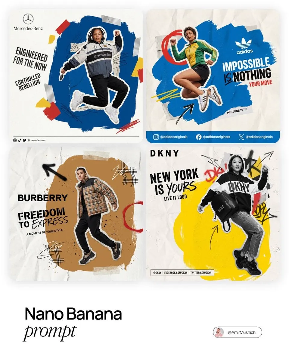
- High contrast. The subject must separate clearly from the background. Use color contrast, brightness contrast, or both. A subject that blends into its surroundings disappears in a small thumbnail.
- One focal point. The eye should land on a single element first, then travel. Too many competing elements create visual noise, and noise reads as low quality at thumbnail size.
- Saturation and warmth. Slightly oversaturated colors tend to outperform muted palettes in feeds, especially on mobile screens. This is a stylistic choice, but for reach-focused content it is a reliable one.
- Scale. The subject should occupy a large share of the frame. A thumbnail that looks like a distant figure in a wide landscape reads as vague; a face filling the frame reads as confident.
- Motion cues. Arrows, cutouts, or dramatic angles suggest action and energy. They nudge the viewer toward imagining the video's movement even before pressing play.
The test is simple: shrink the thumbnail to the size it appears in a feed on a phone. If the subject, the emotion, and the message are still readable, the design is working. If you have to squint, redesign.
Typography That Works on a Thumbnail
Text on a thumbnail is a double-edged sword. Done well, it adds a second channel of communication: it can name the topic, amplify the emotion, or add a number that promises scale. Done poorly, it clutters the image and makes the whole thing look amateur.
The rules are simple. Use short text — ideally three to five words. Make it large, so it remains legible at small sizes. Use a heavy, bold typeface, and give it an outline or a contrasting shadow so it survives any background. Place it where it does not cover the subject's face or the main focal element. And make sure the text promises something the video actually delivers; clickbait text that mismatches the content destroys retention and triggers negative feedback from viewers.
Numbers are particularly effective in thumbnail text because they are concrete and scannable: "3 tools", "10x faster", "day 30". They give the viewer a reason to click that feels specific rather than vague.
The First Three Seconds: Hooks and Retention
The thumbnail gets the click; the opening earns the watch. On short-form platforms, the first two to three seconds decide whether a viewer stays. The pattern is brutal: viewers swipe away the moment they are bored, and a high swipe-away rate tells the algorithm the video is low quality, capping its distribution.
The strongest openings do one of three things. They start mid-action, dropping the viewer into the most interesting moment and letting context arrive later. They open with a provocative statement or question that creates an information gap. Or they show the payoff immediately — the result, the transformation, the final reveal — and then rewind to show how it happened.
The same AI tools that help you generate visuals can help you iterate on openings. Generate two or three alternative opening shots, cut them together, and test which one holds attention longest. This is where the data-driven approach pays off: retention graphs from the platform's analytics show exactly where viewers drop off, and you can target your revisions at the biggest drop.
Consistency and Style with AI Video Tools
AI video generation has made it practical to produce a consistent visual style across a whole channel. The tools that tripped over consistency a year ago now handle character and style locking through reference images and keyframe control. For short-form creators, this is a strategic advantage: a recognizable style builds a brand, and a brand earns repeat views.
Establish a style reference — a color palette, a lighting scheme, a character design, a type treatment — and reuse it across videos. When viewers recognize your visual signature in the feed, your thumbnails stop competing on novelty alone and start competing on familiarity. Familiarity, all else equal, wins clicks.
AI also accelerates iteration on the content itself. Instead of reshooting or spending hours in an editor to test a different angle, you can generate multiple variants of a scene and pick the strongest. The workflow becomes: draft, generate variants, test, refine. Speed of iteration is the real currency of short-form growth, because it lets you publish more tests and learn faster from the algorithm's response.
Titles, Hashtags, and Subtitles as Hidden SEO
The thumbnail is the visual packaging, but the metadata around the video is the search layer. Titles, hashtags, and subtitles tell the platform what your video is about and who should see it.
Titles should be specific and benefit-driven, matching the promise made in the thumbnail. Vague titles waste the click you earned. Hashtags should mix broad topics with niche communities; a handful of well-chosen tags beats a long list of generic ones. Subtitles are the quiet workhorse: a large share of short-form video is watched on mute, and on-screen captions keep those viewers engaged. Many platforms also index subtitles, which means they feed directly into search and recommendation.
A practical distribution habit is to adapt packaging per platform rather than cross-posting identical assets. The same video can carry a different thumbnail, title, and caption on each platform, tuned to that platform's audience and conventions. The content stays the same; the packaging changes.
Measuring What Works and Doubling Down
Virality is unpredictable at the level of a single video, but the underlying metrics are not. The two numbers that matter most are click-through rate and retention. CTR tells you whether the packaging works; retention tells you whether the content delivers. Both must be strong for a video to break out, and both can be improved deliberately.
Build a habit of reviewing your analytics weekly. Look at your top-performing videos and identify what they share: a topic pattern, a thumbnail style, an opening structure, a length range. Then produce more of that. Look at your worst performers and identify what they share as well — often the pattern is a mismatch between promise and content, or a slow opening.
Track your experiments explicitly. When you change your thumbnail approach or your hook structure, note the change and compare results over the following weeks. The creators who grow consistently are not the ones with the best ideas; they are the ones who test systematically and let the data correct their taste.
Building a Repeatable Posting Routine
Consistency compounds. A channel that posts three times a week with a stable process learns faster and grows more predictably than a channel that posts sporadically, no matter how good individual videos are. The reason is that growth on short-form platforms is driven by repeated sampling: each post is a test, and the algorithm's response to each test teaches you what your audience wants. More tests, more learning.
A repeatable routine has four parts. First, a topic pipeline: keep a running list of video ideas, ranked by audience signals — comments, shares, searches, and what competitors in your niche are doing well. Second, a packaging step that happens before production, not after: for each idea, draft the thumbnail concept and the opening line before you shoot or generate, because packaging decisions shape content decisions. Third, a production cadence: batch similar work together — write all scripts on one day, produce all visuals on another — so the creative state of mind is not constantly interrupted. Fourth, a review ritual: once a week, look at the numbers, keep what worked, and discard what did not.
The batching principle deserves emphasis because it is the highest-leverage habit available to solo creators. Producing three videos in one sitting is dramatically more efficient than producing one video on three separate days, because setup, tool loading, and creative momentum are shared across the batch. The same applies to thumbnails: generate variants for all upcoming videos in one session, then refine them in another.
Finally, protect your packaging standards from drift. When you find a thumbnail style or opening pattern that outperforms, write it down — literally keep a short style guide for your channel. Channels grow when good decisions are repeated, and they stall when every video is a fresh improvisation.
FAQ
How many thumbnails should I test per video? At minimum two, ideally three. Generate different concepts — emotional, contrast-driven, mystery-driven — and let the data decide. On platforms that allow post-publication thumbnail changes, swap and compare.
Does the thumbnail matter on TikTok? Yes, even though the format emphasizes the video itself. The cover image is what appears in the profile grid and in some feed contexts, and a strong cover improves profile visits and repeat engagement.
How long should a short video be? Long enough to deliver value, short enough to hold attention. Shorter is generally safer for discovery; depth can come from a series rather than a single long clip.
Should I use AI-generated thumbnails or design them myself? Use both. AI is excellent for generating concepts and variants quickly; a human pass for typography and final polish usually lifts quality further. The best workflow combines generation with curation.
What is the fastest way to improve retention? Move the payoff earlier. If viewers drop off at the 10-second mark, the opening is taking too long to deliver. Cut the setup, start closer to the action, and test again.
Final Thoughts
Virality is a system, not a lottery ticket. The system has three parts: packaging that earns clicks, content that holds attention, and iteration that turns data into improvement. AI tools make the iteration faster and the packaging cheaper, but the fundamentals remain human: understanding what your audience wants, promising it clearly, and delivering on the promise. Master those three things, and the views will follow.
