
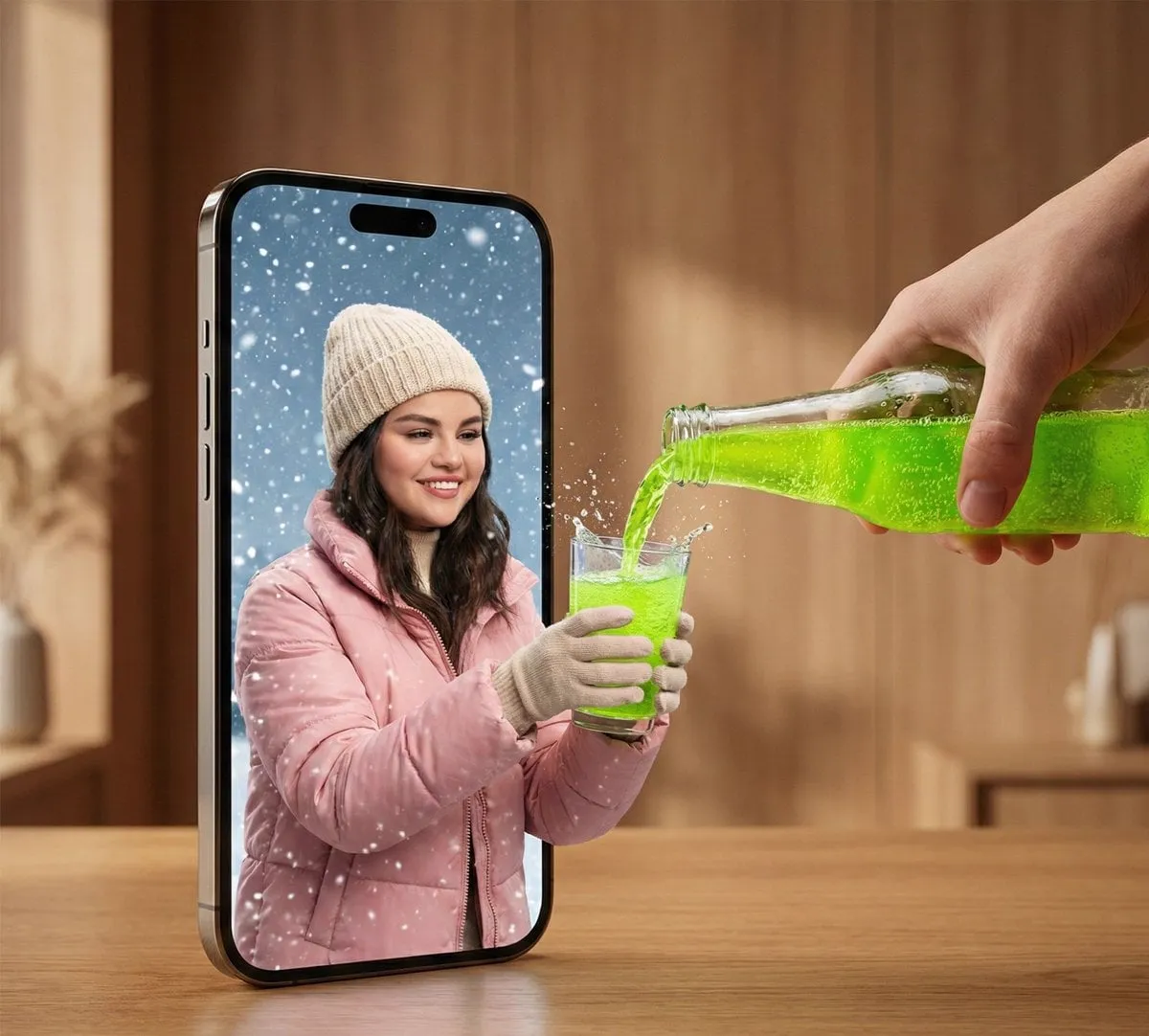


Why Thumbnails Decide Whether Anyone Watches
The thumbnail is the first thing a viewer sees, and for most channels it is also the last. On a crowded home feed, a person decides in a fraction of a second whether a video deserves a click. Everything that happened in the editing room counts for nothing if that tiny image fails. This is why top creators treat thumbnail design as a separate discipline, with its own research, testing, and iteration cycle.
The math is simple. If your click-through rate goes from 2 percent to 4 percent, you double the traffic your algorithm sees, which usually doubles impressions again. Small changes in the thumbnail compound across every video you publish. A channel that improves its average CTR by even one point can outgrow a competitor with better content but weaker packaging.
AI has changed this game in a way that matters for independent creators. Previously, a good thumbnail required graphic design skills, a subscription to an expensive editor, or hours of manual work in Photoshop. Now a capable AI image tool can produce a dramatic background, a clean cutout of your face, or a stylized title treatment in minutes. The barrier to entry has dropped, and the winners are the creators who combine these tools with solid design fundamentals.
This guide walks through the psychology of clicks, what modern AI thumbnail tools actually do, a repeatable production workflow, and how to test and improve your thumbnails over time.
How Click Psychology Actually Works
Before touching any tool, it helps to understand why people click. A thumbnail works when it answers three questions in the split second a viewer glances at it: what is this about, why should I care, and is it worth my time?
The most reliable pattern is a single emotionally expressive face. Humans are wired to read faces, and a strong expression communicates the emotional payoff of the video faster than any text. This is why reaction channels, review channels, and tutorial creators almost always lead with a face. The expression should match the video's promise: shock for surprising facts, excitement for reveals, concern for warnings.
The second pattern is visual contrast. A thumbnail competes with dozens of others in a grid, so it needs to stand out at a small size. High contrast between subject and background, saturated accent colors, and a clear focal point all help. What kills a thumbnail is clutter: too many elements, tiny text, or a busy background that makes the subject disappear.
The third pattern is curiosity with a specific promise. Vague mystery rarely works; specific gaps work well. Instead of "The Truth About AI Video," a thumbnail that says "I Tested 5 AI Video Tools" sets an expectation the viewer can evaluate. The text should be readable at mobile size, which usually means no more than three or four short words.
What Modern AI Thumbnail Tools Can Do
AI tools for thumbnails fall into a few broad categories, and understanding them helps you choose the right one for each step.
Image generation models are the core of the new workflow. They can create photorealistic backgrounds, dramatic lighting scenes, fantasy environments, or product shots that would be expensive to produce on set. Instead of searching stock sites for a decent background, you describe the scene and generate several options in minutes.
Image editing and inpainting tools handle the details. You can remove a distracting object, extend a background, change the sky, or fix a stray hair in a portrait. Inpainting is especially useful when you shot a photo that is 90 percent right but has one element ruining it.
Cutout and background removal tools isolate the subject in one click. This matters because the classic high-CTR format is a clean subject cutout over a bold background. The AI handles the fiddly edge work that used to take minutes by hand.
Text and typography helpers design the overlay. Some tools suggest short, punchy wording; others render stylized text that matches the visual mood. The best results come when you treat the tool as a typography assistant rather than letting it write the entire message.
Face enhancement and expression tools polish portrait thumbnails. They can improve lighting on the face, widen the eyes slightly, or create a cleaner look. Use these lightly; a thumbnail that looks obviously edited can read as clickbait and hurt trust.
A Repeatable AI Thumbnail Workflow
The goal of a workflow is consistency without creative burnout. You want every thumbnail to take about the same time and follow the same quality bar.
Step one: define the hook
Write one sentence that captures the video's core promise. This becomes the brief for everything else. If you cannot write the hook in a single sentence, the video probably lacks focus too. The hook drives both the expression you want and the words you put on the thumbnail.
Step two: generate background options
Describe the scene in the image generator: location, lighting, mood, and any objects that support the topic. Generate four to six options and pick the one with the strongest contrast and clearest focal area. Avoid backgrounds with busy patterns or small text; they fight with the subject.
Step three: prepare the subject
Shoot a clean photo of yourself with even lighting, or generate a character that matches the video. Remove the background, then place the subject over the chosen background. Position the face in the upper third or center where eyes naturally land. The face should occupy a large enough area to read at small size.
Step four: add text last
If the hook needs words, add them after the image is composed. Keep the wording short, use a bold font, and place text where it does not cover the face. Check legibility at thumbnail size by shrinking the preview; if you squint and lose the words, cut them or enlarge them.
Step five: export and compare
Export the candidate and compare it side by side with your last few thumbnails in a grid. Ask whether it stands out, whether the emotion is readable, and whether the promise is clear. If it looks like every other thumbnail you have made, change the color palette or composition.
Design Rules That AI Does Not Override
AI removes the craft barrier, but the principles of good design still apply. The tools will happily generate a thumbnail that violates every rule; your judgment is what keeps the result strong.
Contrast comes first. Check the thumbnail in grayscale; if the subject disappears, the contrast is too low. A common fix is a dark or desaturated background with a bright subject, or the reverse. Contrast creates separation, and separation creates readability.
Size matters more than detail. Most viewers see the thumbnail at a few hundred pixels wide, sometimes on a phone in a moving feed. Elements that look great at full resolution may vanish at real size. Design for the small version and zoom out frequently while working.
Faces beat objects. If the video is about a person, a face is almost always the strongest element. If there is no person, a single recognizable object with emotional weight works. Avoid generic icons that look like every other channel.
One idea per thumbnail. Decide whether the thumbnail sells the outcome, the process, or the surprise. Trying to sell all three at once creates clutter. The single strongest idea, executed cleanly, outperforms a collage of weak ones.
Choosing Tools for Your Workflow
The right toolset depends on your volume and style. A creator publishing daily needs speed and consistency; a creator making a few high-production videos per month can afford more manual control.
For high volume, a pipeline that generates backgrounds automatically, cuts out your face with one click, and applies a preset text style is ideal. The goal is to spend ten minutes per thumbnail, not an hour.
For maximum control, use an image editor alongside generation. Fine-tune lighting, adjust color grading, and manually correct details the AI got wrong. This is slower but gives a more art-directed result.
For consistency across a series, save your settings: the background prompt template, the text font, the color palette, and the composition layout. A series that shares a visual system builds recognition; viewers learn to spot your videos in the feed.
Whichever tools you pick, keep the workflow boring and repeatable. Creativity belongs in the hook and the concept, not in relearning the software every week.
Testing and Iterating Like a Data-Driven Creator
Thumbnails are hypotheses. You guess what will perform, publish, and then read the data. The creators who win treat every video as a small experiment.
YouTube's analytics show impressions, CTR, and average view duration. The CTR tells you about the packaging; the duration tells you about the content. If a video has high CTR but low duration, the thumbnail overpromised. If it has low CTR but high duration, the content is good but the packaging fails. Both signals are useful, and you should act on each differently.
A/B testing is the gold standard. Instead of guessing between two strong thumbnails, test both against the same video. Let each variant accumulate enough impressions to be meaningful; early differences are noisy. Keep the winner, study why it won, and feed that lesson into the next round.
Audience-specific variants can further improve performance. The same video can be packaged differently for search viewers, subscribers, or a specific demographic. If your analytics show different audience segments, test whether different faces, wording, or colors perform better for each.
Iteration is not about perfection; it is about compounding small gains. A thumbnail that adds 0.5 percent CTR on every video becomes a massive growth advantage over a year of publishing.
Common Mistakes and How to Fix Them
Several failure patterns show up constantly, and most are easy to fix once you see them.
Text overload is the most common. Tiny sentences, multiple lines, and words that duplicate the title all hurt. Fix it by cutting the text to the single most important phrase and making it huge.
Fake emotion is a close second. A forced surprised face undermines trust when the video delivers something ordinary. Fix it by matching the expression honestly to the content, or by dropping the face entirely and using a strong object instead.
Busy backgrounds dilute the subject. Stock photos with lots of detail, or AI backgrounds with random elements, make the thumbnail impossible to read. Fix it by blurring, darkening, or simplifying the background so the subject owns the frame.
Inconsistent branding confuses recognition. If every thumbnail looks like it came from a different channel, you lose the accumulated recognition. Fix it by defining a small visual system and sticking to it.
Skipping the small-size check leads to unreadable results. Fix it by making the small preview the primary view during design, not an afterthought.
Frequently Asked Questions
Do I need to show my face in every thumbnail?
No. Faces are powerful, but a strong object, a dramatic scene, or a bold design can work when the video does not revolve around a person. Test both styles and let the data decide.
How long should I spend on a thumbnail?
For most creators, ten to thirty minutes is healthy. If you are spending hours, your workflow is too manual. If you are spending seconds, you are probably ignoring the principles above.
Should I use AI faces or my own photo?
Your own face builds recognition and trust. AI-generated faces can work for anonymous or fictional characters, but viewers may feel deceived if the face implies a real person who never appears.
Can I rely on AI text generators for the words?
AI can suggest phrasing, but the final wording should be your hook, not a generic phrase. Generic wording produces generic CTR.
How do I know my thumbnail is good before publishing?
Place it in a grid with your previous thumbnails and with competitors' thumbnails. Shrink it. Ask whether it stands out at a glance and whether the promise is clear. If you hesitate, make a second option and compare.
Final Thoughts
The thumbnail is not decoration; it is the first chapter of your video. AI tools have removed the technical barrier, which means the differentiator is now judgment: picking the right hook, applying design fundamentals, and testing relentlessly.
Start with a simple workflow that produces clean, high-contrast thumbnails in a repeatable way. Measure what happens. Keep the patterns that work, discard the ones that do not, and let small compounding gains do the heavy lifting over time. The creators who treat packaging as seriously as production will keep winning the click, and the click is where every audience begins.
