
The Thumbnail Is the First Draft of Your Video's Success
On YouTube, the competition for a click happens before the video even plays. In a feed full of options, viewers decide in a fraction of a second whether your content is worth their time, and the thumbnail is the single biggest factor in that decision. A large share of click decisions are influenced by the thumbnail, which means that two videos with identical content can have wildly different performance solely because of the image that represents them. Creators who treat thumbnails as an afterthought are leaving a huge portion of their potential audience on the table.
The modern thumbnail is not just a pretty picture. It is a visual argument: it tells the viewer what the video is about, why it matters, and what they will get by clicking. It combines composition, color, text, and emotional cues into one compressed message. And in the current competitive environment, where upload volume keeps growing and viewer attention keeps shrinking, the thumbnail has become a discipline of its own, with principles, testing, and increasingly, AI assistance. This guide walks through a complete workflow for designing SEO-friendly thumbnails that earn clicks, using AI tools where they genuinely help and keeping the process fast enough for regular uploads.
What Makes a Thumbnail Get Clicked
Before touching any tool, it helps to understand the mechanics of a click. A thumbnail works by triggering recognition and curiosity simultaneously. Recognition means the viewer instantly understands the topic, often by matching a familiar format: a face with an exaggerated expression, a dramatic before-and-after, a numbered list. Curiosity means the viewer feels a gap between what they see and what they want to know, and clicks to close it.
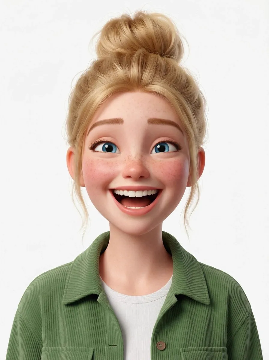
Three elements do most of the work. The face is the strongest attention anchor in human vision, especially a face with clear emotion; a genuine-looking surprise, excitement, or confusion reads instantly and creates an emotional hook. The subject should be obvious at small size, because most viewers first see thumbnails as tiny images on a phone; if the subject is only clear when zoomed in, the thumbnail has already failed. And the text, used sparingly, should promise a specific outcome or pose a compelling question, not describe the video's title again.
Clarity beats cleverness. The best thumbnails communicate their promise in under a second, at small size, without requiring the viewer to parse complex imagery. Every element that does not support that instant understanding is noise, and noise reduces the click rate.
The Visual Rules That Modern Thumbnails Follow
The algorithms and the audience have converged on a set of visual conventions that consistently outperform random designs. Understanding them gives you a strong starting point.
Contrast is the first rule. Thumbnails compete against each other in a dense feed, so the ones that stand out use strong contrast: bright versus dark, saturated color against neutral backgrounds, large shapes against small ones. A common approach is a dark or blurred background with a bright, high-contrast subject in the center.
Color psychology does real work. Warm colors like red and orange signal urgency and excitement, and they appear disproportionately in high-performing gaming and challenge content. Blue communicates calm and trust, which suits educational content. The practical rule is to pick one dominant accent color and use it deliberately, rather than painting the thumbnail in a rainbow of competing hues.
Composition follows the rule of thirds and the center-frame convention. The key subject, usually the face or the product, should sit where the viewer's eye naturally lands, and important elements should avoid the edges where cropping and UI overlays cut into the image. Text belongs in a stable zone: on mobile, the right side of the thumbnail is often covered by the video duration badge, and on desktop, the title sits below and slightly overlapping the image. Design with those obstructions in mind.
Text That Adds Value Instead of Repeating the Title
Thumbnail text is easy to misuse. Too much text creates clutter; text that repeats the video title wastes the space; text that is unreadable at small size is worthless. The right text performs one of three jobs: it adds information the title does not carry, it creates curiosity, or it clarifies the video's format.
Keep text short: two to four words is the practical range. Use the largest, boldest font your design can hold, with a strong outline or shadow for contrast. Choose a font family that matches your brand, but favor legibility over style. And test the thumbnail at small size before publishing; if the text is not readable as a tiny image, it is not doing its job.
Effective text patterns include numbers ("3 Mistakes"), questions ("Why Is It Failing?"), and concrete promises ("Full Setup"). The text should be specific enough to create a mental image of the content, but open enough to make the viewer curious. Avoid generic words like "video" or "watch this," which add no information and no emotion.
Generating Thumbnail Assets With AI Image Models
AI image generation has changed the production side of thumbnails dramatically. The most useful applications are creating background scenes, generating illustrative elements, producing stylized character art, and prototyping concepts before committing to a design. Instead of hunting through stock libraries for the perfect background, you can generate one that matches the video's mood exactly.
For most thumbnail work, image-to-image or inpainting workflows are more useful than text-to-image. Start with a real frame from your video or a photo of yourself, then use AI to clean up the background, change the lighting, add dramatic effects, or remove unwanted objects. This keeps the authentic connection to the actual content, which matters for viewer trust; a thumbnail that promises something the video does not deliver will hurt retention and channel reputation.
When generating, think in variations. Generate three or four concepts per thumbnail, varying the composition, color, and subject emphasis, then narrow down based on the principles above. AI makes iteration cheap, so the bottleneck shifts from production cost to your judgment about what works. That judgment improves with practice and with data from real performance.
Using AI for Competitor Analysis and Testing
One of the least appreciated uses of AI in thumbnail design is analysis. You can gather thumbnails from successful videos in your niche and use AI tools to identify patterns: which colors dominate, which facial expressions recur, what text styles the top performers use. This is not about copying competitors; it is about learning the visual language of your niche before you design something that fights it.
The same analytical approach works on your own thumbnails. After a video publishes, collect performance data: impressions, click-through rate, and retention. Compare your thumbnails against each other and against the niche patterns. Over time, you build a personal dataset of what works for your audience, which is far more valuable than generic advice.
A/B testing is the gold standard. YouTube's built-in testing lets you compare up to three thumbnails against each other, showing each to a segment of your audience and picking the winner automatically. Run tests on your biggest videos, change one variable at a time, and record the results. The compounding effect of a few percentage points of CTR on every upload is enormous over a year.
A Repeatable AI-Assisted Design Workflow
The goal is a workflow you can run in under an hour for every video, without losing quality. Here is a practical sequence.
Start with the promise: write down in one sentence what the viewer gets from the video. Translate that into the emotional hook: what feeling should the thumbnail trigger? Choose the anchor: usually a face, a product, or a dramatic object. Generate or gather the base visual: a clean frame from the video, a generated background, or a studio photo. Use AI to refine: remove distractions, boost lighting, add effects. Compose the layout: place the subject, add the short text, apply the brand colors. Check the small-size test: shrink the thumbnail to phone size and confirm it still reads. Then export high-resolution versions and set up the test.
Each step is fast, and the workflow improves with every iteration because you learn what your audience responds to. The discipline is doing the full sequence for every upload, not just the videos you care about. Consistency of process is what builds the dataset and the skill.
Brand Consistency Across Your Channel
Thumbnails also do branding work. When a viewer scrolls through their feed and sees a thumbnail from your channel, they should recognize it instantly, even before reading the channel name. This recognition is built through consistent design elements: the same color palette, the same font family, the same face placement, the same style of imagery.
Consistency creates a compounding trust effect. Returning viewers recognize your content and click faster; new viewers start associating the visual style with quality, which raises their willingness to click. It also makes your channel look professional and intentional, which separates serious creators from casual uploaders.
The risk is that consistency becomes sameness, and every thumbnail looks like a template. The solution is to keep the framing elements stable, the colors and fonts and composition, while varying the subject and the emotion. Your thumbnails should feel like episodes of the same series, not copies of each other.
Designing for Multiple Platforms and Languages
A single video often needs thumbnails for more than YouTube. The same content may be promoted on X, in a newsletter, or as a custom cover on a podcast episode, and each surface has its own dimensions and conventions. The efficient approach is to design the master thumbnail at a large square or 16:9 size, then generate platform-specific crops from it. Keep the critical elements, the face and the text, inside the safe center zone so that every crop keeps the message intact.
For creators with international audiences, language is the second dimension. A thumbnail that works in English may need a localized version for a Spanish, Portuguese, or Japanese audience, and the text should be translated, not machine-pasted. Short text translates more cleanly than long phrases, which is another reason to keep thumbnail copy to two to four words. If the video's title and audio are localized anyway, the thumbnail should match; a mismatch between the image language and the content language signals carelessness and lowers trust. Build localization into your workflow by keeping the thumbnail template files organized by language, so generating a new market's version is a matter of swapping the text layer rather than redesigning from scratch.
Common Thumbnail Mistakes and How to Fix Them
Several errors appear again and again. Cluttered compositions with too many elements confuse the eye; simplify to one clear subject. Text that is too small, too long, or unreadable at small size; enforce the two-to-four-word rule and test at phone scale. Overpromising: a thumbnail that promises something the video does not deliver destroys trust and retention; keep the promise honest. Inconsistent branding that makes the channel feel random; lock your palette and fonts. Ignoring platform UI: elements hidden behind duration badges or overlapped by titles; leave safe margins. And skipping the test: publishing without comparing alternatives leaves easy wins on the table.
Frequently Asked Questions
How long should I spend on a thumbnail? Aim for thirty to sixty minutes per video as a working budget, less once your templates and brand kit are in place. The thumbnail is usually worth more time than minor editing polish on the video itself.
What resolution should thumbnails be? The standard is 1280 by 720 pixels, which is 16:9, with the important content staying within the safe center area. Export at high quality; compression artifacts reduce perceived professionalism.
Does AI-generated imagery hurt my click-through rate? Not inherently. What hurts CTR is inconsistency with your video's content and weak design principles. AI is a tool; the design judgment is yours.
How many thumbnails should I test per video? Two to three is the practical range. More than three fragments the sample and slows the decision. Test on your most important uploads where the extra effort pays off.
Can I use text on thumbnails if my audience is international? Yes, but keep it minimal and consider whether the text is universally understood. Universal visual hooks like faces and dramatic scenes travel better than words.
Do thumbnails affect SEO directly? They affect click-through rate, and CTR is one of the signals YouTube uses to judge how well a video satisfies search and browse queries. Higher CTR feeds better distribution, so thumbnails are a genuine SEO lever, even though they are not a keyword field.
