

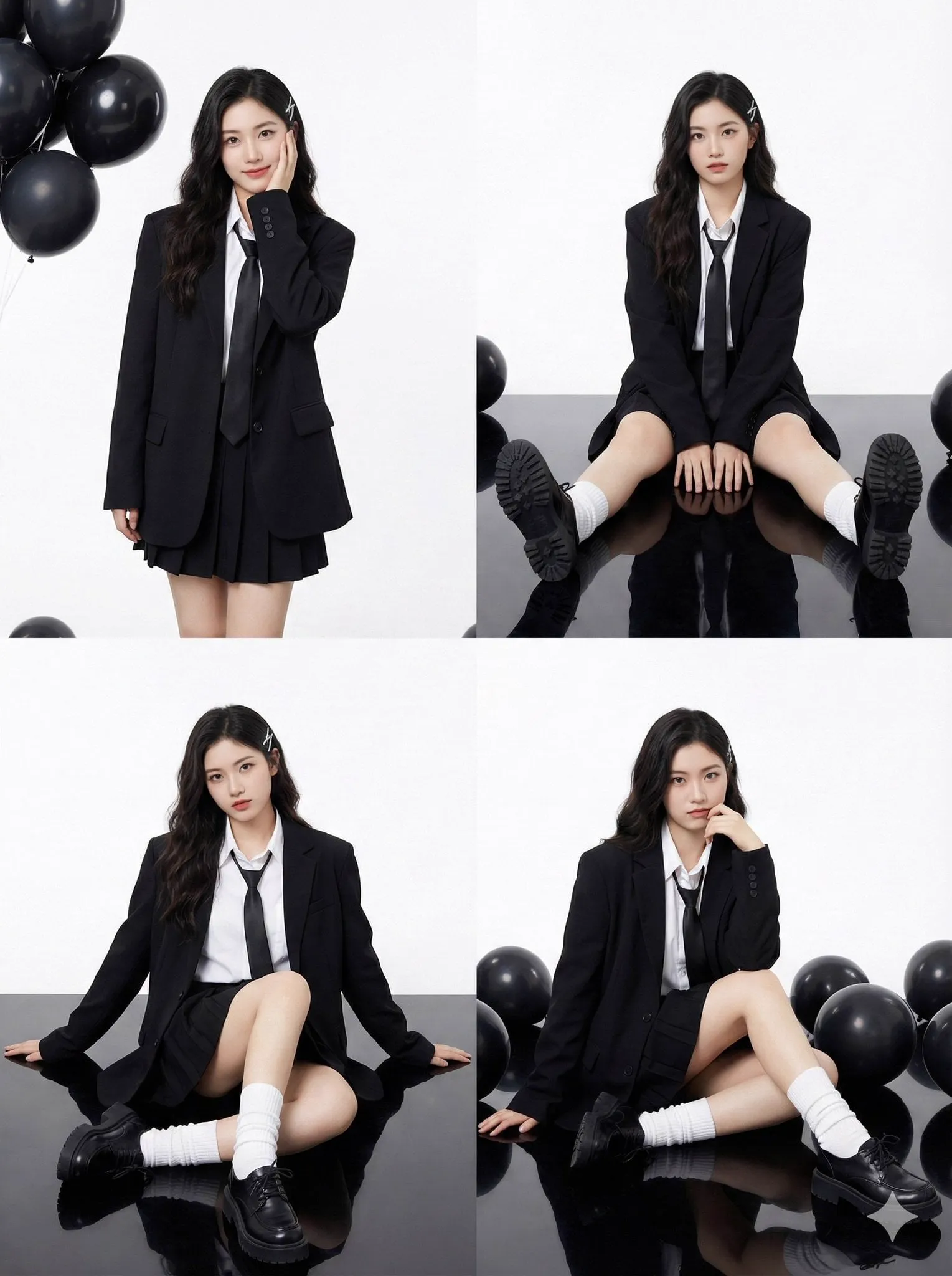

The thumbnail is the first thing a YouTube viewer sees, and in a crowded feed it decides whether your video gets a chance. It is effectively a one-second advertisement for your content, and it works alongside the title to earn the click. Yet many creators treat it as an afterthought, choosing an automatic frame from the video rather than a designed image that commands attention. This guide explains the principles behind thumbnails that win clicks and how modern AI image tools make professional thumbnail design faster and more consistent.
Why the Thumbnail Is a One-Second Ad
YouTube recommendations surface thousands of videos next to each other, and the thumbnail is the primary differentiator at a glance. Viewers scan, and within a fraction of a second they decide what looks worth their time. A video with a weak thumbnail loses to a weaker video with a strong one. The click-through rate, the percentage of viewers who click after seeing the thumbnail, feeds directly back into the algorithm, telling it your content is worth recommending.
Over time, YouTube's recommendations weigh engagement signals like click-through rate and watch time. A high click-through rate from a well-designed thumbnail both wins the immediate viewer and signals the platform to distribute the video more widely. Thumbnail design is therefore not decoration; it is a piece of performance engineering.
The Core Principles of a Click-Winning Thumbnail
Great thumbnails are not random; they follow a consistent set of design principles.
One Clear Subject and One Clear Emotion
A thumbnail that tries to show everything shows nothing. Choose one central subject, usually a person's face or a single object, and one dominant emotion that matches the video, curiosity, surprise, delight, or urgency. A clear emotional promise at a glance is more persuasive than a cluttered collage.
Visual Contrast and Readability at Small Sizes
Thumbnails are viewed tiny, on phones and dimly lit rooms. The design must survive being shrunk. Use high contrast between the subject and the background, saturate the important colors, and keep negative space clean. If a thumbnail does not read clearly at a small size, it will not win the click.
Legible, Minimal Text
Text helps, but it is often overused. A short phrase of two to six words in a bold, readable font works far better than a paragraph. The text should complement the image, not repeat the title, and it must remain legible in the corner where the video length badge appears. When in doubt, fewer words.
A Consistent Brand Style
Repeating a consistent color treatment, frame style, and font across your channel helps viewers recognize your content instantly. Visual consistency compounds the recognition advantage, especially for serialized content. It also makes your production look more professional.
Choosing the Right AI Image Tools for Thumbnails
AI image generation has become a strong partner in thumbnail design, both for generating base images and for enhancing them. The right tool depends on the task.
Generation Tools for Base Images
Generative image models turn a text prompt into a finished illustration or scene. They are ideal for concept-driven thumbnails, such as a dramatic scene, a stylized character, or a bold non-literal visual you cannot easily capture on camera. Describe the subject, style, lighting, and composition with precision to steer the result.
Code-Generation and Enhancement Tools
When you have a real video still or photo, AI upscalers and enhancement tools increase resolution and clean up noise, making a webcam frame look broadcast-clean. Background-removal tools isolate the subject so you can composite it onto a designed background. These tools bridge the gap between raw footage and a polished, designed thumbnail.
Staying in One Creative Loop
The most efficient workflow keeps you in a single editing tool. Generate or enhance the image in a dedicated AI tool, then export to your editor, either an image editor or directly into the channel's design tool, to add text and final polish. Avoid hopping between too many apps, which slows the loop and dilutes your style.
Predicting What Will Perform Before You Publish
The biggest advantage of AI in thumbnail design is the ability to test ideas cheaply before committing. Because generation is fast, you can produce several thumbnail variations for a single video and evaluate them against principles rather than guessing.
Generate Multiple Variations
Create a small set of thumbnails for each video, varying the emotion, the subject position, the color palette, and the wording. This gives you options and lets you pick the strongest without re-shooting or re-editing.
Apply the "Small Size" Test
Shrink each candidate and view it at the size it will actually appear. The one that remains readable, striking, and specific at thumbnail size is your winner. If two are close, test both by alternating them on a live video and reading the click-through data.
Iterate From Data, Not Opinion
Your strongest guide is real performance data. After a video goes live, compare click-through between variants and identify what your specific audience responds to. Over several videos, the pattern of what wins becomes clear and feeds directly into your next design.
Building a Fast, Repeatable Thumbnail Workflow
Designing thumbnails one at a time is slow. A repeatable workflow makes it a small, predictable step in each video's production.
Step One: Save the Best Frame
Pull the single most expressive, on-genre frame from your footage. A genuine face with a strong expression beats a posed graphic for authenticity.
Step Two: Enhance With AI
Run the frame through an enhancer to boost resolution and introduce your signature color grade or lighting treatment. Remove the background if you want to composite the subject onto a designed backdrop.
Step Three: Compose and Add Type
In your editor, position the subject off-center, add short bold text in your brand font, and build a subtle visual hierarchy so the eye lands on the subject, then the text, then the background.
Step Four: Test in Context
Place the thumbnail in a mock YouTube feed next to competitors' thumbnails. If it does not stand out, iterate. Keep a template library so the next video takes minutes instead of an hour.
Common Thumbnail Mistakes to Avoid
Fluent designers avoid a set of recurring errors. Clickbait that does not deliver earns clicks but craters watch time, which is worse than a lower click-through rate over time. Text that bleeds into the length badge or the time display destroys readability. Overly bright, cluttered designs fatigue the eye and read as ads. Faces without a clear emotional expression lose the human connection. And inconsistent styles across a channel prevent the recognition that serialized creators depend on.
The Mismatch That Hurts Trust
The most damaging mistake is a thumbnail that overpromises. If the thumbnail promises something the video does not deliver, viewers click quickly and leave fast, damaging both watch time and trust. Keep the thumbnail honest, it should be enticing, but it must represent what the video actually offers.
Color, Face, and the Science of the Quick Glance
Behind the aesthetic rules there is real perception science that explains why some thumbnails win. The brain processes faces faster than almost anything else, which is why a clear, expressive face dominates most high-performing thumbnails. Warm, saturated colors, especially orange and yellow against darker tones, pop in a feed of muted and similar content. High contrast between subject and background makes the shape readable even at tiny sizes and in low light.
The Makeup of a Memorable Face
A single cropped face drawn close to the frame performs better than a full-body shot or a crowd. Position the eyes above the vertical center so the face remains visibly inside the thumbnail on mobile feeds. Choose an expression that telegraphs the video's promise, surprise, intensity, curiosity, delight, and let that expression carry more weight than any text.
Working With Color Palettes Deliberately
Limit each thumbnail to a dominant and an accent color so it reads as a cohesive image rather than a collection of clashing tones. Use the accent color for the single element you most want noticed, a CTA arrow, a highlighted word, a product. Keep a consistent background treatment across your channel so your thumbnails are recognizable as yours at a glance.
Respect the Small-Size Reality
Design on a reduced canvas periodically, not just at full size. A thumbnail that looks sharp at full resolution can collapse into noise when shrunk. Check every candidate at roughly the width it appears in search and on the home page, and reject anything that loses its legibility at that size, no matter how good it looks large.
Applying the Same Discipline to Titles
A thumbnail cannot succeed on its own; the title is its partner. Write titles that complement rather than repeat the thumbnail, using the thumbnail for the visual and emotional punch and the title for specificity and context. Keep titles tight, front-load the key idea, and avoid filler like "watch this" or "amazing". Together, thumbnail and title form a single promise, and when both are honest and specific, click-through and watch time both improve.
Testing Title and Thumbnail as a Unit
Because the two are judged together, test them as a unit too. When A-B testing offers title thumbnail variations, change one pair element at a time to isolate what moved the metric. Over time you build an evidence base of which combinations your specific audience finds most compelling, the same iterative loop that grows every part of a channel.
Building a Library of Proven Templates
As you learn what performs, turn your best results into reusable templates. Save your winning layouts, color treatments, and font pairings as channel assets so you are not redesigning from a blank canvas on every video. A small template library accelerates production, maintains consistency, and lets you vary the emotional message within a reliable visual frame.
When to Break the Template
Templates serve consistency, but they should not become a cage. Deliberately break your established look for major milestones, a season finale, a product launch, or a bold format experiment, because a change of visual language signals that something special is happening. Random variation without a reason shreds recognition; intentional deviation for a big moment amplifies it. The discipline is deciding, consciously, when to hold the line and when to step off it.
Measuring the Effect of Each Choice
Every template change is a hypothesis. Track the click-through of your usual look against variants over enough videos, not a one-off, to gather a meaningful sample. What you learn compounds: the more data you collect, the more your templates encode genuine channel insight rather than generic design advice. Over a few months, your thumbnail system stops being guesswork and becomes an evidence-tuned part of your channel's growth machinery.
Frequently Asked Questions
Should I use text on every thumbnail? No. Text helps many thumbnails but hurts others. Use short text when it clarifies the promise, and lean on the image when the visual alone is clearer.
Can AI generate a thumbnail from a video automatically? Many tools can pull and enhance a compelling frame automatically, but the best thumbnails usually involve a human applying design judgment on top of the AI output.
How many thumbnail variations should I make? Three to five candidates per video is a practical range, enough to explore options without slowing production.
Are thumbnails more important than titles? They work together. A strong thumbnail with a weak title, or vice versa, underperforms. Design both as a single unit that clearly promises value.
Earning the Click With a Designed First Impression
Your thumbnail is the gateway to every view. By mastering the principles of a single clear subject, contrast that survives small sizes, minimal legible text, and a consistent brand style, then supercharging the process with AI generation and enhancement, you turn thumbnail design from a chore into a repeatable advantage. Combine it with honest, value-matching titles and let the click-through data guide each iteration. Your videos will not just be better found; they will be better chosen by the viewers who matter.
